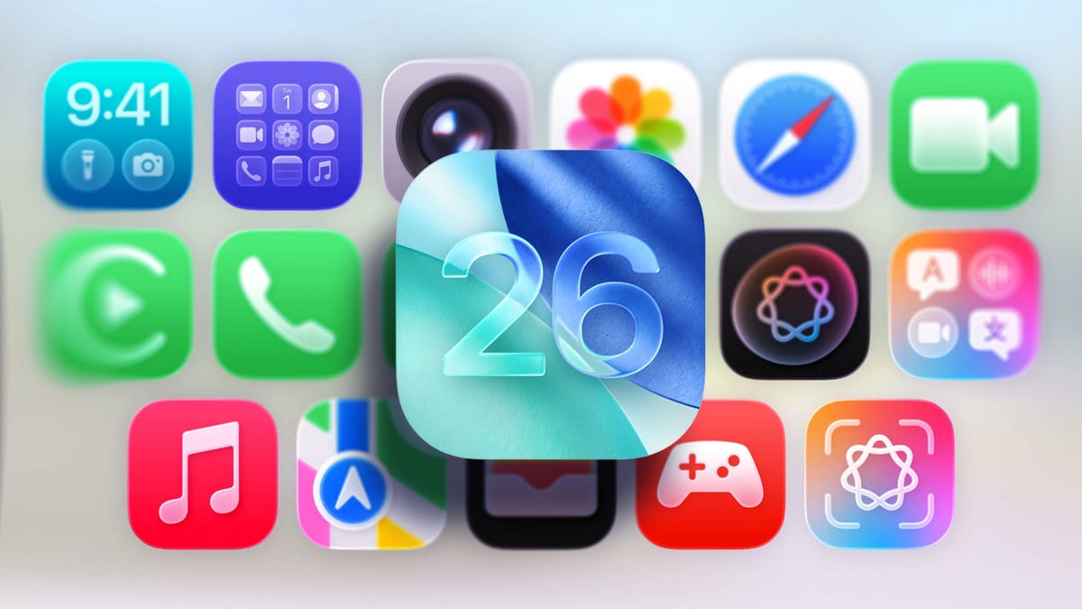
iOS 26 is a big leap forward in both functionality and aesthetics, making it feel like one of the biggest updates Apple has pushed out for the iPhone, ever.
While some of its best features are hidden or tucked away, Apple’s new design language, Liquid Glass, takes center stage and is impossible to miss, even if it’s subtle at times. As the name suggests, your iPhone’s user interface is now dressed up with new translucency effects, shiny edges, and a fluidity that makes the already-smooth operation system feel like it’s morphing under your finger as you use it.
All that said, when it comes to looks, Liquid Glass is little more than a spit shine update, and that’s a good thing. Apple took care not to overhaul too much with the latest design and iOS 26 operates almost identically to its predecessor, iOS 18, which means you won’t find yourself getting lost when trying to use your iPhone.
If you haven’t updated to the latest version of iOS yet and want to get an idea of how it compares to iOS 18 first, you’ve come to the right place. Below, I’ve highlighted a few notable areas that have changed in iOS 26 compared to iOS 18.
For more, don’t forget to check out our reviews for the iPhone 17, iPhone 17 Pro, and iPhone Air.
Don’t miss any of our unbiased tech content and lab-based reviews. Add CNET as a preferred Google source on Chrome.
Watch this: The New iPhone Air Changes the Game for Preorders
05:34 Home screen
Apple kept the new Liquid Glass minimal on the home screen (left), with only minor changes to the default home screen appearance compared to iOS 18.
Screenshots by Jeff Carlson, Nelson Aguilar/CNET
Looking at the home screens, the primary difference you’ll find is that in iOS 26, the dock background and the search option that sits between the dock and the home screen icons are more transparent and have a sheen to the edges, whereas in iOS 18, these are slightly darker.
Other smaller changes are that the icons on iOS 26 look slightly larger, and some app icons seem to have been more influenced by the redesign than others, most notably (from the screenshots) Settings, Camera and Mail.
For Liquid Glass to really shine on the home screen, you’ll want to opt for the “All Clear” mode, which will create the most dramatic change to your icons and widgets. Going this route could potentially introduce some viewability issues, but the “reduce transparency” setting remedies this quite well.
Control Center
Things here are largely unchanged. Outside of the new glassy look in iOS 26 (left), the 1×2 and 2×1 controls are more rounded than those of iOS 18.
Screenshots by Jeff Carlson, Nelson Aguilar/CNET
Things here are largely unchanged. Outside of the new glassy look in iOS 26, the 1×2 and 2×1 controls are more rounded than those of iOS 18.
Lock screen
The digital clock is noticeably larger in iOS 26 (left) than it is in iOS 18.
Screenshots by Jeff Carlson, Nelson Aguilar/CNET
It’s easy to see the differences that Liquid Glass brings to the iPhone lock screen. The digital clock in iOS 26 dynamically resizes depending on the wallpaper and the number of notifications you have at any given moment, which is pretty cool. The clock itself on iOS 18 can be changed, but it won’t change in size in response to content displayed on the lock screen.
The background on notifications is clearly different between the two OS versions, with iOS 18 providing more opacity and black text versus iOS 26’s near-transparent background on white text. The controls at the bottom in iOS 26 also appear more like physical buttons with depth and more of a see-through background.
The new unlock effect in iOS 26 is that the motion of unlocking your iPhone will appear as though you’re lifting a sheet of glass, highlighted by a shiny edge to give it form when you begin to slide your finger up.
Menus and dynamic tab bars
iOS 26’s new Dynamic Tab (top) gives you a cleaner look and more space to view your content.
Screenshots by Jeff Carlson, Nelson Aguilar/CNET
A new addition in iOS 26 is the introduction of dynamic tab bars in apps that will change depending on whether you’re scrolling or trying to perform a specific action. Apple says this will create a more intuitive experience while freeing up space for your content. If you were to replace the glass effect with heavily saturated colors, no one would blame you for mistaking this new tab bar with what Google’s doing in Android 16 in some of its apps — they look a lot alike. But compared to iOS 18, this new dynamic tab bar should not only reduce sifting through multiple menus, but it looks pretty good in the process.
iOS 26 will dynamically adapt to light and dark backgrounds
In iOS 26, the color of menu icons and icon text will adapt depending on the background.
Apple/GIF by CNET
While it’s harder to compare Liquid Glass to iOS 18 here, an upcoming feature is that buttons and menus will adapt depending on the content’s background color. For instance, when you’re scrolling through an app with a light background, the floating menu options will appear with black text for easier viewing and will automatically change to white upon scrolling to a dark background.
In iOS 18 (top), some aspects of the user interface would appear darker depending on the color of the background. Take a look at the top and middle examples to see how it compares to Liquid Glass at the bottom.
Screenshots by Jeff Carlson, Nelson Aguilar/CNET
iOS has had this type of feature show up in a less dramatic fashion before, as you can tell from the photos app screenshots above. Comparing these to what’s on the horizon, it’s hard not to get excited about the small tweaks Liquid Glass has in store, too.
Those are just a few of our initial findings, and we’ll likely add more once we uncover them. If you want more about iOS 26, check out three upcoming features that are a bigger deal than Liquid Glass.
Watch this: iPhone Air Is a Wild Card – and Starts a Big Change for Apple
06:39