The Milwaukee Bucks celebrated last December. The Los Angeles Lakers celebrated in December 2023.
Since its inception, the NBA Cup has become a welcomed change of pace to the league’s traditional regular-season schedule. The Lakers beat the Indiana Pacers in the championship of the inaugural event — once known as the NBA In-Season Tournament. Last year’s final featured the Bucks topping the Oklahoma City Thunder, as the event rebranded as the Emirates NBA Cup after the league announced a multiyear deal with the airline company.
Group play for this year’s tournament will run through Nov. 28 and feature matchups every Friday. Eight teams will advance to the knockout round in an effort to advance to the semifinal round and then the championship game, both to be played in Las Vegas. Semifinal play will take place Dec. 13, and the final will be played Dec. 16.
Now in its third season, the NBA Cup is always a topic of discussion because of the customized court designs for all 30 teams. The designs have garnered commentary ranging from high praise to extreme criticism, and this year’s courts, designed by artist Victor Solomon, will have fans chatting.
The Athletic’s Jason Jones, Josh Robbins, Eric Koreen and Jay King have seen all 30 floors and compiled their own ranking, using a scoring system in which 30 points were given to their favorite court and one point was given to their least favorite. (This explains the numbers in parentheses next to each writer’s name below.)
Where did each court rank? Have a look below, as the rankings start from the bottom of the bunch to the cream of the crop. Feel free to offer your thoughts on the courts — and tell us about your favorites — in the comments section.
(All images are courtesy of the NBA.)
30. Atlanta Hawks (22 total points)
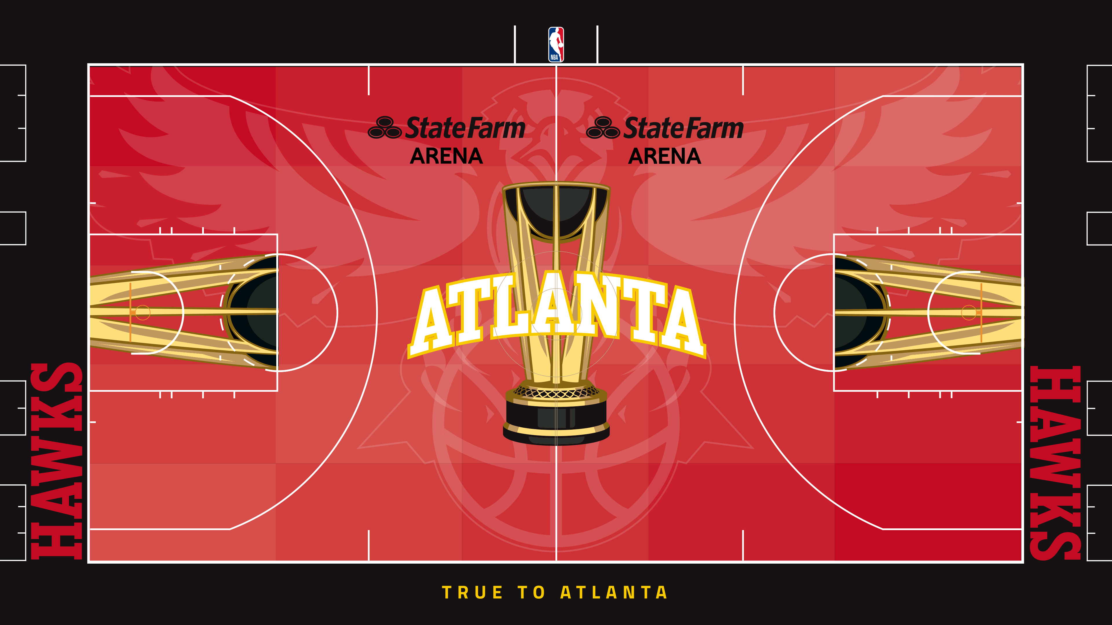
Robbins (8): I’m all for innovation and progress, so I like that the league experiments with court designs. But I don’t like when court designs (or football field designs) negatively impact the viewing experience for fans in the arena and those watching on TV. Many of my rankings will reflect that. Red and blue courts may look cool on paper, but I think they distract fans who watch the game. So, I dislike this court — and all the other red courts — because it takes the focus off the game itself.
Koreen (4): The court is too red. The logo is too garish. This is just too … much.
Jones (8): This reminds me of those old uniforms with the big bird across the jersey. That’s not a good thing. Those jerseys were terrible.
King (2): Too much red. Way too much red. Over the years, the red courts have all been the worst. This one fails to break that trend.
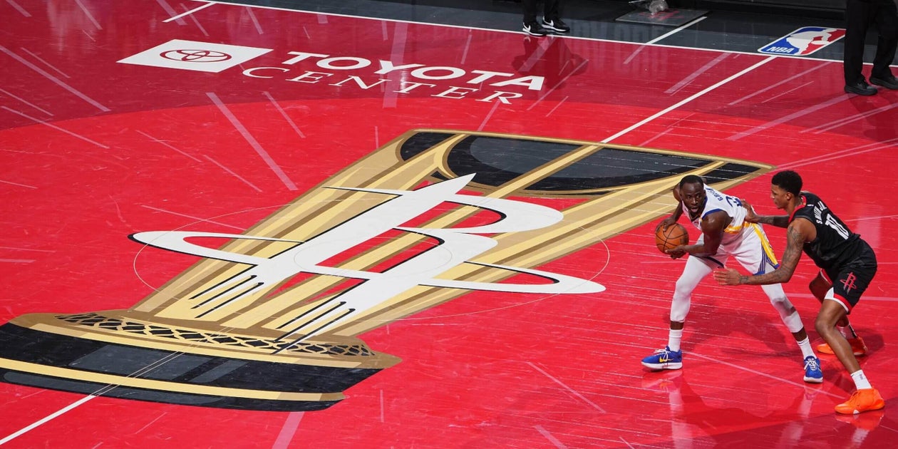
29. Houston Rockets (25)
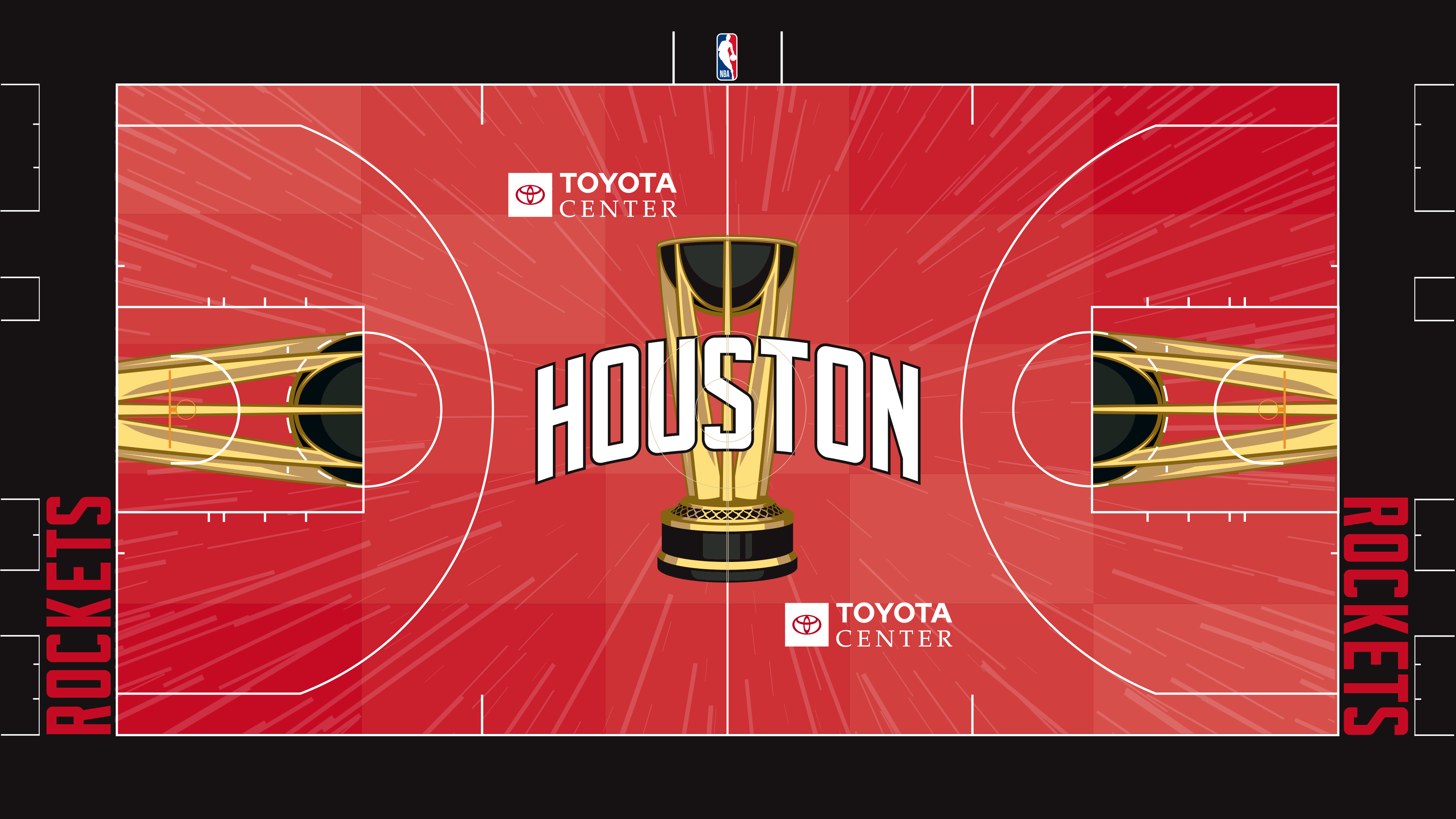
Robbins (11): The rocket trails are the one nice part about this court, and I applaud that because NASA’s Johnson Space Center is in Houston.
Koreen (2): I assume this is what it looks like when you die and you’re being sent, uhhh, you know, to the bad place.
King (5): Hell, Koreen. It’s called hell. And I’m staring at it.
Jones (7): Nice place mat.
28. Toronto Raptors (34)
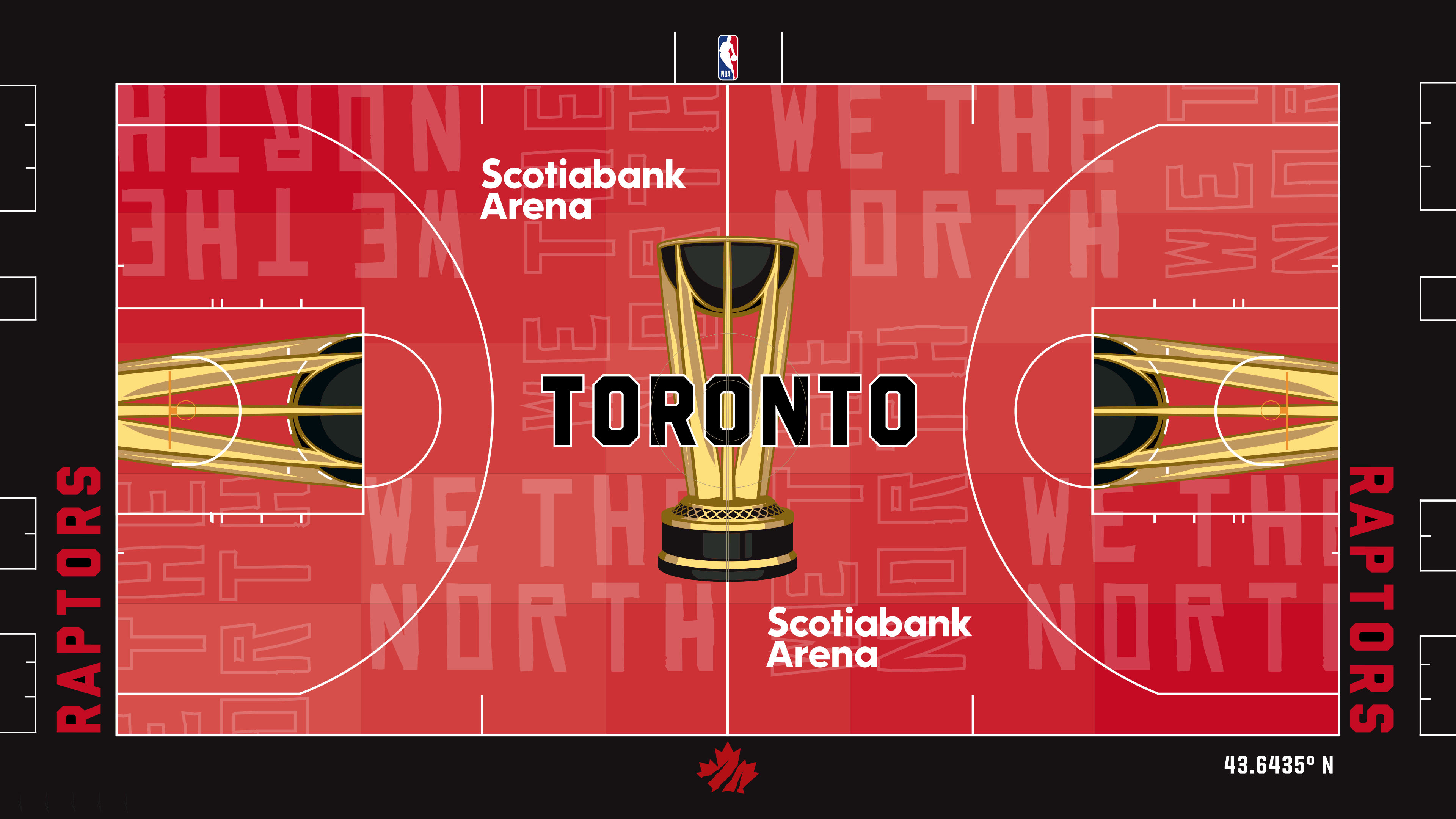
Jones (14): We didn’t need “We the North” so many times. We get it, you’re in Canada. The phrase on the court that much is hard to keep track of. Every time I look, I think I see “We the North” 10 more times.
Koreen (7): No! Bad Raptors! You do not need to have your catchphrase written that many times, in that many fonts, on your court. It is unnecessary. And to do it on a red court? This is far too maximalist for me. The maple leaf with the Raptor claw mark is the only reason this isn’t lower on my list. I think that’s one of the cooler things the Raptors have done with their primary logo recently.
Robbins (10): There are three major demerits here. First, the distracting red court (see the Atlanta commentary). Second, having so much writing on the court. Third, the horrendous grammar in “We the North.” This is a trifecta of lameness. So, why did I rank it ahead of most of the other red courts? Well, it’s a nice shade of red, and the maple leaf and the latitude marker are cool. Too bad they didn’t go full steam on the latitude. Geography is good.
King (3): Did the designer of this court get in trouble? Was he or she forced to write “We the North” over and over like a child in detention? Koreen is right about the maple leaf with the Raptor claw mark, though. That part rules.
27. Oklahoma City Thunder (35)
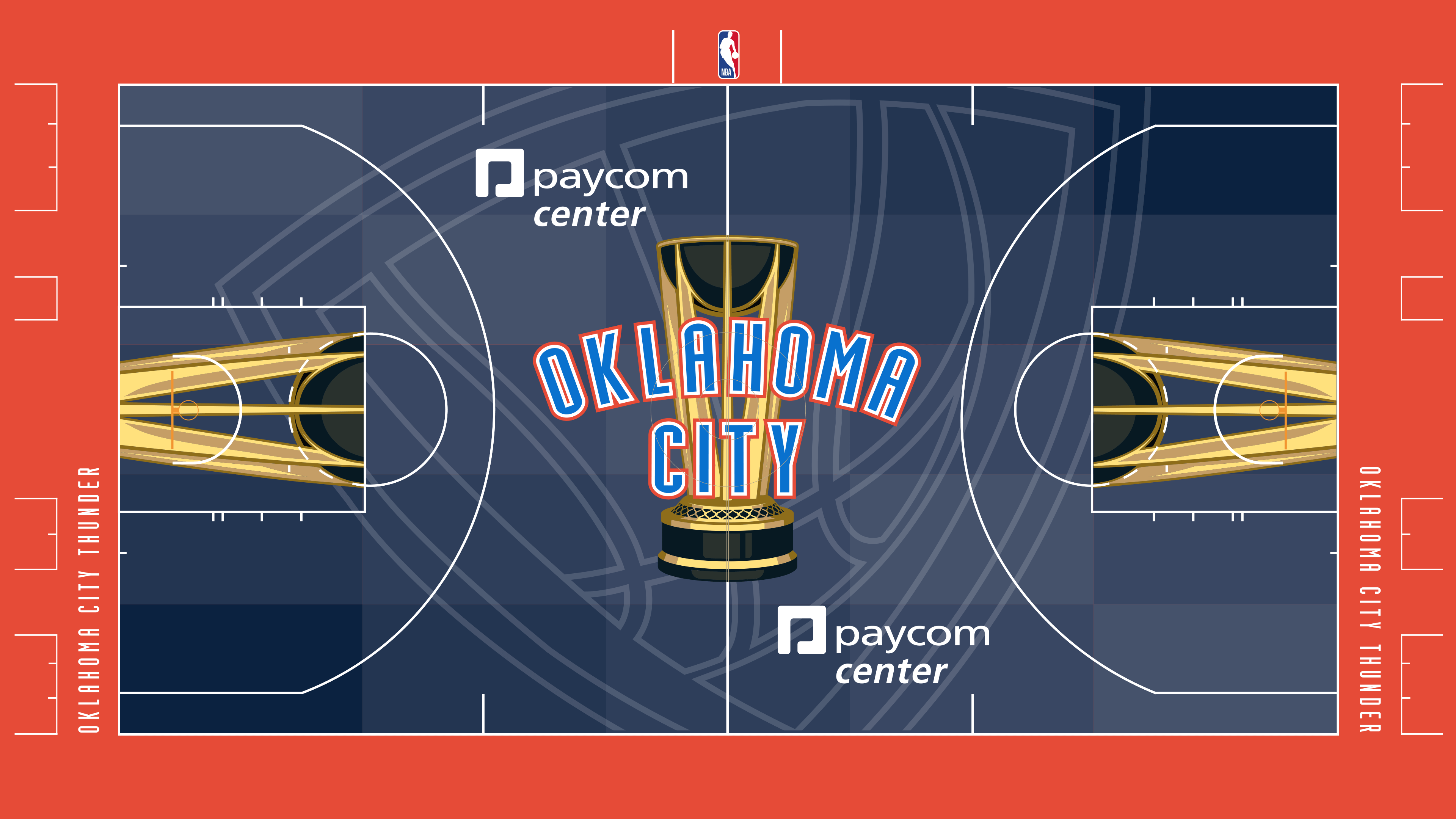
Koreen (16): I know teams don’t go for a redesign right after winning a title, but the Thunder’s motif is so sleepy. As soon as I stop looking at it, I forget what it looks like. With that said, leaning on the dark blue as the primary color is the safest choice. Given their options, safe is fine.
King (16): Maybe the Thunder SHOULD go for a redesign right after winning a title. At the very least, they should increase the font size on the baselines. Looking at that made me want to visit the eye doctor.
Jones (2): The champs deserve better than a diamond-shaped basketball. I know OKC isn’t exactly the sexiest city in the NBA, but that doesn’t mean the court has to be boring.
Robbins (1): This court reminds me of the scene in the movie “Pitch Perfect” in which an a cappella group sings with sock puppets over their hands. The Barden Bellas’ leader, played by Anna Camp, watches and says, “There’s no craft there.” With this court, where is the craft? Where is the creativity? The court is ugly and boring, which is a lethal combination.
26. Sacramento Kings (39)
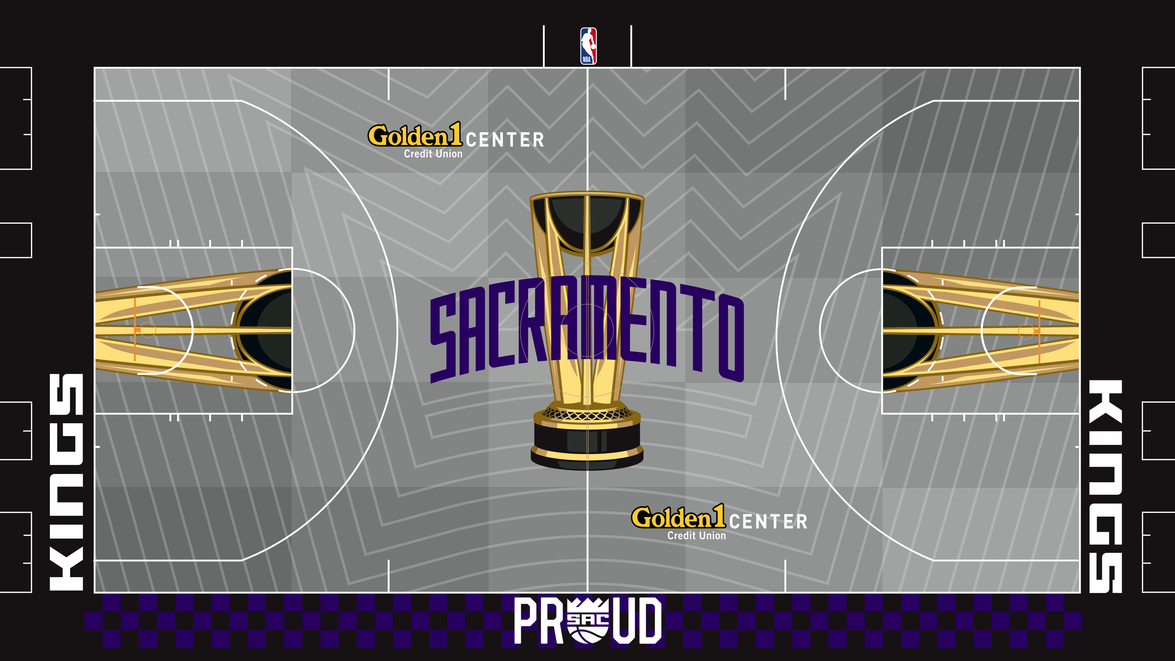
Robbins (25): In this case, I suspect that the pattern on the court won’t be as visible in real life as it is here. That’s why I have this design as high in my rankings as I do. Without seeing the pattern, this is another dull court, and dullness would keep fans focused on the game itself.
Koreen (8): Is this a Magic Eye puzzle? If I stare at it long enough, will a plan for this franchise finally come into focus? (I’m sorry. That was mean.)
Jones (5): Gray tiles on a kitchen floor. I get there’s a crown on the floor, but the lines are sending me to the twilight zone.
King (1): Proud? Of what, reassembling the 2022 Chicago Bulls? Making the playoffs just once since 2006? Capturing magic under Mike Brown and then firing him less than two seasons later? The rest of the court isn’t great, either.
25. New Orleans Pelicans (40)
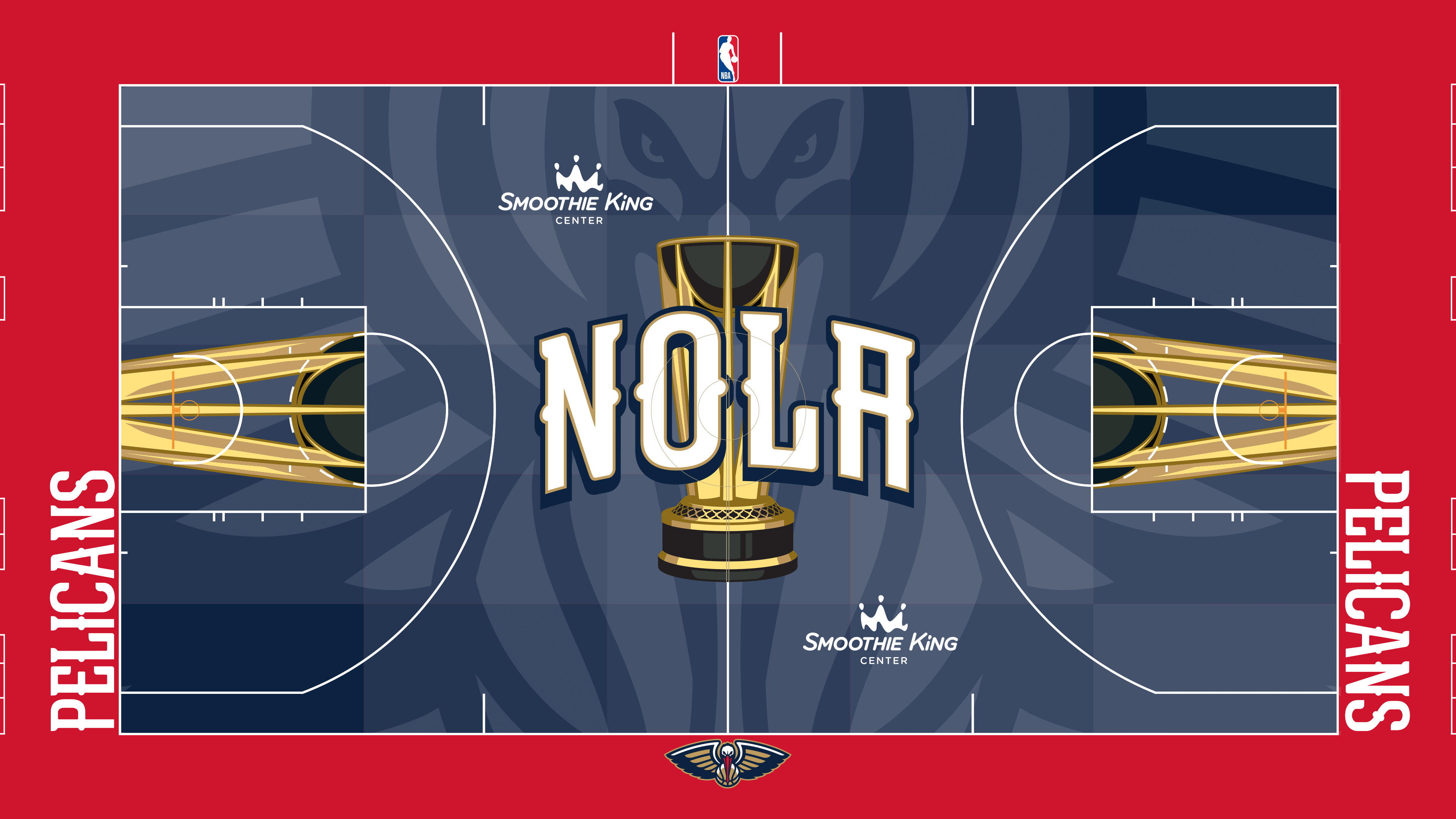
King (15): This court made me think of Billy Madison. “I drew the court blue because I’ve never seen a blue court before and, to be honest with you, I wanted to see a blue court.”
Jones (13): The bird looks scary. That’s really all I’ve got.
Koreen (9): I would like to see a fight between the pelican on this court and the hawk on Atlanta’s. The Pelicans have never truly found a memorable look, but this is inoffensive.
Robbins (3): Stick with me, please, for a moment. I like Boise. I spent a very pleasant summer weekend there. I recommend it to travelers. But I blame the Boise State University athletic department for this NBA Cup alternative court madness. Boise State made it fashionable to have a weird-colored playing surface, and I think the school’s “Smurf Turf” detracts from the game. A football field shouldn’t be blue, except, perhaps for the midfield logo and the end zones. A basketball court shouldn’t be blue, either.
24. Golden State Warriors (41)
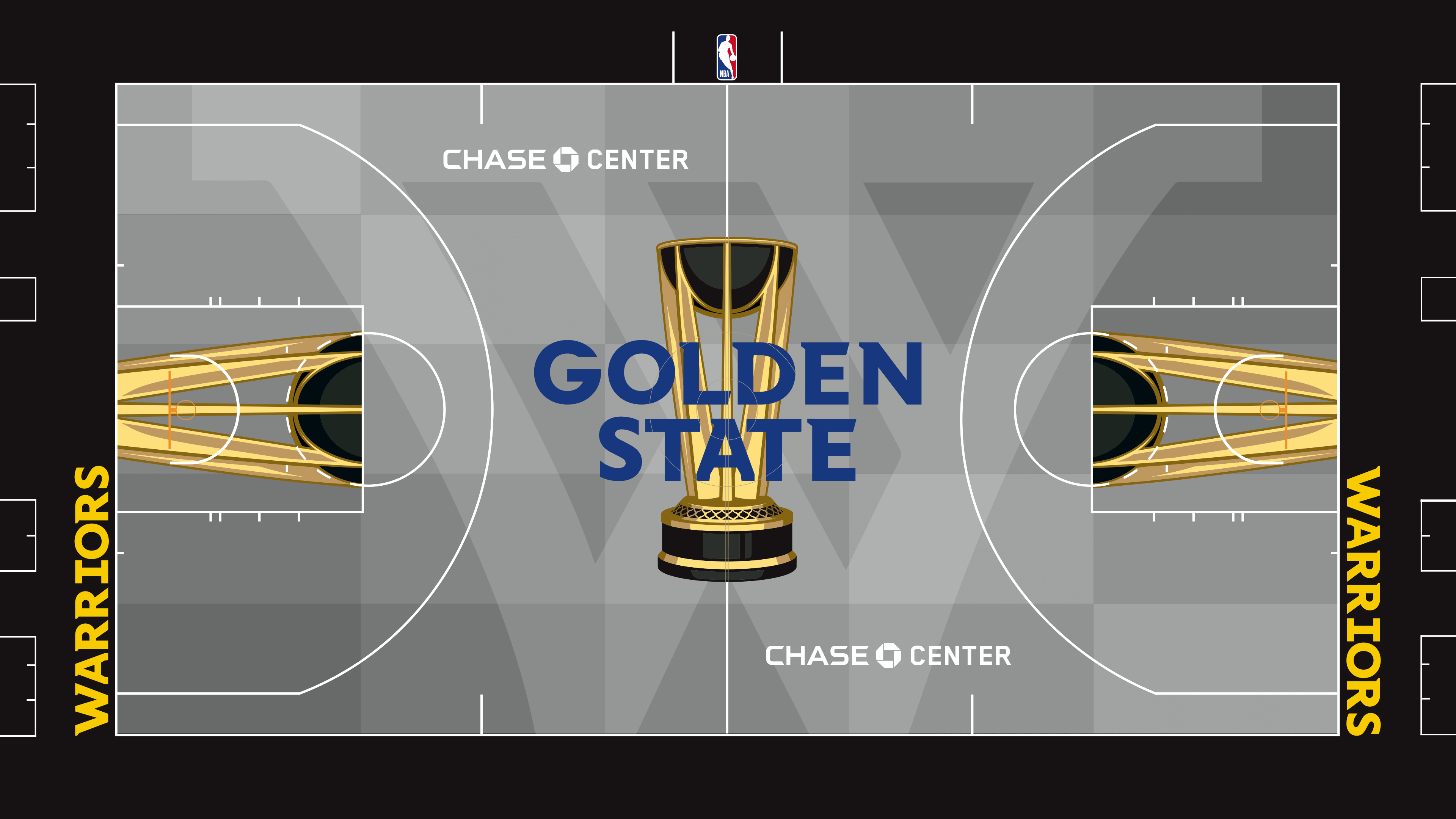
Robbins (24): I like that this court makes me yawn. When NBA players play, the focus should be on what they’re doing. The court should not be a distraction. This is so darn dull that it keeps the focus on where it belongs.
Koreen (3): You are the Golden State Warriors and your base color is … gray? And you’re using an unrecognizable logo? The Bay Bridge is iconic.
King (13): Koreen might hate on it, but this logo is passable. A net that doubles as a W. Other than that, this court doesn’t inspire me. It doesn’t infuriate me, either, so at least there’s that.
Jones (1): This is a big yawn. A big gray W. Black and gray. This is almost a tribute to the Raiders.
23. Denver Nuggets (43)
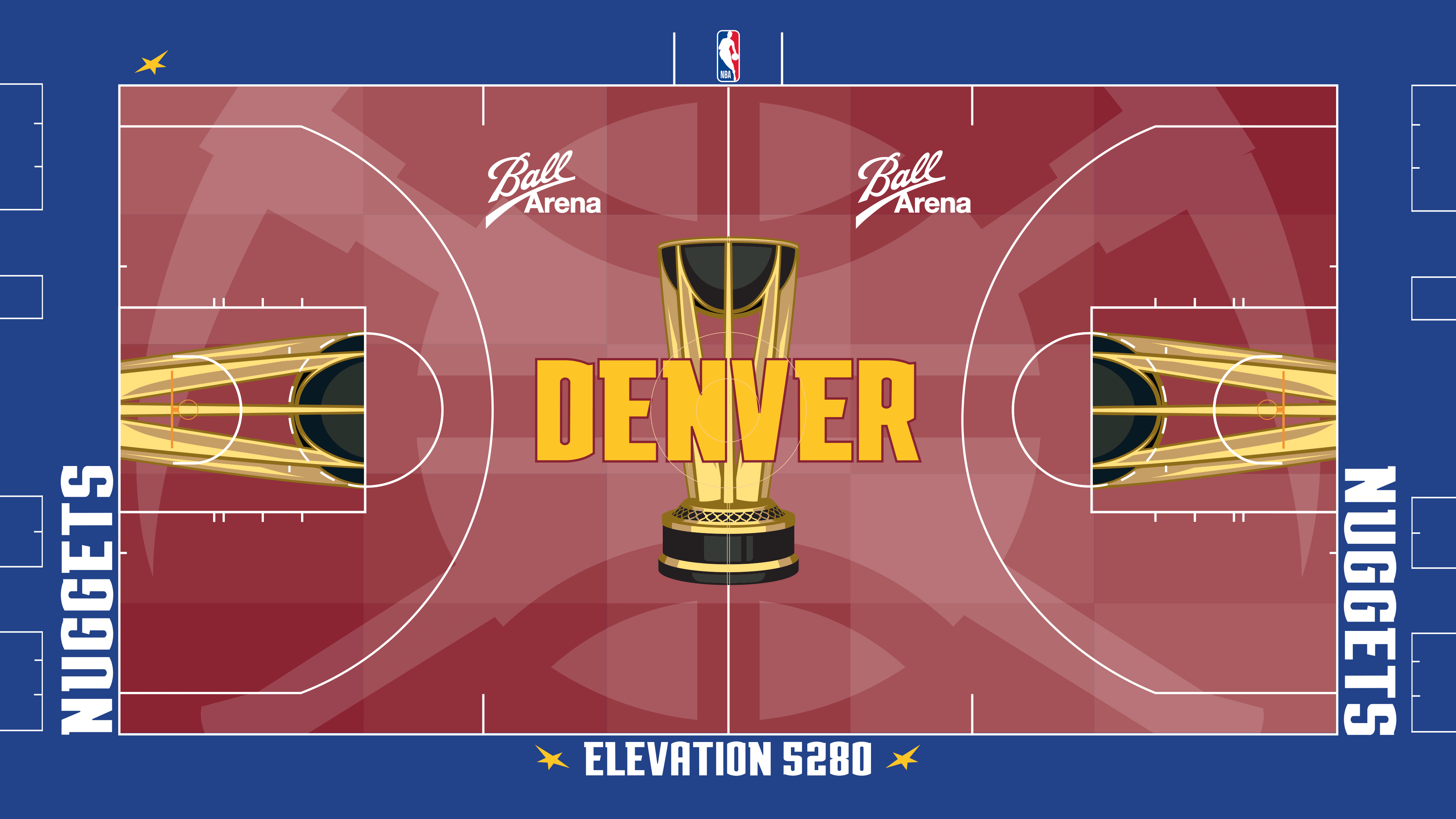
Jones (16): I wish they used the Denver skyline, but I’m being picky. I’d make every alternate to a Nuggets jersey a throwback to the old-school look with the skyline and bright colors. I dig that more than “Elevation 5280.”
Koreen (12): Does anybody know how high above sea level the city of Denver sits?
King (9): I don’t love the shade of red used here, but this court is built for morons like me … literally. During the first year of the NBA Cup, I did not understand the significance of the number 5,280, which was featured on the court with no explanation. Now, the Nuggets are kind enough to explicitly state that they are referencing Denver’s elevation. Salute to them for making it easy for the dummies like me.
Robbins (6): Another red court, another red failure. I must admit that I love how the Nuggets (and Colorado Avalanche, who play in the same building) attempt to psyche out their opponents by reminding them of the altitude. That “Elevation 5280” reference is in other areas within Ball Arena, including the space where visiting teams’ buses pull into the building.
21. (tie) Miami Heat (44)
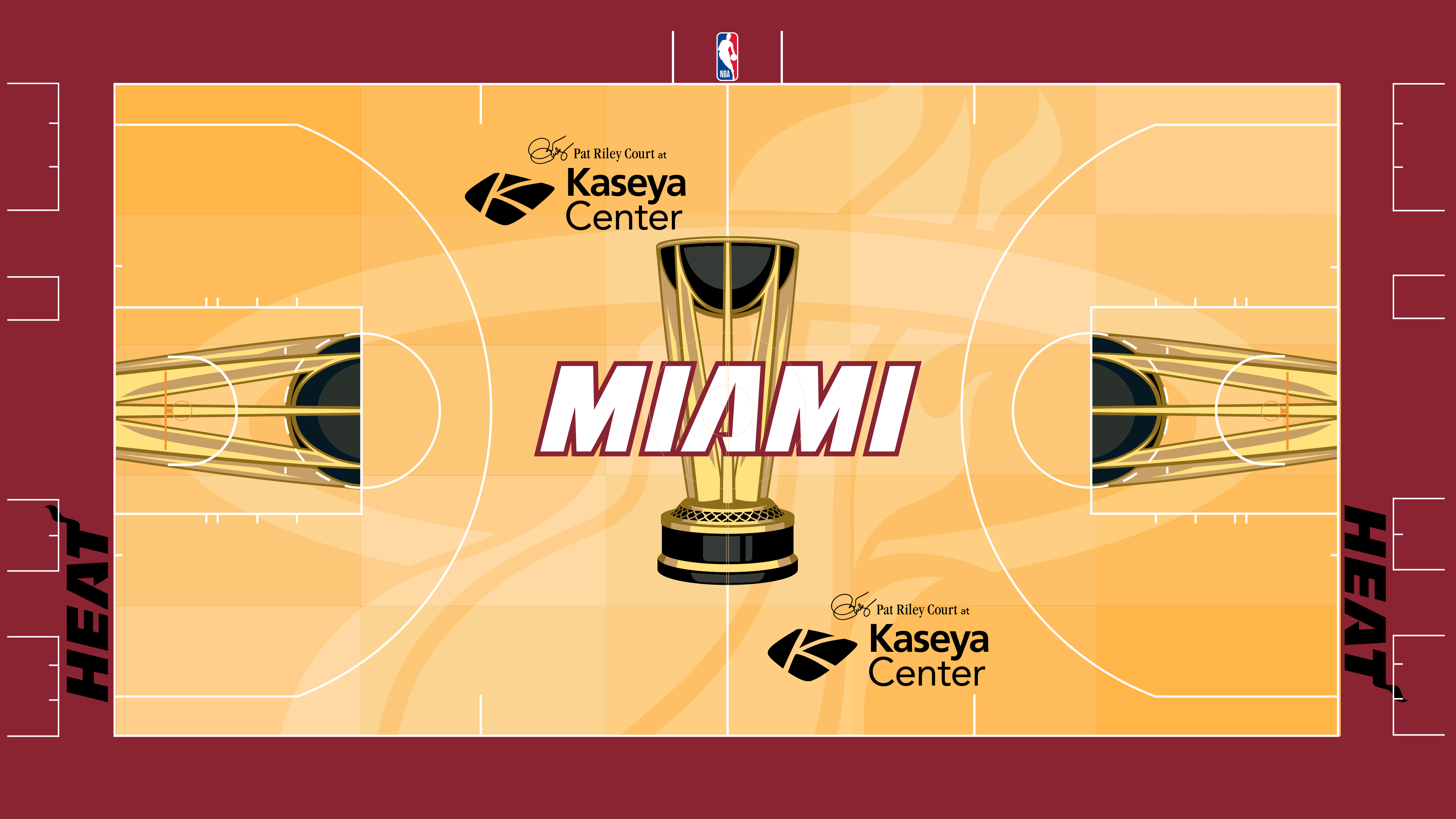
Robbins (28): I’m taking a leap of faith here that in real life, the court will resemble a regular hardwood court closely enough that the fans watching inside the arena and on TV won’t be distracted too much.
King (6): This is bland. It is gross. It has no character. I do not want to watch Jaime Jaquez Jr. play basketball on this court. And I am usually a Jaquez enjoyer.
Koreen (6): How can the same people that brought us the Miami Vice uniforms also bring us the most boring of these courts? Is there some sort of cap on creativity output per decade?
Jones (4): Kudos for not using “Heat Culture.” Beyond that, this looks like a normal court.
21. (tie) Dallas Mavericks (44)
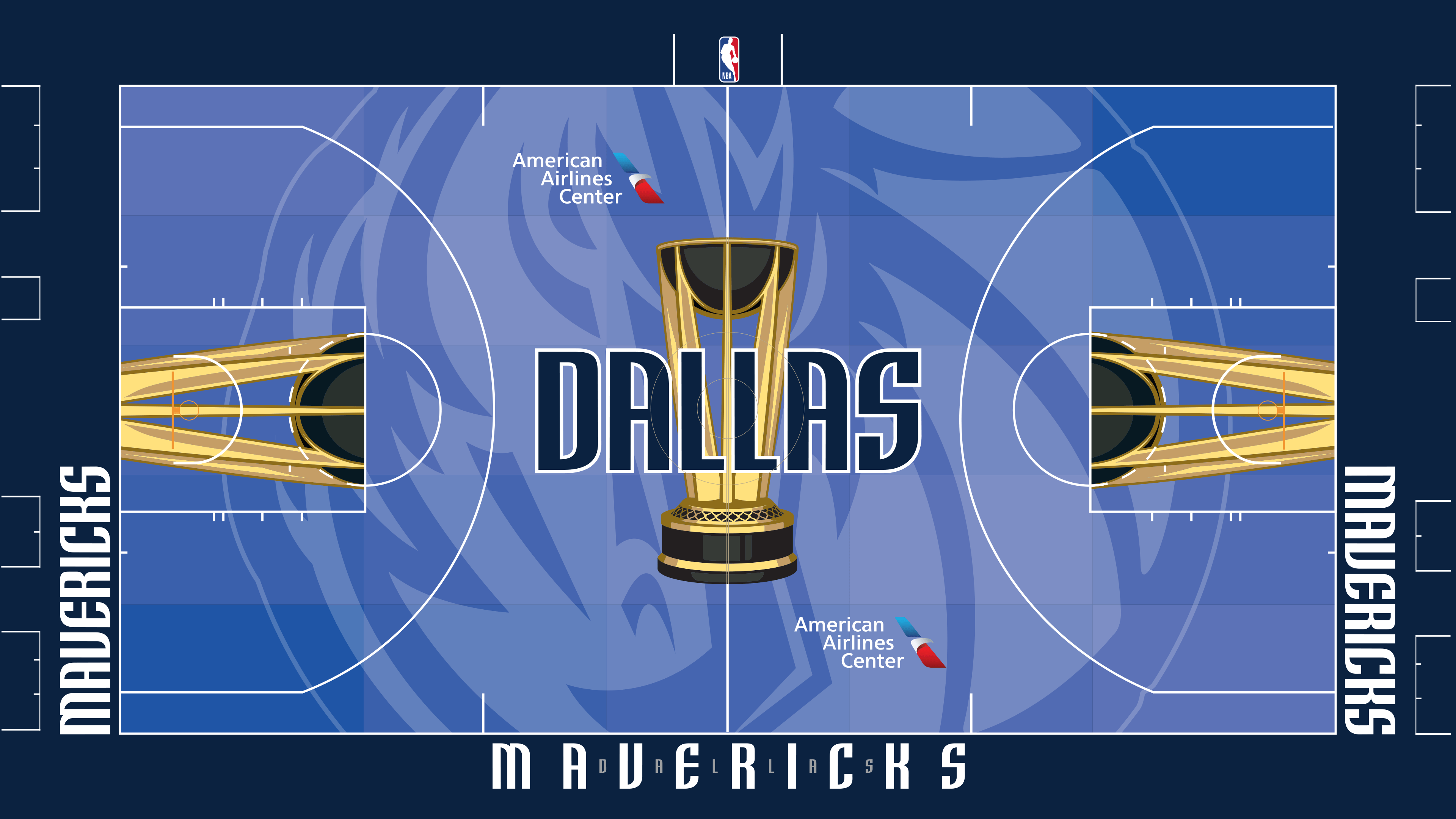
Robbins (16): This is a nice shade of blue. I covered a game at American Airlines Center during this season’s first week, and I have to admit, I don’t care for the Mavericks’ mascot, who reminds me too much of the Detroit Pistons’ mascot, Hooper. No two mascots in any pro sports league should be similar to each other.
King (14): That shade of blue is not too rich, not too dull. It makes me think of a sunny day. Still, this court just feels like it’s missing something. And I’m not sure why, but the “Dallas” written in between the letters of “Mavericks” kind of creeps me out.
Jones (9): That’s a really big horse on the court. That’s really all I’ve got. No MFFL reference? Years ago, I hoped that the acronym was something profane, only to learn it was “Mavs Fan For Life.” That’s about as blah as this court.
Koreen (5): This is not a hard rule, but in general, I think that most good logos can be drawn by school-aged children. Which is to say that I’ve never liked this Mavericks logo, and it taking up nearly all of the court is a bummer for me. Also, we’re nearly a quarter century into the Mavericks’ color-scheme change, and I still think of this as a green franchise and not a blue franchise. I guess that’s a me problem, but these are my rankings.
19. (tie) Cleveland Cavaliers (45)
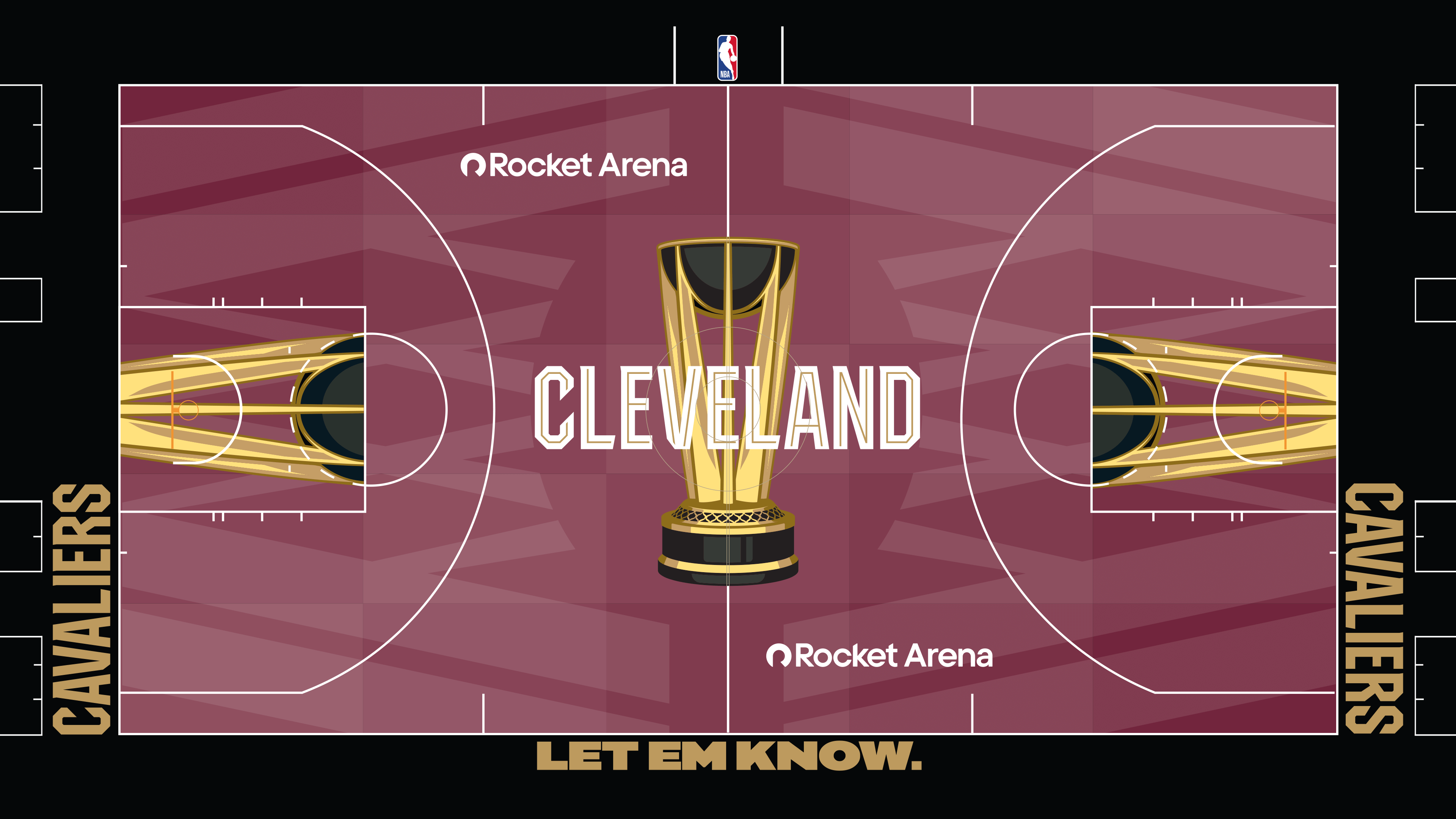
Koreen (26): Mmmm, merlot! (For real, nice work incorporating the logo.)
Jones (6): Are those nets on the court? Please, let me know.
Robbins (9): Yeah, now that you mentioned it, what are those? Anyway, this is too dark a red.
King (4): This is probably nitpicky, but why does this court have a period after “Let Em Know”? Given the strength of the message, wouldn’t an exclamation point work better? Or better yet, since it’s a basketball court, just no punctuation mark at all? The period makes me think “Let Em Know” should only be muttered like an elementary school teacher just yelled at you: “Inside voices, please!” Why aren’t the Cavaliers letting ’em know a little more forcefully?
19. (tie) LA Clippers (45)
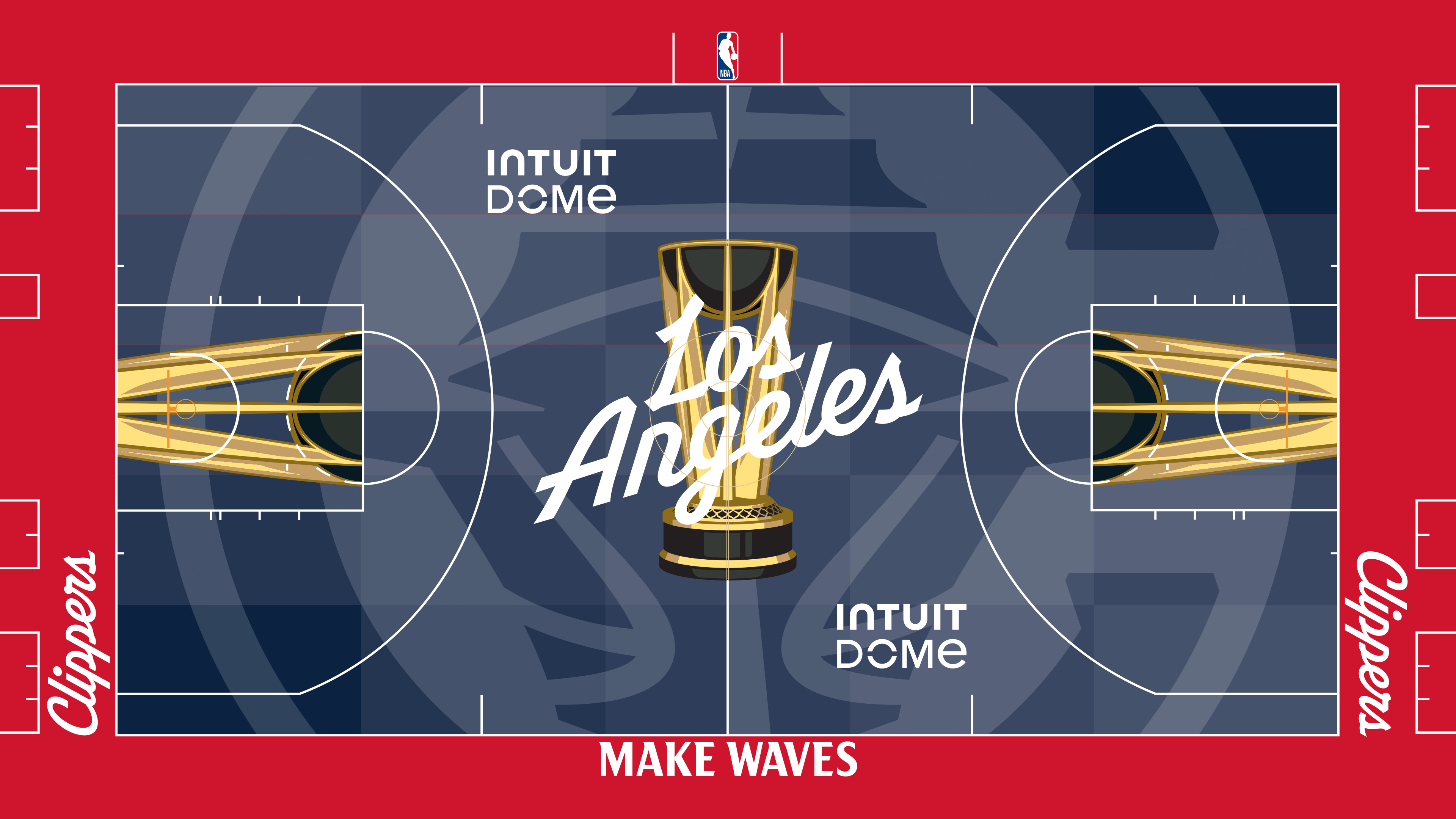
King (18): I spent most of my life somehow unaware that “Clippers” had a nautical meaning. It wasn’t until their logo shift that I put two and two together. As previously established, I’m not the smartest guy. But I am smart enough to know that they need a better slogan than “Make Waves.” I can appreciate the color scheme, though.
Koreen (15): Give me that “Clippers” font in script on the baselines all day. I don’t love a logo that takes up the entire court. It is going to take a while for the whole sailing vibe to sink in as a Clippers motif after they avoided it for so long. “Make Waves” is just on the right side of corny, although I’m a bit surprised they didn’t opt for “Plant Trees.”
Jones (10): “Make Waves” … I get it. But the team plays in Inglewood, so that doesn’t work for me. For some reason, the boat looks like a crosshair target on the court. It’s not as creepy as the mascot, Chuck the Condor (the bird in knee pads), but this is just OK.
Robbins (2): I like the slogan, “Make Waves.” But I dislike the court. Inuit Dome is the NBA’s best, most inventive arena. The arena itself doesn’t have feelings, but it deserves a better temporary court than this.
18. Detroit Pistons (47)
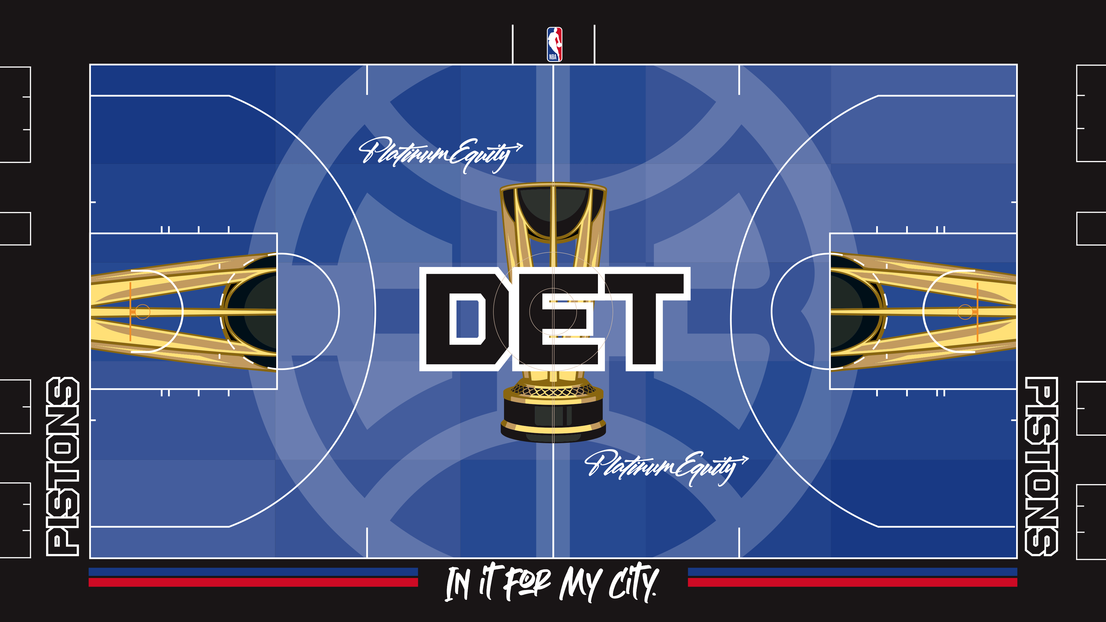
Jones (15): This reminded me of the area code for Detroit. Even though Ludacris mentioned the 313 in his 2001 song “Area Codes,” that didn’t stick in my mind like seeing 313 plastered on the floor. It’s not the Bad Boys, but it’s not the worst I’ve seen.
Robbins (15): The only things that I like about this court are the fonts and the uses of the Pistons’ primary colors at the bottom of the court. I don’t hate anything here.
Koreen (10): The Pistons are right there with the Celtics and Lakers as franchises that should not mess around with their primary logo. Every time they go away from their main look, I’m reminded of how good that main look is. Between that and the nod to Platinum Equity, Pistons majority owner Tom Gores’ investment firm, this is the court that most consciously makes me think about the occasional pitfalls of capitalism.
King (7): I want to like this. The colors work together. At first glance I didn’t hate it. The details just don’t help. The fonts are distracting. There’s nothing to call back the franchise’s great history. I should see reminders of Isiah Thomas, Rick Mahorn and Ben Wallace. Instead, I see the name of an investment firm.
17. Brooklyn Nets (54)
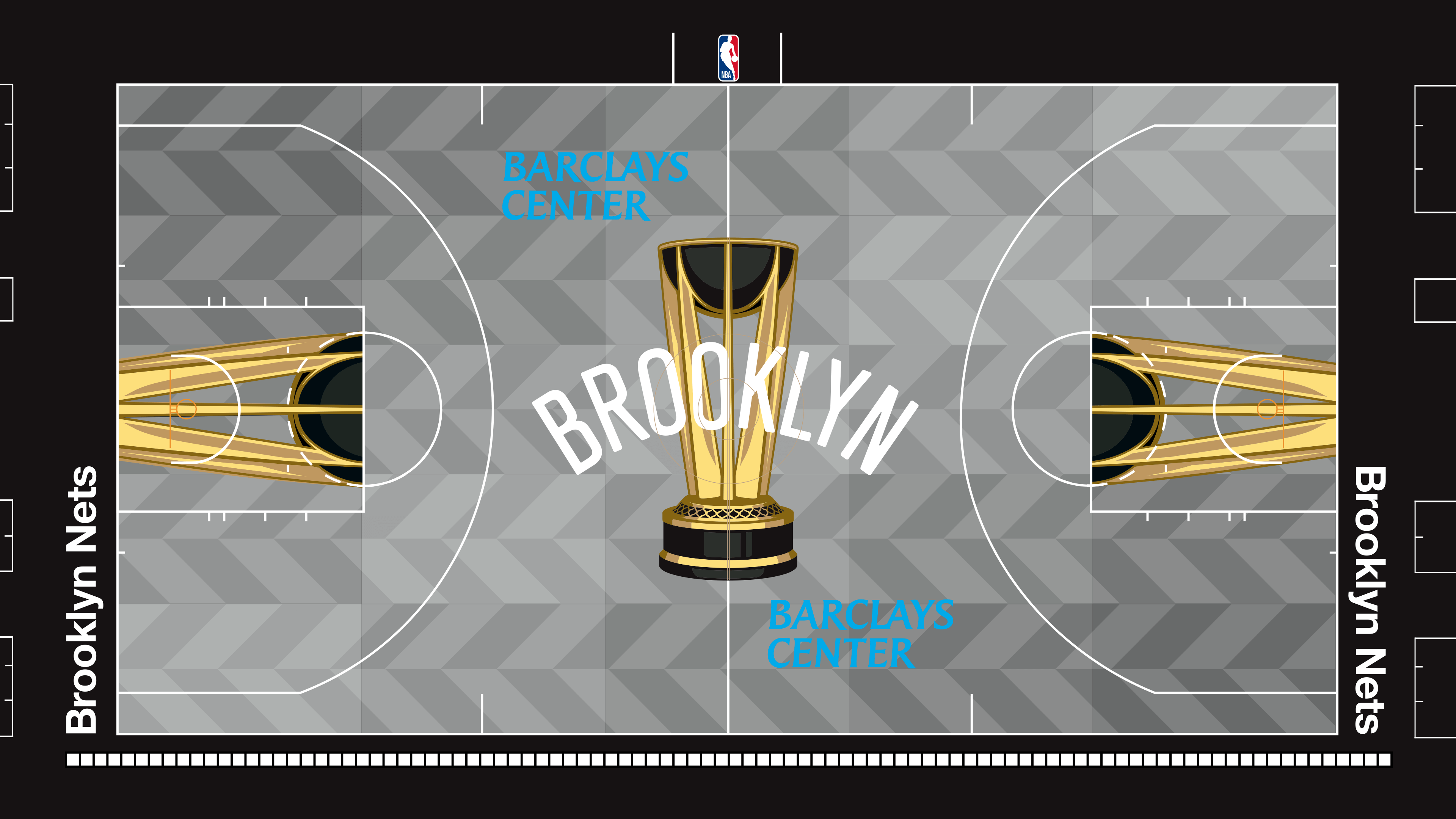
Robbins (26): The Nets sure do go crazy over their herringbone motif, don’t they? The white squares at the bottom of the court remind me of the tiling within the New York subway system, and that’s something nice to lean into. (The arena sits atop a subway stop.)
Koreen (13): The Nets’ baseline logo remains one of the highlights of all of these courts, not just Brooklyn’s. Unfortunately, it’s the only thing I really love about this. Aren’t endless chevrons kind of the Raptors’ thing? Demerits for having to watch the Nets play basketball on this court.
Jones (3): The Nets would be better off with a tribute to The Notorious B.I.G. or something else that screams Brooklyn. I’m not sure what this is.
King (12): Did something get stuck on the keyboard? Why does the sideline have so many dashes?
15. (tie) Memphis Grizzlies (58)
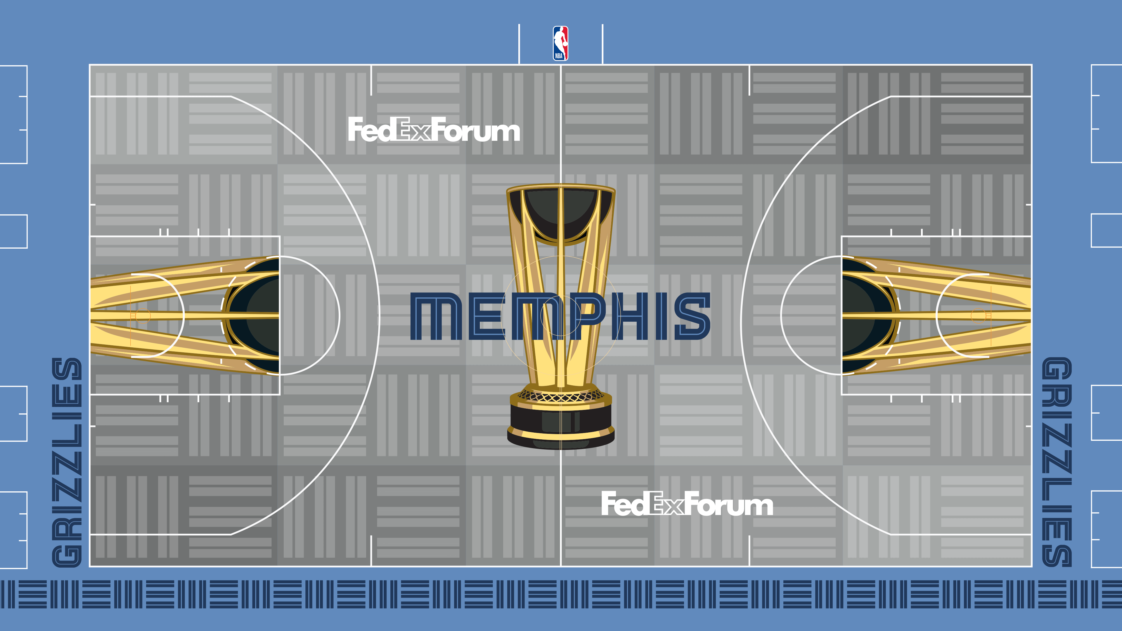
Robbins (27): It took me a while to get on board with the “MEM” pattern here, but it works for me now. I like the color scheme. A negative is the exclusion of the grizzly in the logo.
Koreen (1): It’s this simple: I hate the three-bar “MEM” thing, and it’s all over the court and the trim. I’m all for logo minimalism, but the effort here just reminds me of Jenga blocks. Too bad, because they have interesting colors with which to play. I cannot help the rage blackout I get from the bars.
King (19): The blue and gray soothes me. I would have preferred less of a reliance on the three-bar thing that irks Koreen to his soul, but I am a little happy that it irritates him so much. Shout-out to the Grizzlies for forcing him to rage blackout.
Jones (11): I’ve seen this pattern before. It’s the carpet of a media room I’ve been in somewhere. Gray carpet is what the court looks like.
15. (tie) Chicago Bulls (58)
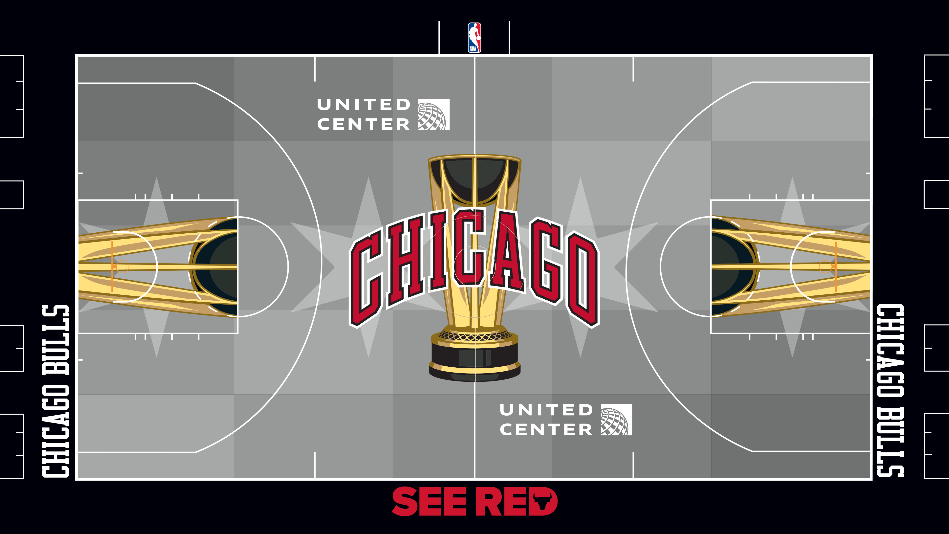
Robbins (21): There’s nothing special about this court. Nothing. Gray is dull, but in this exercise, dull is good, as it doesn’t distract from the game itself. That’s the redeeming quality of this court and the other gray courts.
Koreen (14): I get that all of the courts have to work in the City Edition jerseys, and in general, I love the stars on Chicago’s flag. But the Bulls’ primary logo is so good that it is disappointing not to see it featured. Also, I wish the stars were blue, as they are on the flag. This is fine, but drabber than it should be.
Jones (12): The stars from the city’s flag don’t work for me in this color scheme. And with the message “See Red” on the court, I expect to see more red on the court.
King (11): The Bulls wrote “See Red” on the bottom of this court, but they appear more interested in forcing the viewers to see gray and black. I’m cool with that choice, though. The predominantly red courts hurt my eyes. This court should feature more nods to history, though. I should be thinking of Michael Jordan and Scottie Pippen when I look at it. I’m thinking of Coby White instead.
14. Charlotte Hornets (59)
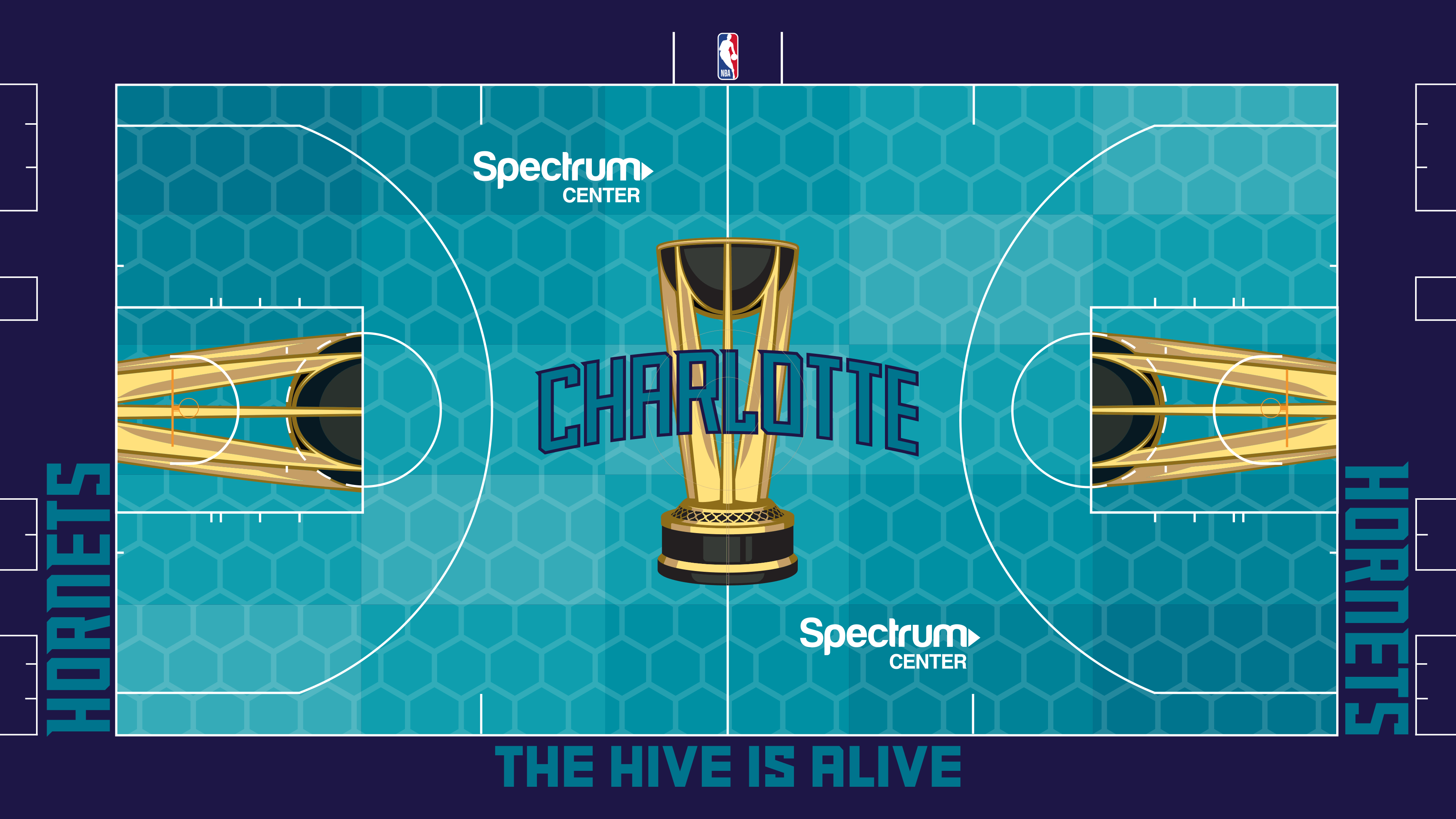
Koreen (21): It’s not what I want in a court — which is why this isn’t higher — but the teal honeycombs do fully encapsulate this franchise. De-emphasizing the teal would feel like a capitulation for the Hornets. They made the right call; it’s just a lot to absorb through a television.
Jones (21): I really dig the hive look, and the color scheme is one of the best in the league. I just wonder what this will look like in person.
King (10): I would have preferred a “capitulation.” Why do the Hornets use teal as a color, anyway? Teal has nothing to do with the insect itself. It looked cool on Starter jackets. Not so much on an NBA court.
Robbins (7): I like teal … but only in moderation. Fans shouldn’t be bombarded with it as the dominant color on their TV screens or within their fields of vision. It’s too much — so much so that it distracts from the game.
13. Minnesota Timberwolves (64)
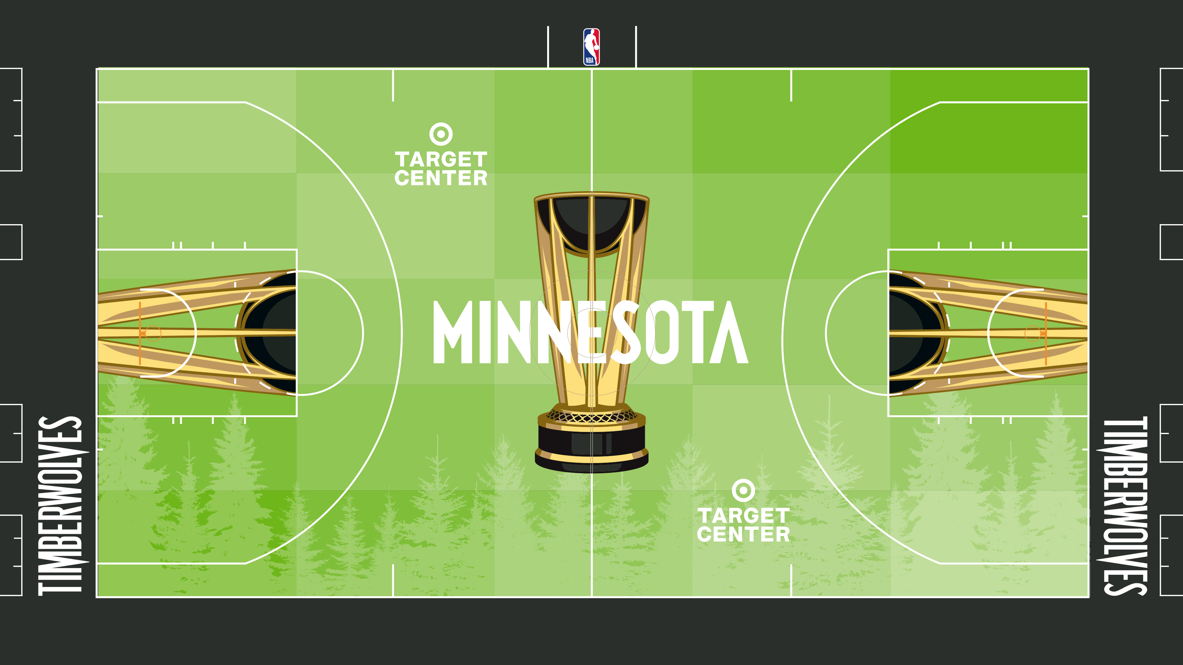
Jones (25): The court looks relaxing. I suddenly want to take a nap. I like the trees, too. It would also fit as part of a company that promotes recycling.
Robbins (20): Mostly green courts are problematic, but at least this shade of green is light on the eyes.
Koreen (11): The trees evoke calmness and serenity. The shade of green evokes Radioactive Man. The cognitive dissonance is off the charts.
King (8): No, no, no. This court looks like a package of Doublemint gum. Which means I now have that jingle stuck in my head. You know the one: “Double your pleasure, double your fun. That’s the statement of the great mint in Doublemint gum.” I’m sorry for getting it stuck in your heads, too. I didn’t choose this life.
12. Boston Celtics (77)
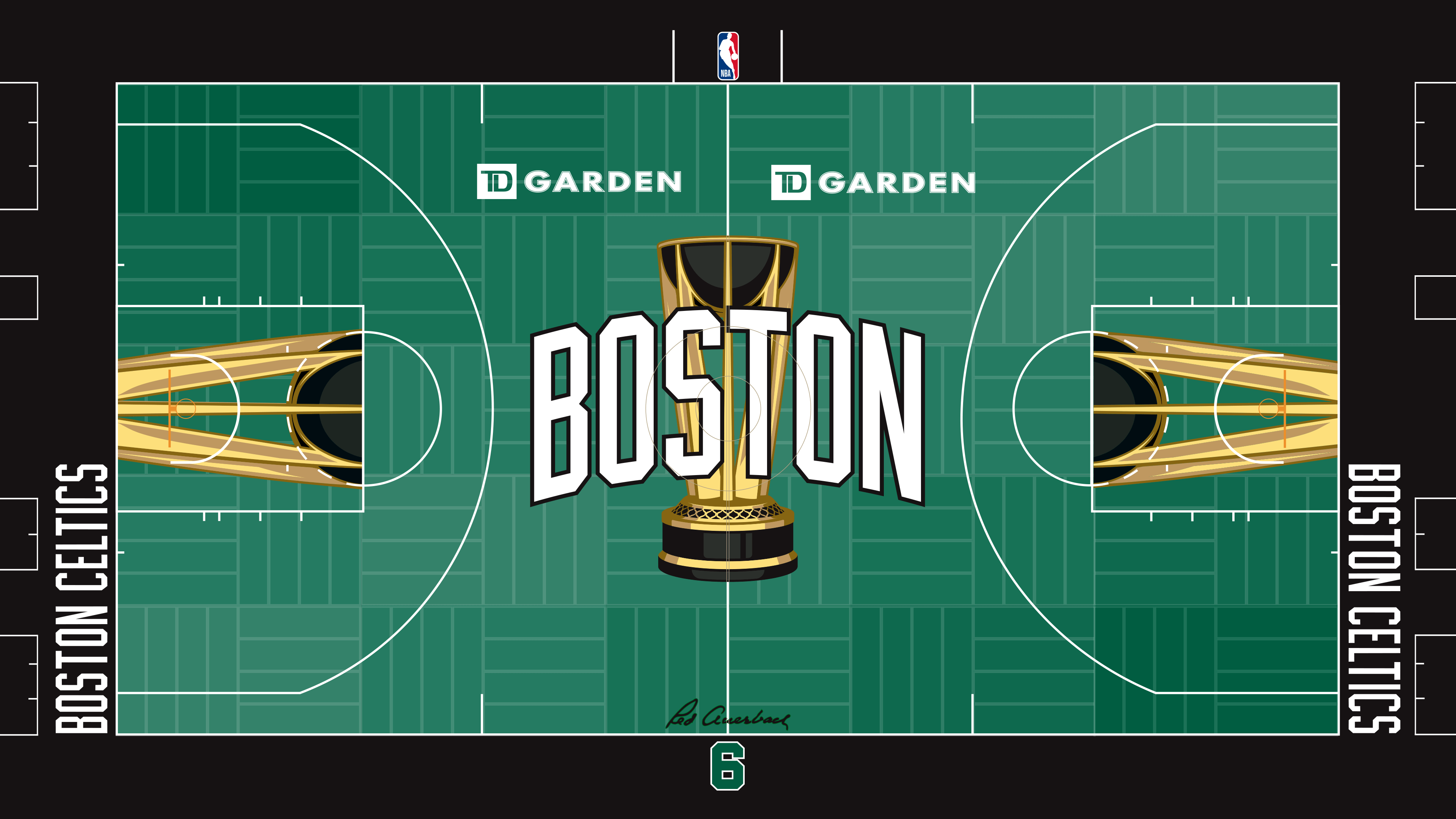
King (27): This court scores points for the simple nods to history. The parquet floor. Red Auerbach’s signature. Bill Russell’s number. That’s a lot of green, but the multiple shades of green here actually work for me. I haven’t always appreciated the Celtics’ NBA Cup court in the past, but this one hits the right notes.
Koreen (23): Congratulations to the Celtics, who went from using the Milwaukee Bucks’ forest green a few years back to a more recognizable shade for the team. They’re not trying much beyond that, but they’re the Celtics — they should keep things minimal.
Jones (23): The simplicity works. It’s old school with a new twist. Parquet floor, the No. 6 for Russell and the Auerbach signature are just enough history to annoy anyone who doesn’t like the Celtics.
Robbins (4): I love the No. 6 honoring Russell. I like the callback to parquet. I even like the “Boston Celtics” font outside the baselines. But a basketball court should not be green.
11. Philadelphia 76ers (79)

Koreen (27): There are too many fonts on this court, but that is my only real complaint. The logo is well used without being obnoxious. The colors complement one another. The baseline font is pleasing.
Jones (22): Going patriotic is predictable, and predictable is good here. “Brotherly Love” on the sideline and “Phila” at half court is even more love. It’s a good look.
King (17): The fonts are too distracting. At least people will be able to watch Tyrese Maxey and V.J. Edgecombe on this court. What an exciting backcourt.
Robbins (13): I don’t like blue courts. But I do like the stars because of their use in the United States’ flag and because of Philadelphia’s importance in early U.S. history. As for the “Brotherly Love” slogan here, it’s apt; I’ve been to all the NBA arenas, and the people who work inside and outside Xfinity Mobile Arena are always nice to me. That’s not sarcasm.
10. Milwaukee Bucks (80)
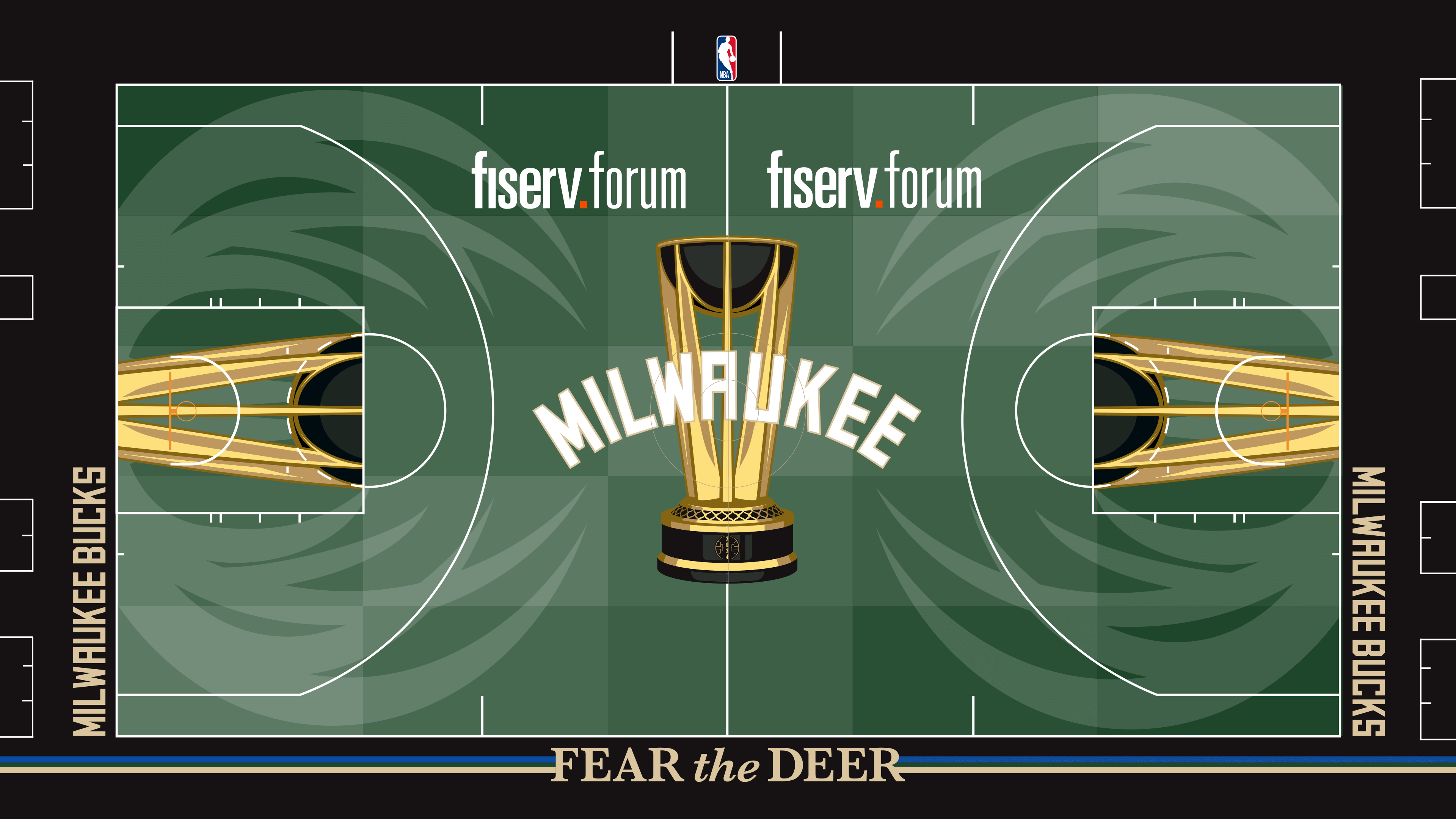
King (25): My family vacations in a place called Fripp Island, S.C. Deer roam around the island. They are the sweetest creatures — certainly nothing to fear. I suspect the Bucks are also nothing to fear this season. However, they did a great job with this court, a strange, longstanding motto aside.
Robbins (19): There are lots of reasons to fear deer — like when they run onto a busy road or carry ticks. These antlers reek of menace, and that makes up for the green court.
Jones (19): I know they’re antlers, but the logos on the court look like the claws from some creature that are about to pick up the trophy.
Koreen (17): The Bucks’ forest green is one of my favorite base colors in the league. However, putting the antlers where they’ve put them, with the key in the middle, makes the logo look like a pair of owl eyes. Owls are cool, but they are notably not bucks or deer or anything.
9. Utah Jazz (81)
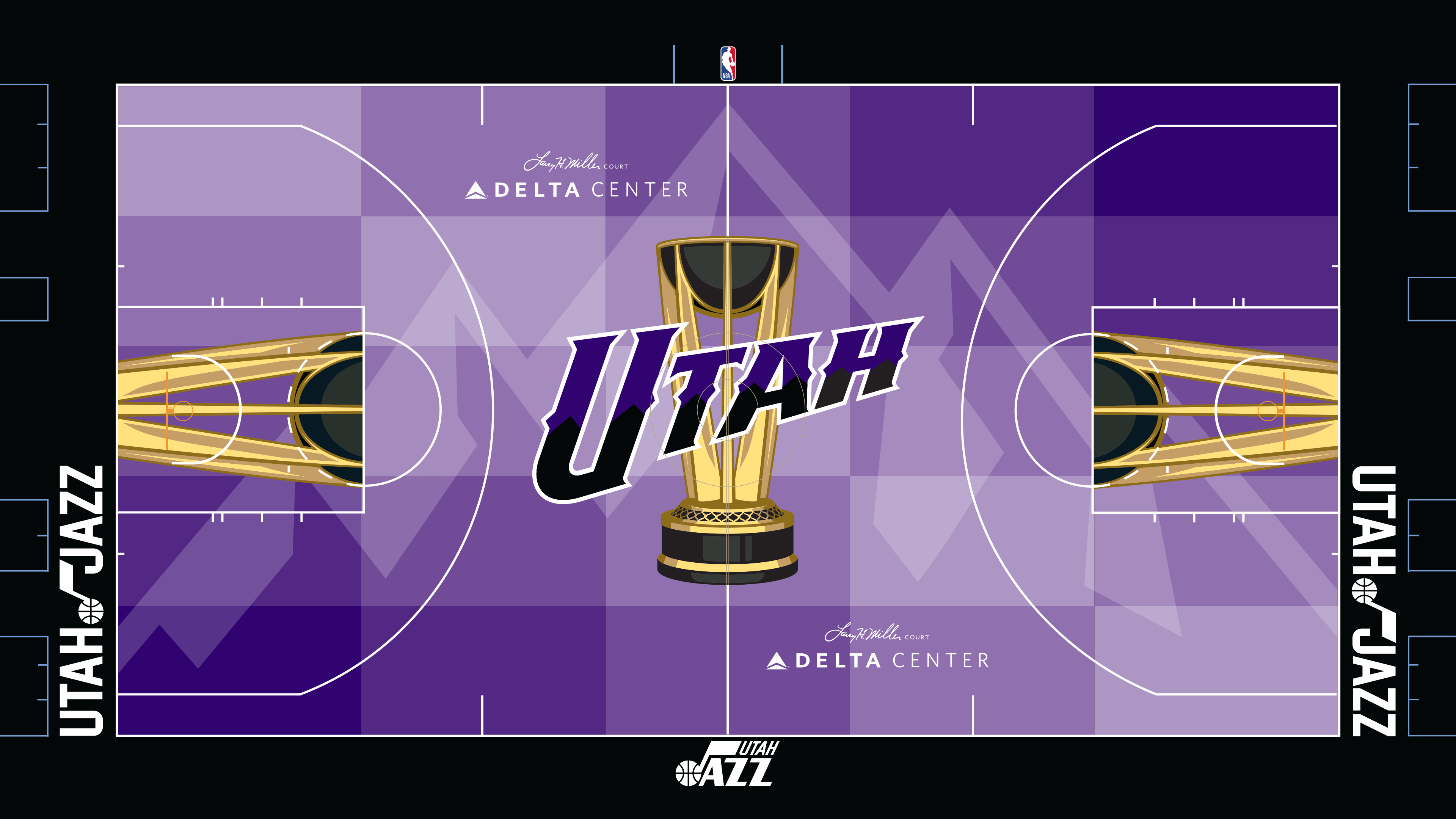
Jones (24): Great color scheme, and the mountains are perfect. The purple Utah jerseys are one of the best I’ve seen in the league from the 1990s, and this court brings back great memories — unless those memories include Game 6 of the 1998 NBA Finals and you’re a Jazz fan.
King (21): Any time I see those mountains, visions of John Stockton assists to Karl Malone dance through my brain. I can forgive the 50 shades of purple, then.
Robbins (18): The Wasatch Mountains ring part of Salt Lake City, so kudos to the Jazz for embracing the mountains in their logo. No court should be purple, but I like that the court designer here is taking a chance with a color that isn’t used anywhere else during the NBA Cup.
Koreen (18): It always makes me sad when the Jazz go away from their music note logo. It is one of my favorites across the league, and to only see it on the baseline is disappointing. With that said, the purple, black and gold work in concert, evoking a frosty winter in the mountains.
7. (tie) Washington Wizards (82)
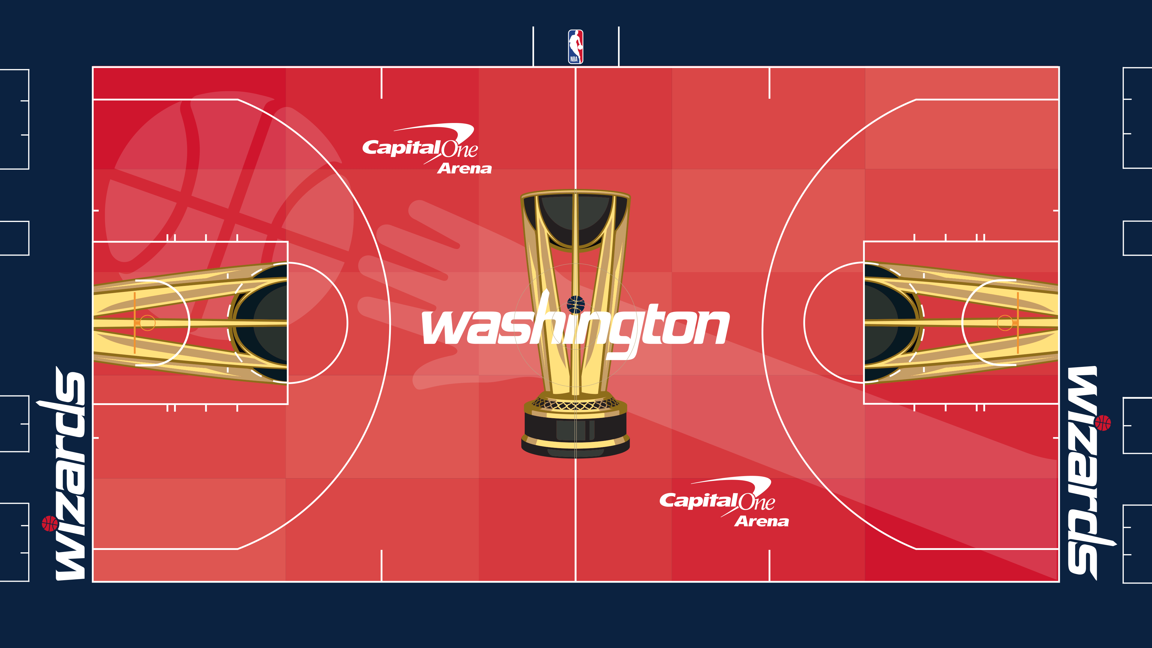
Koreen (28): This is, by far, my favorite of the gigantic logos. There is something very pure about it. It makes me think of the playground. Going red is dangerous, but this one looks tolerable. Maybe it will look worse on a TV than on a computer screen. This is nice, with a lot of crisp elements.
Jones (29): I love nostalgia. The reference to the old Washington Bullets logo is a winner. That’s really all I care about here. The logo isn’t subtle, either. It’s a great look for the Wizards.
King (20): Don’t go red. Don’t ever go red. But this could be worse.
Robbins (5): A basketball court should not be red, and this is the worst of the red NBA Cup basketball courts. I mean, it’s not even a pleasant shade of red. Nor is it cherry blossom pink. I very much enjoy the callback to the old Bullets logo in which outstretched arms served as the Ls in “Bullets.” Unfortunately, that’s the only aspect of this that I like.
7. (tie) Indiana Pacers (82)
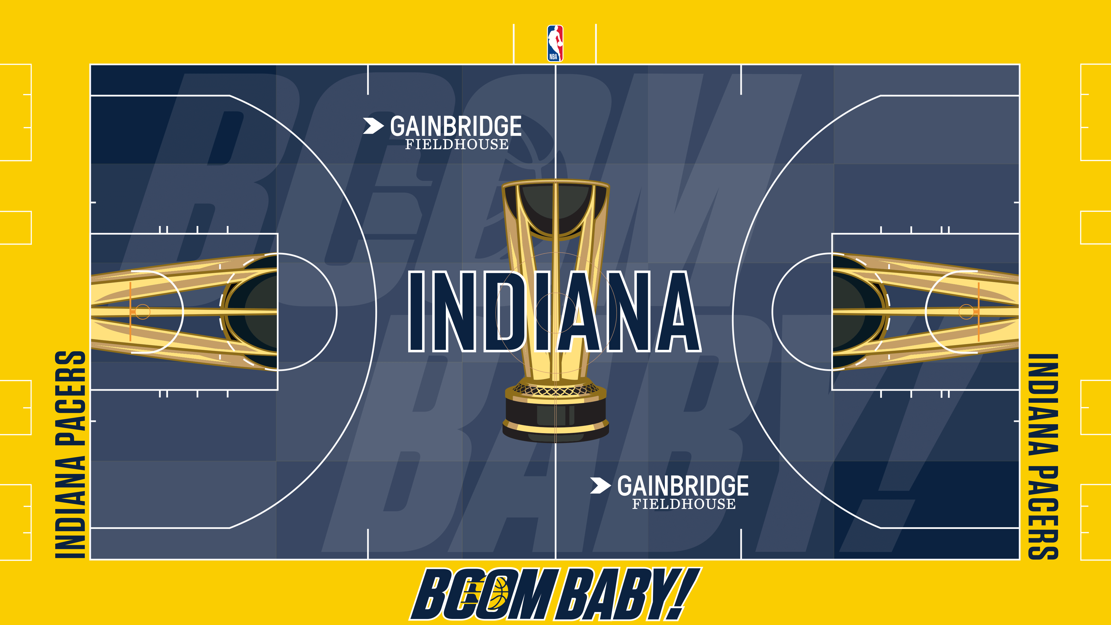
Jones (26): If skylines are my favorite backdrops for these courts, big words are a close second. “Boom Baby!”
King (24): Indiana’s commitment to honoring Slick Leonard with this court touches the heart. Boom baby, indeed. Maybe a little too much yellow, but that’s not what’s important here.
Koreen (20): I admittedly did not know how “Boom Baby!” related to the Pacers (not enough League Pass for me, I guess). It is really cool that the Pacers have devoted so much of this to their former coach and analyst. The court is a little busy for me, but it truly is the thought that counts, along with a reliable color scheme.
Robbins (12): The court design is ugly, but I like how the franchise embraces Leonard’s trademark call on broadcasts.
6. Phoenix Suns (83)
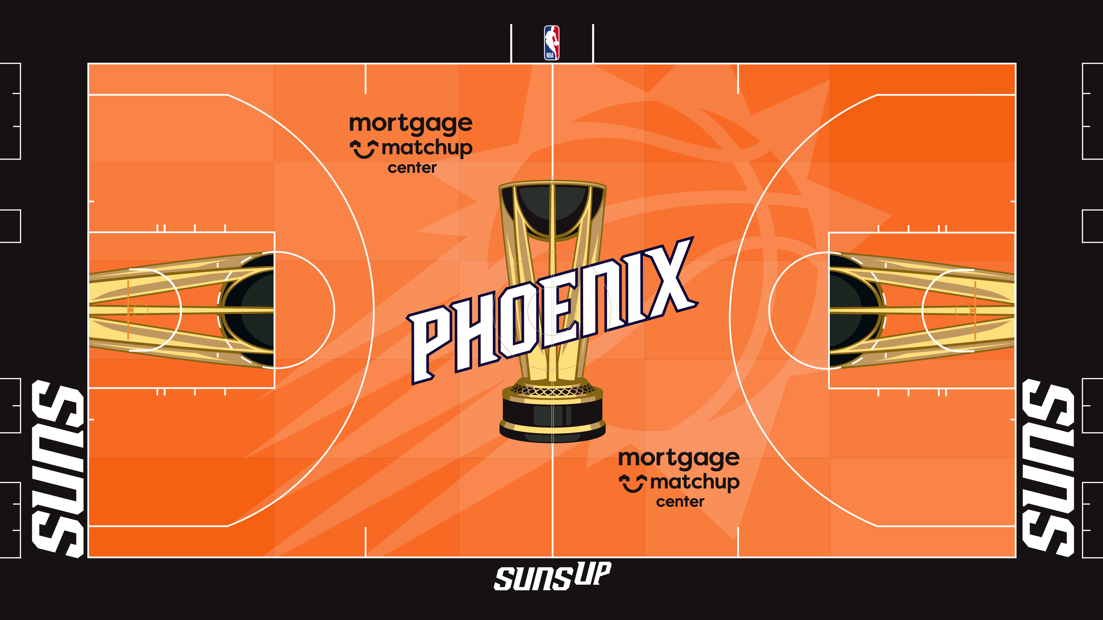
Koreen (25): Just in time for Halloween. I have nothing else to say about this court, so I’ll add that I had no idea the Suns’ arena was now called the Mortgage Matchup Center. It will always be America West Arena to me.
King (23): Suns up? Probably not. But other than that directionally misleading slogan, I am a fan of this court. The white “Phoenix” lettering pops on the orange court.
Jones (18): This isn’t great, but it’s not horrible. It’s a throwback to the old black jerseys that Charles Barkley and company wore with the black around the orange court.
Robbins (17): Red courts are weird, and there are a lot of those. Blue courts are weird, and there are a lot of those. An orange court is weird, but at least this one is the only orange court in the NBA Cup. So, points for originality!
5. San Antonio Spurs (90)

King (26): The Spurs have gone with some funky colors in the past. Back to their primary colors here, and it’s one of my favorites. It helps that Victor Wembanyama will surely do some unforgettable things on this court.
Koreen (22): The logo is dumbfoundingly large, but I am a sucker for the Spurs’ black-and-silver combo. Do you know what complements silver well? Gold.
Robbins (22): The outline of Texas, including the spur, is a bit busy to me. But I do like that fans watching on TV or inside the arena could look at this court and pretend that the players are playing on a blacktop. There are only two court surfaces that evoke basketball: a wood-colored surface or a blacktop.
Jones (20): At least light gray is not the dominant color of the court. This logo is so big that it’s cartoonish — but it doesn’t bother me. Maybe because it’s Texas and not a large animal staring at me.
4. Los Angeles Lakers (98)
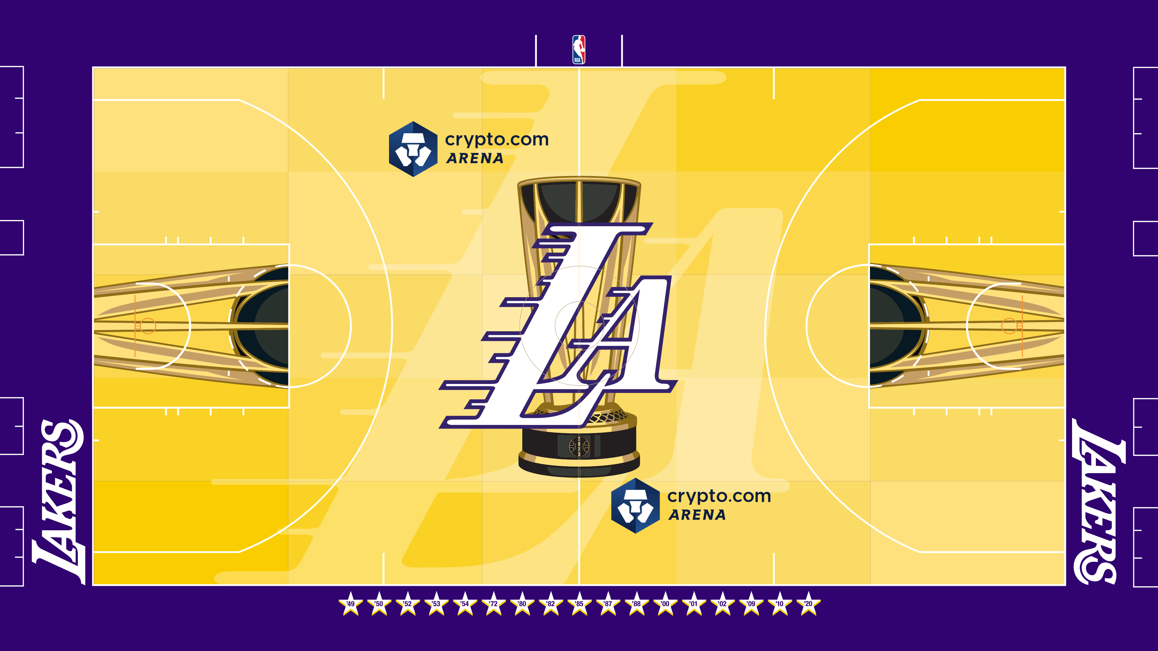
Robbins (30): This is the gold standard (pun intended) of all these courts. If fans inside the arena squint hard enough, they can pretend that the court color is similar to a regular hardwood basketball court and, therefore, concentrate on the game rather than be distracted by the court itself.
Jones (27): Another legacy franchise that’s hard to mess up, as long as you keep it simple. Purple and gold with championships in the mix.
King (22): The color scheme is a classic. Honoring the championships is wise. The Lakers could have leaned even further into their rich history here, but they did enough.
Koreen (19): As long as they don’t go crazy, there is a floor for the Lakers in terms of design. None of this is bold by NBA Cup standards, but it’s purple and gold. The stars on the sideline representing each title for the franchise are kind of annoying … but the Lakers are kind of annoying, so it works.
3. New York Knicks (103)
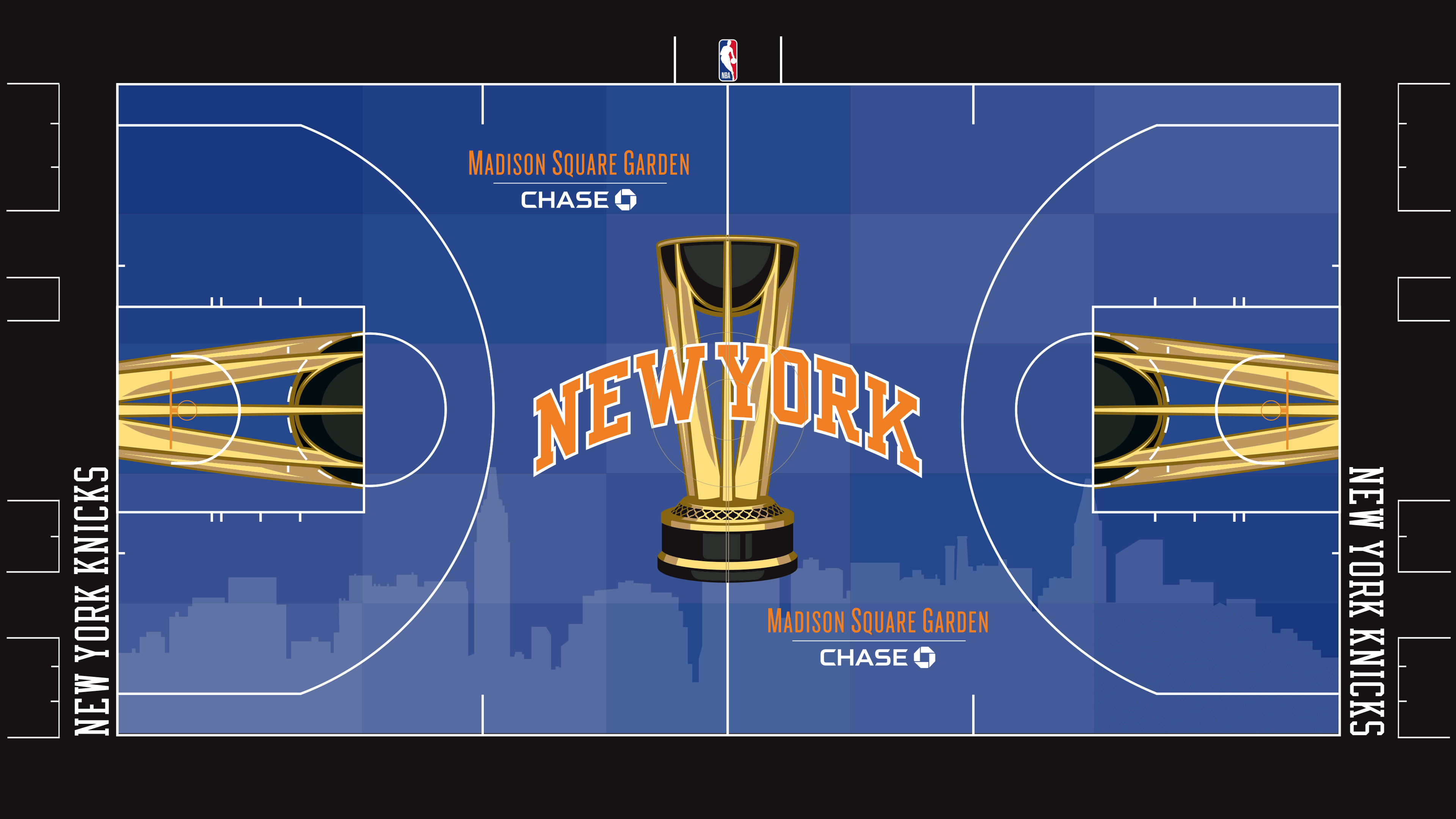
Jones (30): The New York skyline is perfect. I have no complaints. This works for the city.
King (30): This is the best court. The colors. The skyline. The reliance on a classic theme. Patrick Ewing and John Starks came to mind the second I looked at it, and that’s for the best.
Koreen (29): Like many of the teams up top, the Knicks have a classic color scheme that they know works. They have the benefit of not having to reinvent the wheel. They get another break here, as the gold really pops next to the orange and the blue. The Manhattan skyline has yet to miss.
Robbins (14): The court is too dark, and no basketball court should be almost all blue. The skyline is the only saving grace here.
1. (tie) Orlando Magic (104)
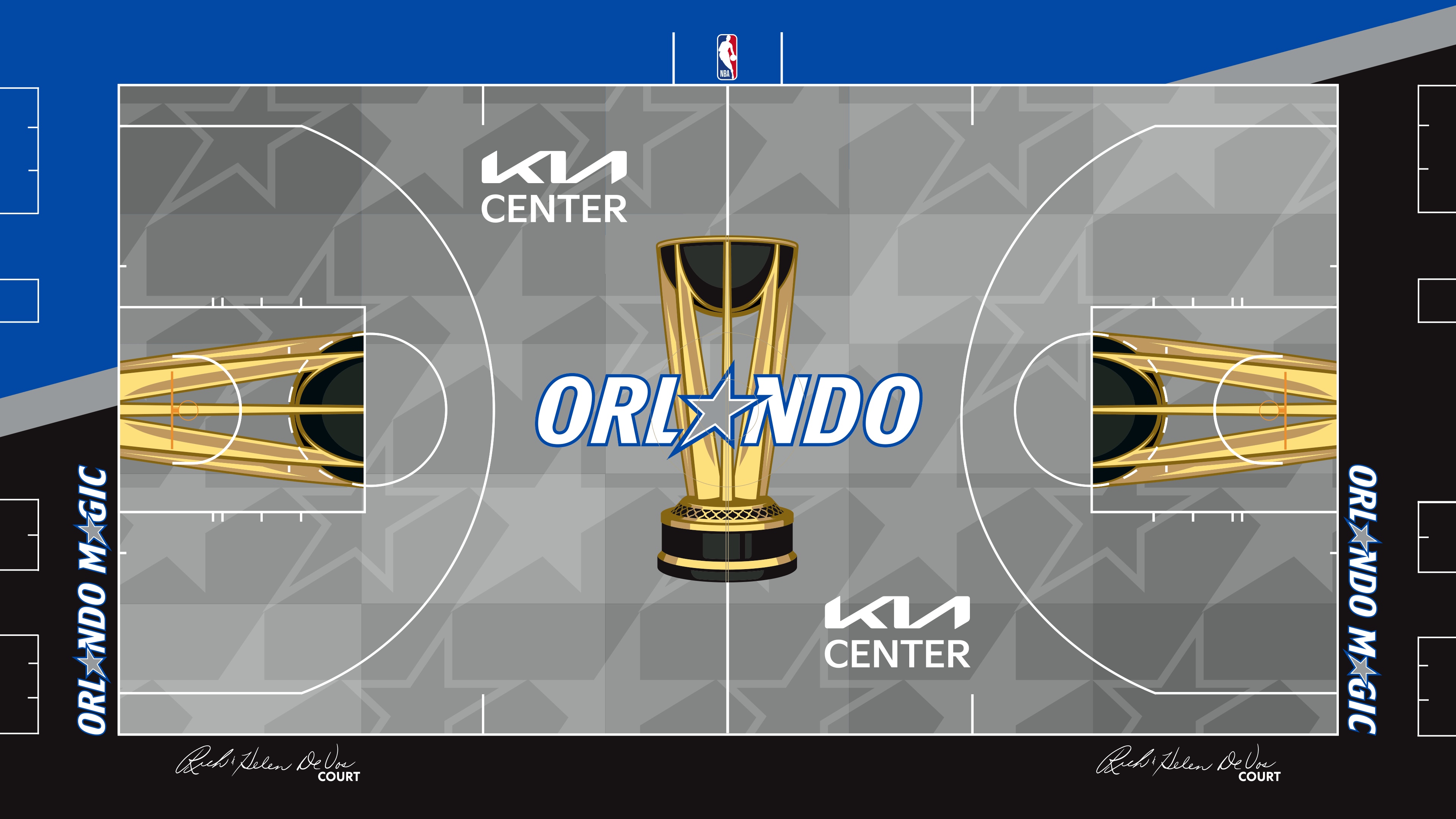
King (29): Shaq. Penny. Nick Anderson. Dennis Scott. Oh, how young Jay King wished that core could have stayed together in the mid-1990s. At least I get reminded of them every time I look at the beautiful star logo.
Jones (28): Simplicity wins again. Orlando didn’t have to do much, and this is a great combination of incorporating the team’s colors and the star logo.
Koreen (24): The Magic’s colors and logo have always worked with this exercise, and the streak continues this year. With so many giant logos on these courts, it is nice to see the smaller stars.
Robbins (23): The Magic love their logo’s stars, and the midcourt logo effectively calls to the franchise’s recent successful rebrand.
1. (tie) Portland Trail Blazers (104)
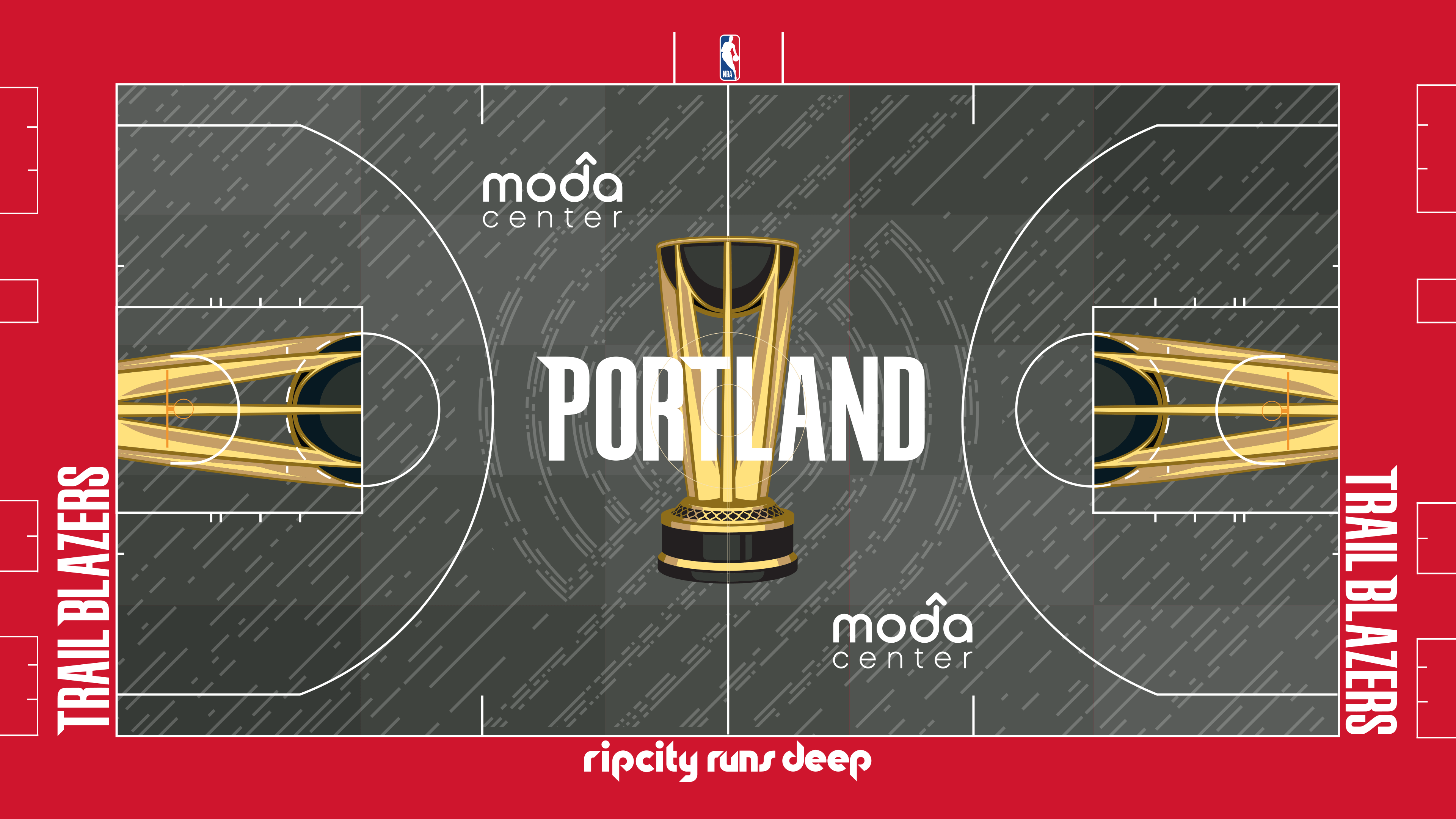
Koreen (30): The Trail Blazers have one of the coolest logo/color scheme combinations in the NBA, so it only makes sense that a court that takes that into account should be my favorite. Using the black court with the red trim is the right call (versus doing the opposite), and the subtlety of the logo in the middle is captivating. Is that supposed to be rain surrounding the logo? Giving this the top rank was easy for me. It’s the only court that I’d give an A.
King (28): This is smoother than a Clyde Drexler takeoff. Everything about it works.
Robbins (29): There is a difference between how these designs look on a computer screen or a phone screen and how they actually look in real life. I’m expecting that in real life, people inside Moda Center or watching on TV won’t be able to see the pattern on the court clearly, and I think that would be a good thing. Without seeing the pattern, this might look like a conventional basketball blacktop.
Jones (17): “Rip City Runs Deep” is a cool slogan. As for the court, I’m not sure what to say. I’m not a fan of gray floors, but the red sidelines and baselines make this gray tolerable.