From the outside, the drab brick building in a Carlstadt industrial park hardly looks like a fitting home for the self-described “leading source of color expertise” in the world. A three-panel display in the lobby for the 2022 Color of the Year — Very Peri (Pantone 17-3938) — lets us know we are in the right place.
We have come here because we need help solving a color conundrum at the heart of New Jersey college sports. Laurie Pressman, vice president of the Pantone Color Institute, greets us near those purple panels and takes the bag with the athletic apparel we have asked her experts to inspect.
She opens it, peeks inside and renders the first judgment.
“These are very different!” she said.
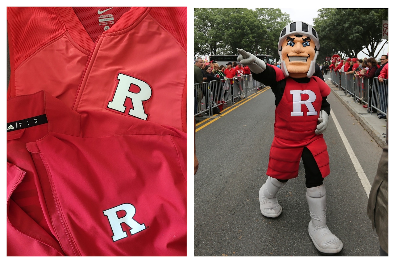
Even our untrained eyes could see that. One garment in the bag is an official Rutgers windbreaker made by Adidas and purchased from the university’s website for $85. The other is an official Rutgers windbreaker made by Nike and purchased minutes later from the same website for $84.99.
The merch is visible proof that, when Rutgers switched from Adidas to Nike this year, it also switched hues — a subtle change that did not go unnoticed among diehard fans. Every college has an official color, of course, but Rutgers is one of a handful that deems that choice important enough to attach to its nickname.
To determine which is the proper scarlet for the Scarlet Knights, we interviewed university historians and officials, talked to nearly a dozen fans and pored through campus archives. Finally, our investigation took us to Pantone, where Pressman said it would take about a week for her lab technicians to render a verdict.
The Adidas windbreaker is a darker, richer, more serious color.
The Nike windbreaker is brighter, bolder, more orange in hue.
They are both red. But which is scarlet?
# # #
George Baier saw the difference right away when the Scarlet Knights took the field for their first football game this season. Five generations of his family have attended Rutgers, and Baier still has a felt scarlet banner that was tacked to the wall in his father’s dorm room.
He looked at the old banner.
He looked at the new uniforms.
“That’s just not the right color,” Baier said. “It just looks … wrong.”
Baier was furious. Would LSU run onto the field in a new purple hue? Would Texas pick a lighter shade of burnt orange? Baier began crafting an angry email to new university president William Tate — call it his (ugh) scarlet letter — and instructed his family not to buy him any Nike gear.
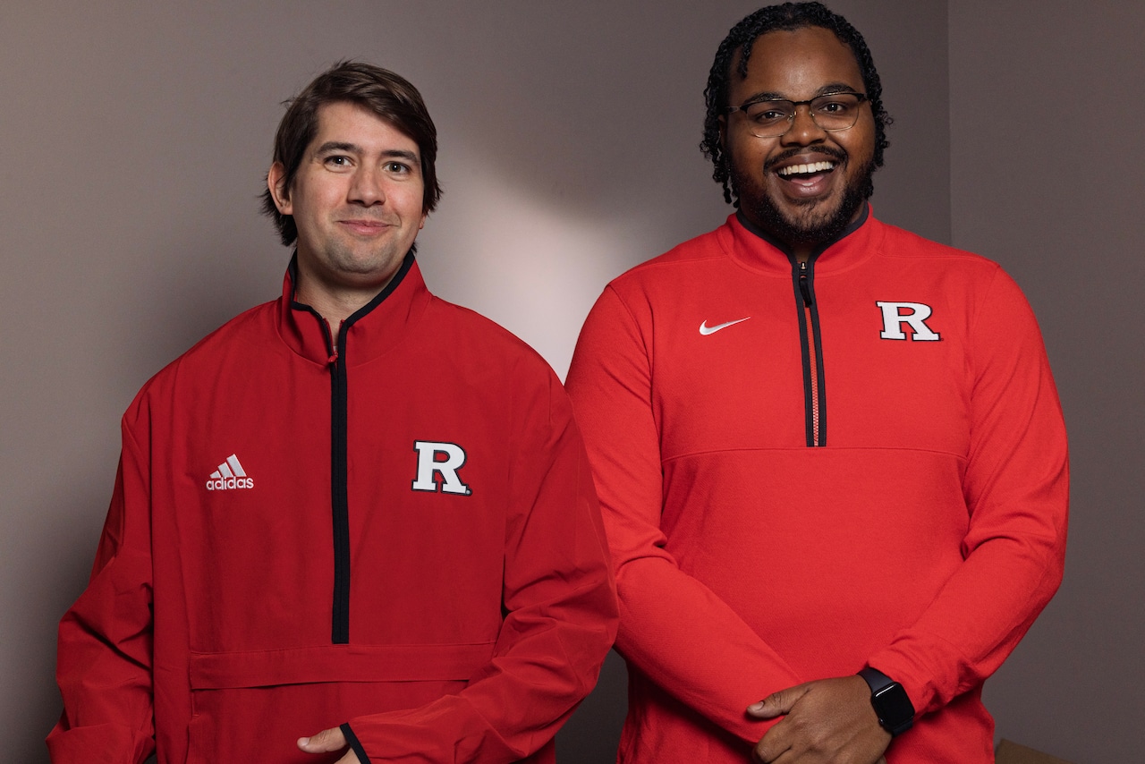 NJ Advance Media staffers Pat Lanni (left) and Christopher Burch model the different shades of scarlet between Adidas and Nike Rutgers sports official gear, Tuesday, Oct, 28, 2025 in the NJAM studio in Woodbridge, N.J. Both reporters are graduates of Rutgers.Andrew Mills | NJ Advance Media for NJ.com
This is hardly the biggest source of outrage among fans these days, of course. Based on how the football season has unfolded, a more appropriate color for the general mood in Piscataway might be Strong Blue (Pantone 18-4051).
But Rutgers tied itself to scarlet before college football even existed. In May 1869, students voted for it as the university’s color after a recommendation in The Daily Targum. Six months later, when Rutgers faced Princeton in the first intercollegiate football game, its players wore scarlet handkerchiefs to distinguish them from their opponents.
“The fun part is, you could really have your own color back then,” said Steve Greene, a 1979 Rutgers graduate and unofficial university historian. “They wanted a fire-engine red and (decided), ‘Why don’t we put some cadmium orange in with bright red?’”
It is impossible to pinpoint what exact color Rutgers trustees when had in mind when they ratified the students’ choice in 1900, but they were serious about their scarlet. “Now we need have no fear that any attempt will be made to deprive us of it,” the trustees declared.
Well, about that …
A century later, team colors would become a fluid concept in modern college athletics. The idea that a team would have two uniforms, for home and away games, is as dated as those head handkerchiefs from the first game.
“People are looking at the uniform as a canvas to tell their story — or as a piece of art,” said Todd Van Horne, a designer who ushered in a new era at Oregon in the late ’90s.
Oregon traded in their quaint Duck cartoon logo for a sleek “O” and decided their green color could mean anything from emerald to forest to Gatorade. Players have helped design the uniforms over the years, with Quinn Van Horne, Todd’s son and partner, asking them questions that seem stolen from a psychological test.
Who do you want to be when you suit up on the field? Are you looking to be Black Panther? Are you wanting to feel like a fast Ferrari?
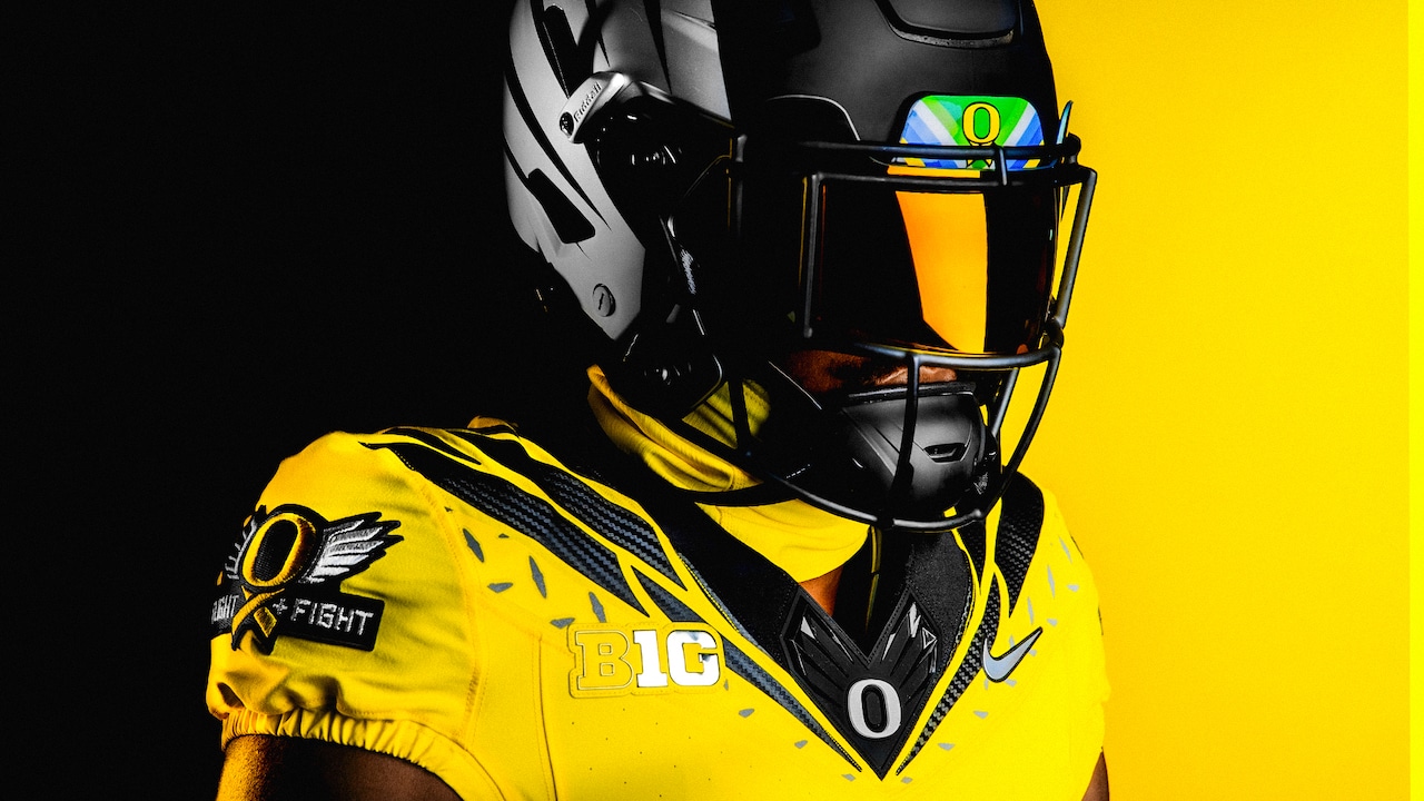 No football program has taken more liberties with its official colors than Oregon, whose designers consider their uniforms to be a canvas. (Courtesy of Oregon athletics) Oregon Athletics
This trend was not for everyone. Michigan is so particular about its maize and blue that the Pantone numbers are listed on its website. Rutgers tried a few unique designs over the years — fans still gripe about the “Salmon Knights” from a decade ago — but ultimately has leaned toward the traditional.
The university declared that its official scarlet was Pantone 186C, a decision that should have ended the debate. But the Adidas uniforms its athletic teams wore for years, according to contracts obtained through an open records request, were actually Pantone 187C.
Rutgers (gasp) was wearing the wrong red.
But was it wearing the right scarlet?
# # #
The laboratory at Pantone headquarters is painted a dull gray and uses D65 lighting — bulbs that were determined to best represent average daylight — to ensure the optimal conditions for evaluating color. This is where the company’s color experts analyzed our two Rutgers windbreakers in a special light booth.
Pantone, founded in New Jersey as a commercial printing business in 1950, developed a matching system six years later that standardized the ink formulas used in colors globally. It has carved out a niche helping companies develop a color strategy consistent with their brand vision.
When Universal Pictures grew frustrated that adorable characters from its “Despicable Me” franchise were turning up everywhere in the wrong colors, it turned to Pantone. Soon, it developed Minion Yellow (Pantone 13-0851), which “projects playfulness and warmth and is suggestive of intellectual curiosity.”
Pressman told us that color consistency is key to a brand identity, and that is especially true with a college team. “All the uniforms need to look the same, all the marketing needs to look the same — it is extremely important,” she said.
Pantone gave us a report with its findings — and the conclusion might surprise Rutgers.
“Pantone 187C, the old uniform color made by Adidas, is closest to what we would traditionally call a scarlet shade,” the report read. “However, Pantone 186C, the new red shade from Nike, displays an added vibrancy that feels more contemporary.
“Whereas they are both emblematic of sport and fitness and would be considered pillars of collegiate color, the Adidas Red had a retro feeling while the Nike Red could be considered a more modern classic red shade.”
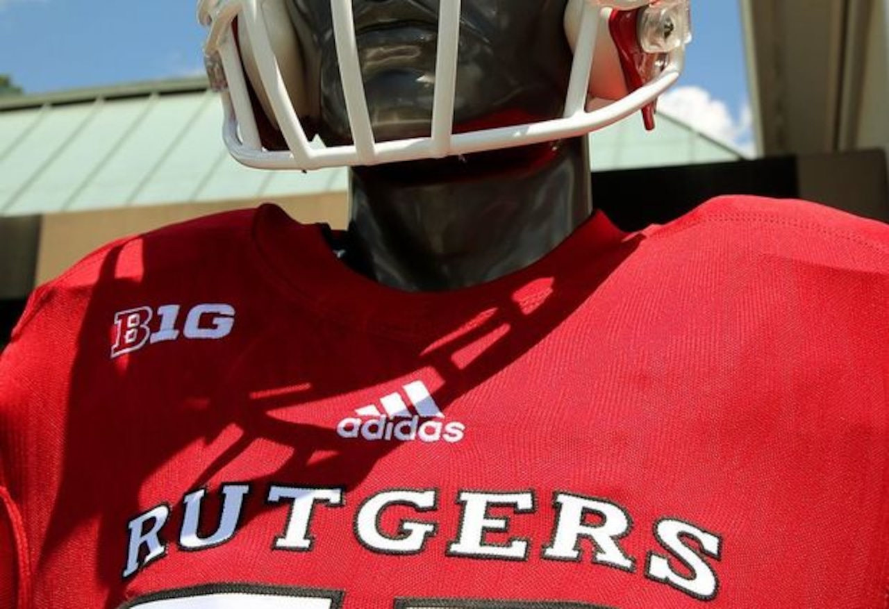 The color of the Adidas-produced Rutgers uniforms were Pantone 187C. The problem? The university’s official color is listed as Pantone 186C. (NJ Advance Media file) Rutgers
In short: The old uniforms are the purer scarlet color, but the new uniforms give off a more contemporary vibe. Pantone’s experts opted for a Safety Yellow (Pantone 13-0630) in their response.
That still didn’t solve another mystery. Why did Rutgers end up changing its colors this season? The answer, it turns out, is so very … Rutgers.
When the university switched from Nike to Adidas in 2017, the latter did not have Pantone 186C available. Pantone 187C, listed as “Team Power Red” in the Adidas online catalog, was the next best option. That’s it. That’s the reason.
“What you’re seeing now in the Nike uniform is the true scarlet color,” a university official said.
Fans seem happy with the change. An unscientific survey of 30 tailgaters on Homecoming found that 19 preferred the Nike scarlet, 10 liked the old Adidas red better while one had no opinion.
When we pulled up a photo of the two windbreakers, side by side, to show that one undecided fan the clear difference between the two, Connor Warren just shrugged.
“I’m color blind.”
If you purchase a product or register for an account through a link on our site, we may receive compensation. By using this site, you consent to our User Agreement and agree that your clicks, interactions, and personal information may be collected, recorded, and/or stored by us and social media and other third-party partners in accordance with our Privacy Policy.