Film photography is popular for many reasons, but chief among them are color and grain: in short, the “vibe.” Photographer Pablo Maraver spent the last year and a half focusing on the former, extensively using and testing 14 different 35mm film stocks to build a comprehensive guide to their color science.
Maraver’s video is a detailed look at not only the color of 14 film stocks, but it also provides a brief history of color photography technology as well as an explanation of how modern color film works — specifically, how the three-layer structure of color negative film can be adjusted to give different stocks varying responses to different colors.
The discussion of color science as it pertains to film invariably brings up a lot of questions regarding not only the film itself, but the developing and scanning methods, too.
“When we talk about the color of each commercial film stock, it’s tempting to think that the film recipe is the ultimate determining factor. [But] the color we see in a photo is not the direct or automatic result of the film that we use,” Maraver explains. “From development to printing or scanning, there’s a whole chain of technical and aesthetic decisions that drastically transform the final result. And all of those decisions are guided by the photographer’s eye, which in the end is the most decisive factor. That said, even though the film doesn’t dictate the final result, it does provide a very clear starting point. Every emulsion has its own character, its approach to skin tones, how it renders greens or blue skies, how it reacts to highlights. There is an identifiable aesthetic, almost a personality that remains present even when the images pass through different hands.”
Maraver says that the goal of the video is to break down, study, and compare that “essence” he describes.

“We’re going to analyze each film characteristic with care so we can understand what each one actually brings to the final image, because only by understanding these nuances can we make informed decisions like choosing the right film for a subject or deciding how to grade our photos,” he adds.
Understanding the color science of a particular film emulsion is complicated since they each react to different lighting environments differently, and the same stock can look different across different environments, too. Maraver specifically shows this with side-by-side Portra photos that exhibit dramatically different color balance.
“To accurately compare different film stocks, it’s essential to standardize the workflow. That way, the only variable left is the film itself,” he says.
Maraver used a Spyder Checker 24 color chart for reference since it has consistent colors and can assess how accurately a given film reproduces them. He placed that checker next to a set of prints and lit the scene with the same color temperature with a “high CRI” LED light. He then photographed this same scene with the same camera and lens, with the only variable being the film stock and the aperture, which was changed depending on the sensitivity of the film stock. All developing was handled by one lab, and Maraver scanned the film at home with the same camera, lens, and LED panel with a consistent white balance.
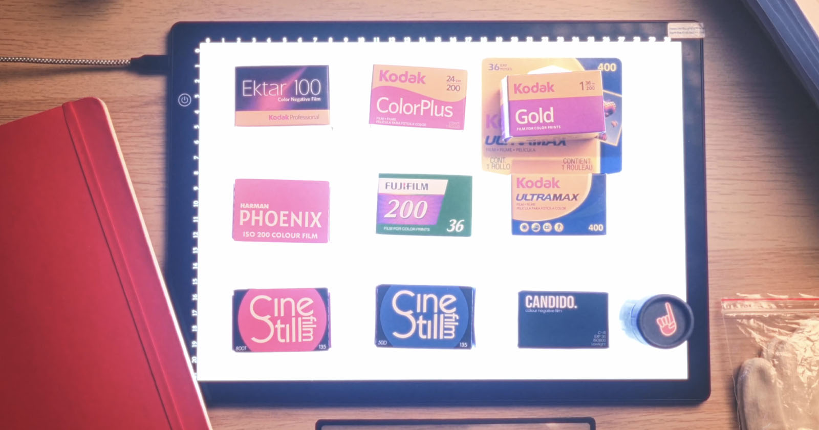
This test includes results from 14 films: CineStill 50D, Kodak Ektar 100, Film Onehundred 100, Kodak ProImage 100, Kodak Portra 160, Kodak ColorPlus 200, Kodak Gold 200, Fujifilm 200, Phoenix 200, Kodak Portra 400, Kodak UltraMax 400, Lomography Color 400, LomoChrome ’92 400, and CineStill 800T.
One film stock that Maraver specifically called out was Fujifilm 200, which had a vector scope result that was the same as Kodak Color Plus 200. Since Fujifilm 200 is also “Made in the USA,” Maraver strongly believes that the two films are the same. Even if they are not, the results appear to be identical, making the argument moot.
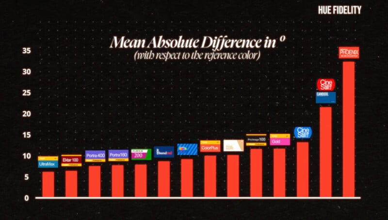
Maraver charted his results based on “true” color accuracy so that photographers know what to expect from each. Kodak UltraMax, Marver says, is the closest to color accurate, along with Ektar 100 and Portra 400. On the opposite end of the spectrum, Harman Phoenix (the original, which is being discontinued in lieu of Phoenix II) and both CineStill 800T and 50D were furthest away, giving a more stylized rendition of color.
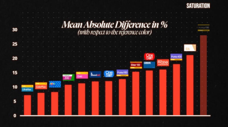
Next, he charted them based on saturation. UltraMax was again at the top, but this time joined by ColorPlus and Lomography Color 400, while the least saturated films were Kodak ProImage, LomoChrome Color ’92, and Portra 400.
Maraver, of course, offers his recommendations based on his findings, but photographers are also free to take his data and make their own decisions on what film fits best for the photos they want to capture. One other benefit to this work is that Maraver was able to take the data and create Lightroom presets that emulate all of these film stocks, which he has made available to download for free.
Image credits: Pablo Maraver