The team unveiled its refreshed logos, wordmarks and brand elements at a private event in downtown Phoenix Saturday night, then revealed it to the public Monday morning. The rollout arrives ahead of the Mercury’s 30th season in 2026 and just months removed from a magical run to the WNBA Finals.
“This new branding represents the Mercury’s championship legacy, devoted fanbase and the new era that began with a record-breaking season and memorable Finals run,” Phoenix Mercury and Suns CEO Josh Bartelstein said. “While our logos have been reimagined, our identity remains the same – our commitment to the community and the grit and joy of our team will continue to define Mercury basketball.”
The IX Basketball, a 24/7/365 women’s basketball newsroom powered by The Next
The IX Basketball: A basketball newsroom brought to you by The IX Sports. 24/7/365 women’s basketball coverage, written, edited and photographed by our young, diverse staff and dedicated to breaking news, analysis, historical deep dives and projections about the game we love.
A redesign years in the making
The rebrand had been on Mercury president Vince Kozar’s mind as far back as the team’s 25th anniversary season in 2021. However, due to the pandemic and a change of guard at the ownership level, the project was delayed. Now, coming off a Finals appearance and at a pivotal turning point in the WNBA’s history, one of the league’s original franchises is beginning a new chapter.
“Something of this magnitude makes the most sense at a seminal moment in the history of the franchise,” said Kozar.
Over the last few years, Kozar and a design team led by associate director of graphic design Kelly Streeter and graphic designer Jaden Guilford worked to modernize the Mercury’s identity without abandoning its most recognizable elements. What emerged is a sleeker, more geometric set of marks that lean more heavily into the franchise’s trademark purple and orange.
It’s not common to see a historic franchise make a drastic change to its identity, just look at a team like the New York Yankees or Boston Celtics, but in a much younger league like the WNBA, the Mercury have more freedom to evolve – shedding the three-dimensional, sometimes busy aesthetics of the 2000s for a simplified look.
Your business can reach over 3 million women’s sports fans every single month!
Here at The IX Basketball and The IX Sports, our audience is a collection of the smartest, most passionate women’s sports fans in the world. If your business has a mission to serve these fans, reach out to our team at BAlarie@theixsports.com to discuss ways to work together.
A closer look at the new logos
The new primary logo builds off the iconic angled “M,” now with sharp edges instead of rounded ones, and set at a specific 19.97 degrees – a nod to the franchise’s inaugural season. It also features a purple crescent to emphasize “Planet Mercury,” and convey a feeling of movement while also adding a color contrast.
The global logo expands on that foundation, surrounding the “M” with planetary rings, a feature in the Mercury’s previous logo. The “M” splits those rings into eight distinct lines, representing that the Mercury are one of the WNBA’s eight founding teams. It will serve as the most universal identifier for the franchise worldwide.
“The global lives everywhere,” Kozar said. “You should have one mark, no matter where you are in the world, people should know your name, your brand and your city. It’ll be on courts, on merchandise, on billboards. It’s going to be super important in the transition for people to know exactly what team that’s for.”
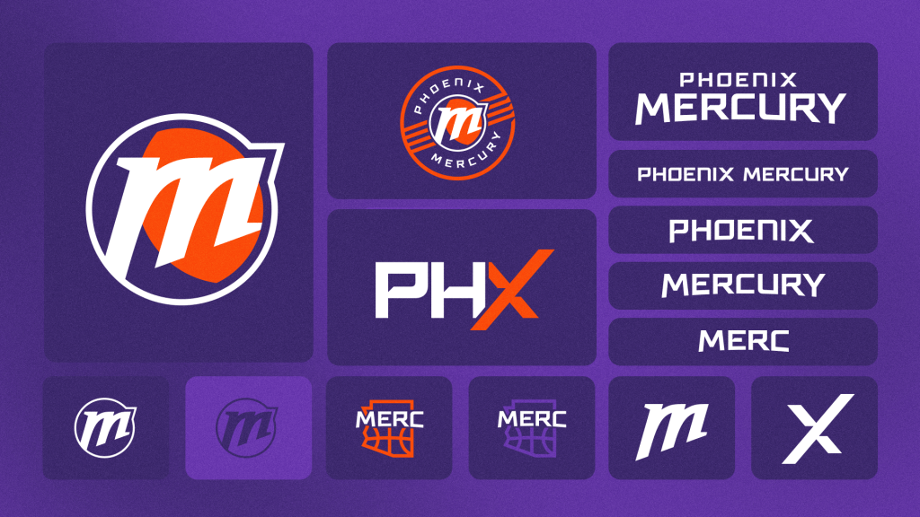 A look at the Phoenix Mercury’s full rebrand toolkit, featuring the updated primary and global logos, revised wordmarks, the refreshed PHX alternate mark and the franchise’s first-ever secondary logo incorporating the “Merc” moniker and an outline of Arizona. (Photo courtesy of Phoenix Mercury)
The Mercury also introduced a secondary logo, shaped like the outline of Arizona with basketball seams and the word “Merc” embedded inside. The moniker, long used casually by fans and players, is now an official part of the team’s brand for the first time.
The franchise also refined its “PHX” alternate logo, first introduced in 2021. The bright orange “X” again honors the X-Factor, the nickname for the Mercury’s longtime fanbase – a choice the designers noted may make Phoenix the only team in professional sports to formally honor its fanbase within an official logo. At the reveal, it was shown how the Mercury plans to recolor the “X” for specific inclusive purposes, such as rainbow-colored for pride or pink for women’s health.
Finally, new wordmarks were created in an original typeface dubbed “Mighty Mercury,” built with an eight-degree arch, once again a nod to the league’s original eight franchises. The font invokes more of a “space” theme, which could be felt the most when two new uniforms were revealed on Tuesday.
Once again, Phoenix will wear the classic white and purple jerseys and shorts in its primary uniforms, but this time a new third color – a lighter purple referred to as “psychic purple” – is added in the mix as a highlight to make the numbers and wordmarks pop. The Mercury also announced that two more uniforms will be revealed in the future.
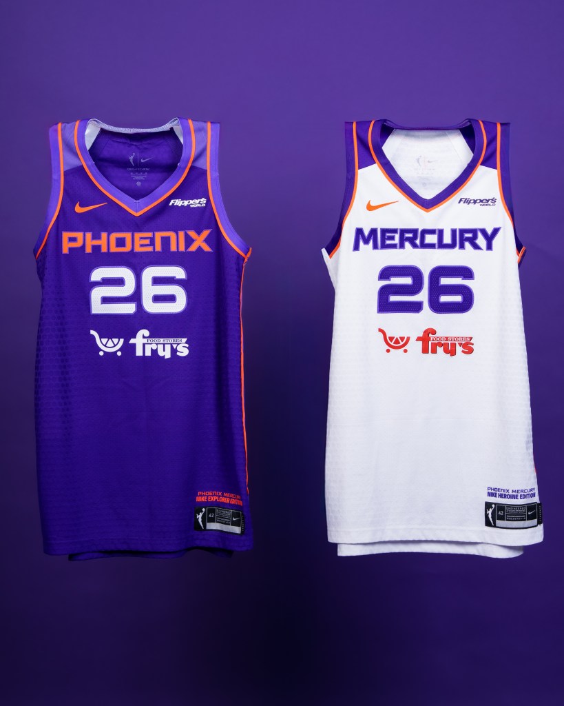 The Phoenix Mercury’s new Explorer (left) and Heroine (right) jerseys showcase the team’s refreshed branding, featuring bold lettering, updated color accents and the franchise’s modernized look for the upcoming season. (Photo courtesy of Phoenix Mercury)
A community-centered launch
To introduce the new look, the rollout began over the weekend at a private event attended by some of the biggest names in the franchise’s past and present: Diana Taurasi, Cheryl Miller, Bridget Pettis, Satou Sabally and Penny Taylor. After a short video was shown unveiling the logos, models showcased 18 items to be included in the first merchandise drop.
Part of that drop includes the “Merc Merch Swap,” which gives the fans the opportunity to trade in any piece of old Mercury, WNBA or even another WNBA team’s apparel in exchange for a t-shirt with Phoenix’s new logo on it.
On the extreme side of things, the Mercury also announced they are partnering with Lady Luck Tattoo, a local tattoo shop, for a promotion in which the first 100 people to ink the new logo on their skin will have their session covered for free.
And finally, the franchise will also showcase its new marks in a drone show over Camelback Mountain in Phoenix at 7:30 p.m. Friday, extending the celebration beyond the team shop and into the wider community.

“Becoming Caitlin Clark” is out now!
Howard Megdal’s newest book is here! “Becoming Caitlin Clark: The Unknown Origin Story of a Modern Basketball Superstar” captures both the historic nature of Clark’s rise and the critical context over the previous century that helped make it possible, including interviews with Clark, Lisa Bluder (who also wrote the foreword), C. Vivian Stringer, Jan Jensen, Molly Kazmer and many others.
Critical reactions
Public reaction to the new look was immediate, and for many longtime fans, hesitant at best. Most social media responses ranged from disappointment to outright criticism, with some saying the updated logos felt too generic or lacked the personality that defined the team’s earlier designs.
Honestly insane how @PhoenixMercury destroyed a classic logo and branding. Tired of the minimalist corpo look of logos/brands.
— Wagon (@9Bryaaan2) November 24, 2025
Others argued the shift away from the planet-based imagery made the brand harder to recognize at first glance, especially for a franchise with nearly 30 years of history.
not a single soul:
the phoenix mercury: we’re rebranding as a gas station
— dvd (@daviidkellam) November 24, 2025
While the early response skews critical, the true test of the rebrand may come once the full look hits the court. Uniforms, logos and wordmarks can read differently in motion under arena lights, and perhaps then more fans will begin to warm up to it.
But either way, the unveiling achieved one thing the Mercury hoped for: people are paying attention. And as the franchise prepares for its 30th season, the conversation around its new era has already begun.