Participant demographics and clinical variables
Among participants in the clinical trial with complete records, 10 individuals met the criteria for controls and 10 individuals met the criteria for TIC patients. Table 2 summarizes the patients’ demographic and clinical characteristics. Several clinical variables showed statistically significant findings, including APTT (p p p p p p p p p p
Table 2 Clinical variable analysis between controls and TIC patients.Identification of DEGs between the TIC and control groups
In this study, gene expression matrices for the training group were generated following a series of preprocessing steps, including data cleaning, normalization, batch effect removal, and merging. This process involved data from two distinct groups: 10 samples from controls (forming the control group) and 10 samples from patients with TIC, specifically those who had suffered severe trauma. The PCA score plot (Fig. 2A) demonstrated a distinct and consistent clustering of the two groups based on the two principal components. This clear separation between the TIC and control groups validated the effectiveness of the preprocessing steps and indicated that these groups were suitably differentiated for further analysis, emphasizing the presence of significant between-group differences. The “DESeq2” package was employed for analysis and set specific criteria for identifying significant DEGs: p 1 in absolute value. Under these criteria, 1014 DEGs were identified, with 711 upregulated and 303 downregulated genes (Fig. 2B). The image is a heatmap depicting the correlation between different genes. Gene names are listed on the left side and at the top of the heatmap. Correlation values are color-coded, ranging from 1 (blue for complete negative correlation) to + 1 (red for complete positive correlation). The intensity of the color indicates the strength of the correlation, with darker reds indicating strong positive and darker blues indicating strong negative correlations. The numbers at each intersection provide the exact correlation coefficient (Fig. 2C). A heatmap illustrates DEGs between the groups, visually representing the gene expression differences and highlighting the molecular alterations associated with TIC (Fig. 2D).
Fig. 2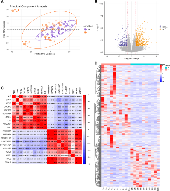
Data processing and identification of DEGs. (A) PCA score plot differentiating controls from severe injury patients with TIC. (B) Volcano plot showing DEGs. Orange dots, upregulated genes; dark-blue dots, downregulated genes. (C) Analysis of correlation coefficients, specifically focusing on the top 20 DEGs. (D) Heatmap of the top 50 upregulated and downregulated genes, illustrating differential expression.
GSEA of all count data
To verify the accuracy of the phenotypes of the samples collected, GSEA was conducted on raw count data. Results showed that the original counts of the samples were closely related to the complement and coagulation cascades, IL-17 signaling pathway, antigen processing and presentation, cell cycle, cytokine-cytokine receptor interaction, tumor necrosis factor (TNF) signaling pathway, phosphatidylinositol 3-kinase (PI3K)/Akt signaling pathway, and natural killer (NK) cell-mediated cytotoxicity, and these differences were statistically significant, suggesting that this sample collection was successful and can be used for subsequent analyses (Fig. 3).
Fig. 3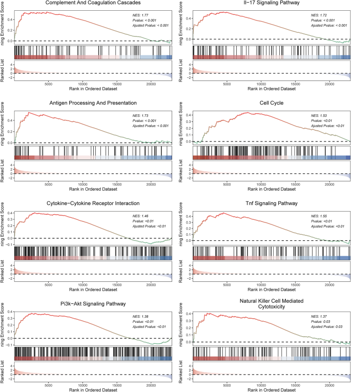
Representative pathways enriched by GSEA. (A) Complement and coagulation cascades. (B) IL-17 signaling pathway. (C) Antigen processing and presentation. (D) Cell cycle. (E) Cytokine-cytokine receptor interaction. (F) TNF signaling pathway. (G) PI3K/Akt signaling pathway. (H) NK-mediated cytotoxicity.
WGCNA
This study aimed to identify the key genes involved in TIC in severe injury patients. To achieve this, the WGCNA algorithm was employed to construct a gene coexpression network. The gene expression profile specific to the TIC subtype of patients with severe injury was initially assessed using cluster analysis (Fig.S1 A). Building a weighted gene network involves selecting the soft threshold power. Analysis of the pick soft threshold function revealed that with a soft threshold power of 4, the scale-free topology fit index curve flattens out at ~ 0.8, and the mean connectivity is relatively high, indicating sufficient information content (Fig.S1 B). Therefore, a power of 6 was determined as the appropriate soft-thresholding value. After this transformation, the genes were clustered using the average linkage hierarchical clustering method. After merging the strongly associated modules using a 1.1 clustering height limit (Fig.S1 C), 35 modules were identified for further study. In defining the gene network modules, this study adhered to a criterion requiring a minimum of 30 genes per module. This criterion was based on the standard set by the hybrid dynamic tree-cutting method. The dynamic tree-cutting method was utilized to identify distinct gene modules. Once these modules were established, the characteristic gene values (eigengenes) for each module were calculated to further understand their roles and interactions within the context of the TIC subtype of severe injury patients (Fig.S1 D).
To assess the correlation between each module and the disease, a heatmap depicting the module-trait relationships was generated using the Spearman correlation coefficient (Fig. 4A). Within the above modules, 3579 genes correlated with the phenotypes. The correlation between the modules was examined, and results showed no significant association between them (Fig. 4B). The reliability of the module delineation was further demonstrated by the transcription correlation analysis within the modules, revealing no substantial linkage between the modules (Fig. 4C). To visualize the correlation between each clinical phenotype and module, the linkET package was utilized to generate a correlation heatmap, which provided a clear display of the association between EPL, LY30, TT, R, C1_value, and each module (Fig. 4D). The “brown” “dark-gray”, “dark-red” and “light-yellow” modules, which are associated with the clinical variable phenotype of interest, revealed a strong association between the TIC and control groups (AD: r = 0.29, p = 1e–06; MetS: r = 0.1, p = 0.08) (Fig. 4E).
Fig. 4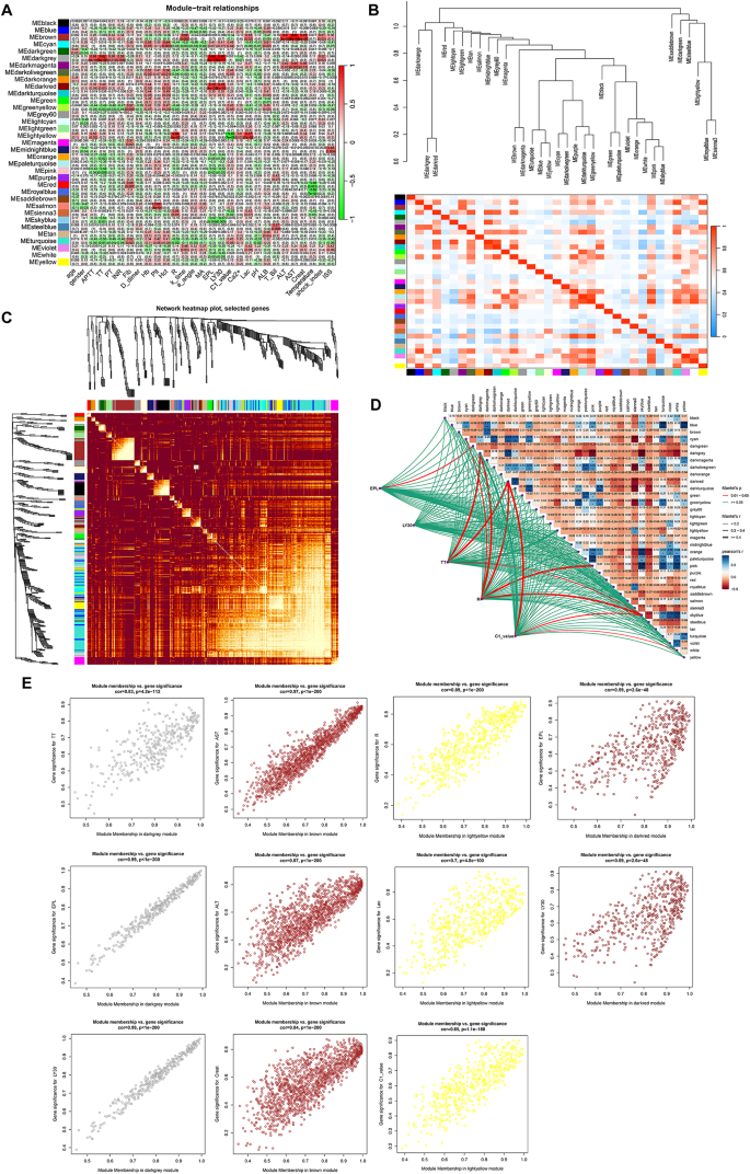
WGCNA revealing the potential genes of TIC. (A) Heatmap illustrating the relationships between modules and clinical phenotype features. Values in the small cells of the heatmap represent multiple calculated correlation coefficients between the eigenvalues of each trait and each module along with the corresponding statistically significant p-values. The color intensity corresponds to the strength of the correlation, with darker red indicating a more positive correlation and darker green indicating a more negative correlation. (B) Heatmap of collinear relationships among feature genes within modules, with red indicating strong positive correlations and blue indicating strong negative correlations. (C) Heatmap plot of the network demonstrating increasing coexpression interconnectedness through a gradient of increasingly saturated yellow and red colors. (D) Network and heatmap providing a detailed view of the relationships between traits, offering insights into the structure and coexpression patterns within the dataset. (E) Module membership (MM) vs. gene significance (GS) scatter plot of the TIC. Scatterplot illustrating the relationship between MM in coagulation-associated modules and GS for severe injury patients with TIC.
Functional analysis of degs, TIC-associated genes, and WGCNA critical module genes
The study focused on the intersection of critical module genes, DEGs, and TIC-associated genes using a Venn diagram, which identified 81 overlapping genes (Fig. 5A). To further understand the biological functions of these interesting genes, a functional analysis was conducted. GO enrichment analysis revealed that the genes are involved in processes such as regulation of DNA-binding TF activity, negative regulation of the immune system process, and negative regulation of response to external stimulus in BP; collagen-containing extracellular matrix (ECM), blood microparticle, and vesicle lumen in CC; and enzyme inhibitor activity, growth factor binding, and peptidase regulator activity in MF (Fig. 5B). KEGG analysis showed that these genes are involved in fluid shear stress and atherosclerosis, mitogen-activated protein kinase signaling pathway, IL-17 signaling pathway, and especially complement and coagulation cascades, which we are interested in (Fig. 5C). In addition to the above analyses, a petal diagram was employed to provide a detailed display of the pathways of interest. As illustrated in the diagram, within “complement and coagulation cascades,” enrichment of specific genes, such as TFPI, PLAT, C1QC, and A2M, was observed. This visual representation highlighted the presence of these genes in the pathway, offering deeper insights into their functional roles (Fig. 5D). To better demonstrate the interaction relationships among the intersecting genes, these genes were uploaded to the STRING database, and Cytoscape was utilized for visual analysis. This approach allowed mapping and visually interpreting the complex network of gene interactions, enhancing the understanding of how these genes interconnect and their roles in the biological pathways under study (Fig. 5E).
Fig. 5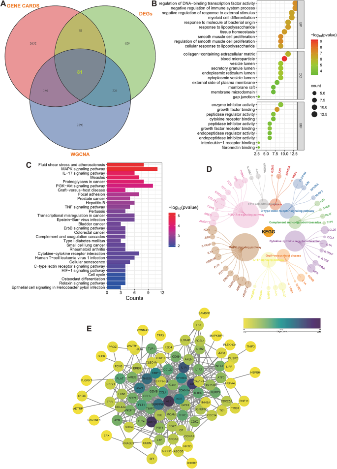
Enrichment analysis of KEGG pathways and visualization of networks involving the overlapping genes. (A) A Venn diagram displaying the intersection of GENECARDs, DEGs, and WGNA, revealing that 81 genes are expressed in all three categories. (B) GO analysis of gene intersections, encompassing BP, CC, and MF. The y-axis represents various GO terms, the x-axis indicates the gene counts enriched in corresponding GO terms, and the size of the circles reflects the number of genes. The 10 most highly regulated BP, CC, and MF were demonstrated. (C) Thirty most highly upregulated and downregulated pathways associated with gene intersections (generated by DAVID). (D) Interconnectedness of various biological pathways and genes. The circular nodes represent individual genes, with their size correlating with the significance of their role in the pathways. Colored lines denote the interaction between genes and the biological pathways in which they are involved. (E) PPI network of the intersecting genes, depicting a gene coexpression network where each node represents a gene and edges indicate coexpression relationships.
Identification of feature genes by ML algorithms
To identify feature genes, this study integrated three advanced ML algorithms, each contributing to a comprehensive analysis. SVM-RFE was first utilized, effectively narrowing down the candidate genes (Fig. 6A and B). Next, LASSO regression analysis was applied to select 13 predictive genes from statistically significant univariate variables (Fig. 6C and D). This method is renowned for its precision in high-dimensional data. Lastly, RF combined with feature selection was employed, analyzing the error rate and number of classification trees (Fig. 6E and F) to identify 46 genes of relative importance. To consolidate these findings, a Venn diagram was used, revealing four overlapping genes identified using all three methods (Fig. 6G). This multifaceted approach ensured the reliability and robustness of our gene selection process. The volcano plot was used in this research to further visualize the expression of feature genes. Through this graphical representation, the feature genes mostly exhibited an upregulated expression pattern (Fig. 6H).
Fig. 6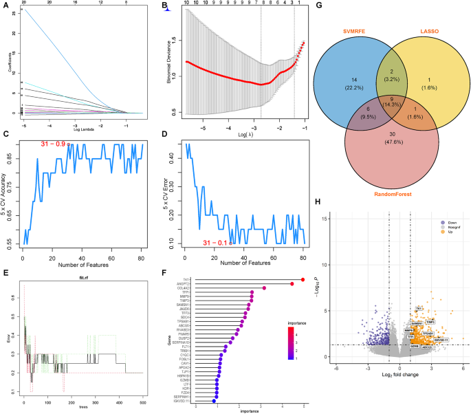
Identification of central genes using ML techniques. (A and B) LASSO regression algorithm employed to refine and select pivotal gene variables, utilizing its capacity for regularization and dimensionality reduction to enhance model accuracy. (C and D) SVM-RFE algorithm systematically prioritizing genes by iteratively training the SVM model and eliminating features to isolate those with the most predictive power. (E and F) RF algorithm utilized for its ensemble learning approach, building multiple decision trees and merging their outcomes to identify genes most influential in classification accuracy. (G) Venn diagrams synthesizing the results from the three distinct algorithms, providing a visual intersection of hub genes consistently recognized across all methodologies, underscoring their potential significance as diagnostic markers. (H) Volcano plot used to visualize the genes selected through ML.
Designing and evaluating a line graph for TIC diagnostic column data
This study first employed a Venn diagram to illustrate the overlapping genes identified by SVM, LASSO, and RF algorithms and WGCNA, pinpointing the key feature genes for further analysis (Fig. 7A). TIC diagnostic models were developed using column line graphs for crucial genes (TFPI, MMP9, ABCG5, TPSAB1, TK1, IGKV3D.11, SAMSN1, TIMP3, and GZMB), and their predictive accuracy was assessed with calibration curves, revealing minimal deviation between predicted and actual TIC risks (Fig. 7B and C). The diagnostic importance of these genes was further validated through ROC analysis and 95% CI evaluation. Each gene showed substantial diagnostic accuracy, with AUC values and 95% CIs as follows: TFPI [0.840 (0.648–1)], MMP9 [0.840 (0.654–1)], ABCG5 [0.760 (0.575–0.945)], TPSAB1 [0.780 (0.577–0.983)], TK1 [0.900 (0.768–1)], IGKV3D.11 [0.710 (0.502–0.918)], SAMSN1 [0.840 (0.648–1)], TIMP3 [0.850 (0.670–1)], and GZMB [0.670 (0.420–0.920)] (Fig. 7D). These results highlighted their reliability as TIC diagnostic markers. In DCA, the column line graph model outperformed standard approaches, especially beneficial at high-risk thresholds (0–1), and showed greater clinical utility than individual gene curves (Fig. 7E). Compared to the control group in the dataset, these genes exhibited significantly higher expression levels in the TIC group (Fig. 7G).
Fig. 7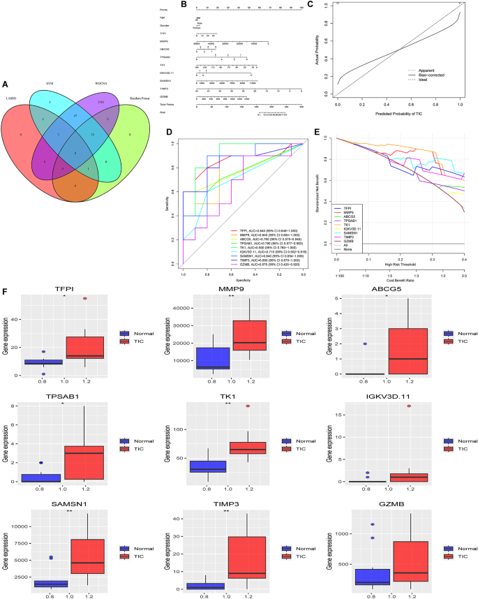
Development and validation of a nomogram-based diagnostic model. (A) Venn diagram displaying the intersection of SVM, LASSO, RF, and WGCNA, revealing that nine genes are expressed in all three categories. (B) Nomogram model diagram utilizing the expression levels of diagnostic marker genes in the combined training dataset with feature-based analysis. (C) Calibration curves demonstrating the accuracy of the nomogram’s predictions by comparing predicted probabilities with observed outcomes. (D) ROC curves to evaluate gene signatures in predicting TIC. Each curve represents a different gene, with AUC and 95% CIs detailed in the legend. (E) DCA for gene signatures in predicting TIC, illustrating the standardized net benefit across a range of high-risk thresholds. Each line represents a gene, with the “All” line assuming all patients have TIC and “None” assuming no patients have TIC. The x-axis reflects the high-risk threshold, whereas the y-axis shows the standardized net benefit. (G) Expression of the nine diagnostically relevant genes in patients with severe injury between the TIC and control groups.
Immunoinfiltration analysis of immune cells
In the immunoinfiltration analysis, five distinct methods were employed: XCELL, QUANTISEQ, MCPCOUNTER, EPIC, and CIBERSORT (Fig.S2). However, these findings consistently showed that only the CIBERSORT method proved highly effective in accurately identifying immunoinfiltration results. Utilizing the CIBERSORT method, a gene expression matrix was used to estimate the infiltration ratios of 22 different immune cells. For each of the 20 samples, a histogram was created to visually represent the composition of these immune cells. Each histogram used a range of colors to indicate the percentages of each type of immune cell, with the total summing to 1 for each sample (Fig. 8A). Box plots were used to compare differences in immunoinfiltration between TIC and control samples (Fig. 8B). These plots indicated a higher infiltration of CD4 naïve T cells, resting NK cells, M0 macrophages, and activated mast cells than the control. B-cell memory cells, T-cell follicular helper cells, activated NK cells, M1 macrophages, resting dendritic cells, and eosinophils demonstrated no infiltration results. Further analysis was conducted to assess the correlations between these types of immune cells in the TIC and control samples (Fig. 8C). The resulting correlation heatmap highlighted significant associations among various immune cells, including CD4 naïve T cells, resting NK cells, M0 macrophages, and activated mast cells. The network graph and heatmap offer a comprehensive overview of how immune cells may interact or influence one another and their potential regulation by or impact on specific genetic markers, such as TFPI and MMP9. This could have implications for understanding the underlying mechanisms of immunoresponses or the progression of TIC, particularly those impacting the immune system (Fig. 8D).
Fig. 8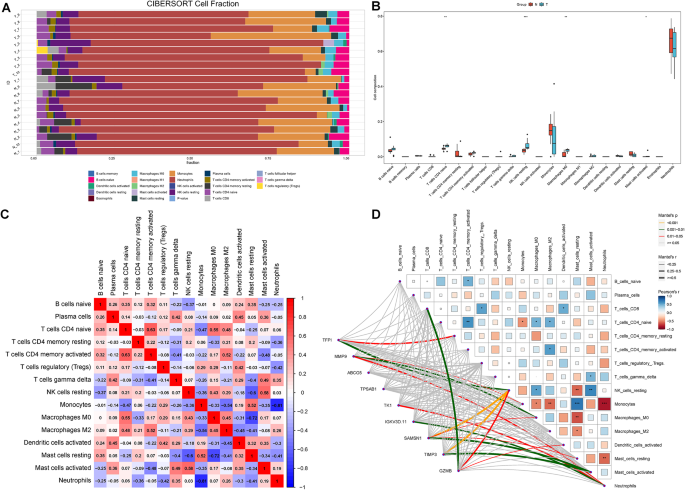
Assessment of immunoinfiltration and analysis of immune-related correlations. (A) Bar plot of the distribution of 22 different immune cells in TIC and control samples. Each column in the graph represents a sample. (B) Box plot of the expression of the relevant genes in the collected sample sets. *p p p C) A correlation heatmap displaying the relationships among immune cell infiltrates. Red, positive correlations; blue, negative correlations. The intensity of the color reflects the strength of the correlation. (D) Network diagram and heatmap correlation analysis between TFPI, MMP9, ABCG5, TPSAB1, TK1, IGKV3D.11, SAMSN1, TIMP3, and GZMB and immune cell types. Lines in the network indicate the correlation strength. The heatmap shows the correlation coefficients (blue for positive and red for negative). *p p p
Multifactor regulation network construction
Leveraging miRNet and NetworkAnalyst databases, networks delineating the relationships between miRNAs, hub genes, and TFs were developed using Cytoscape. This network intricately connects 8 hub genes, 64 miRNAs, and 53 TFs, establishing a visual map of regulatory interactions that govern gene expression (Fig. 9). TF prediction was based on the JASPAR database.
Fig. 9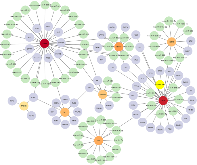
miRNA-gene-TF regulatory network. A regulatory network mapping the interactions between miRNAs, diagnostic biomarker genes, and transcript factors. Circular nodes represent entities where green indicates miRNAs, purple indicates transcript factors, orange indicates genes with moderate interaction, and red indicates genes with high interaction centrality. The central large red node represents a gene with a particularly high degree of connectivity, suggesting a pivotal role in the regulatory network. Lines connecting nodes signify regulatory interactions, with the node size reflecting the extent of each gene’s regulatory influence. This network provides insights into complex regulatory mechanisms at the molecular level.
GSEA
The signature genes (TFPI, MMP9, ABCG5, TPSAB1, TK1, IGKV3D.11, SAMSN1, TIMP3, and GZMB) and corresponding expression data were entered into the GSEA platform, utilizing the curated gene sets c5.go. v7.4.symbols, and c2.cp.kegg.v7.4.symbols for comprehensive GO and signaling pathway analysis, respectively. The top 10 results from GO and KEGG analyses are presented illustratively (Figures S3 and S4).
RT-PCR validation of diagnostic hub genes
To validate the expression of hub genes at the transcriptional and protein levels, qRT-PCR analyses were conducted on TIC and control whole-blood RNA samples from patients. Due to the lack of statistically significant IDE expression during the initial screening process and the absence of a complete transcript for IGKV3D.11, primer design and validation for these two genes were not performed in the RT-PCR experiment. The mRNA expression levels of TFPI, MMP9, ABCG5, TPSAB1, TK1, SAMSN1, and TIMP3 were significantly increased in the TIC groups compared to controls (p 10).
Fig. 10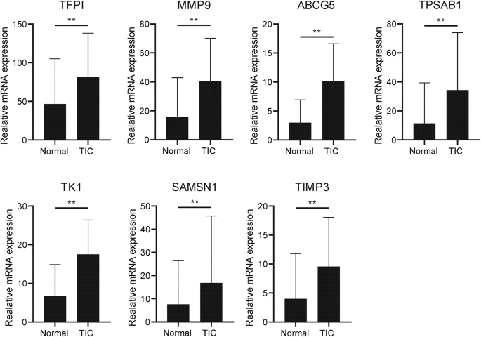
Transcriptional expression of TFPI, MMP9, ABCG5, TPSAB1, TK1, SAMSN1, and TIMP3 in whole blood from TIC patients and control controls. Mean ± standard deviation. ***p p p