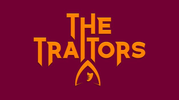
We’ve written previously about The Traitors UK logo (above) comparing it to The Traitors Australia and Traitors US versions. And spoiler alert, the UK Traitors logo came out on top. With its hooded figure and sharp silhouette, it says a lot about the game with just a few lines. It’s unfussy yet effective. The mark of a good logo, I think.
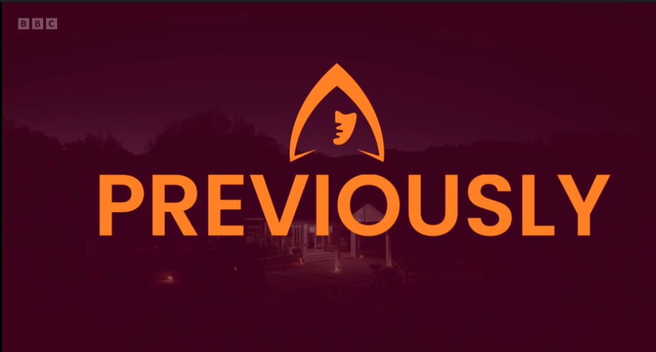
But watching the series this year, I noticed something that I’ve never paid attention to before. The logo is used to replace the letters ‘iou’ in the ‘previously’ that flashes up at the start of each episode (below) – the part where we look back at the episode before.
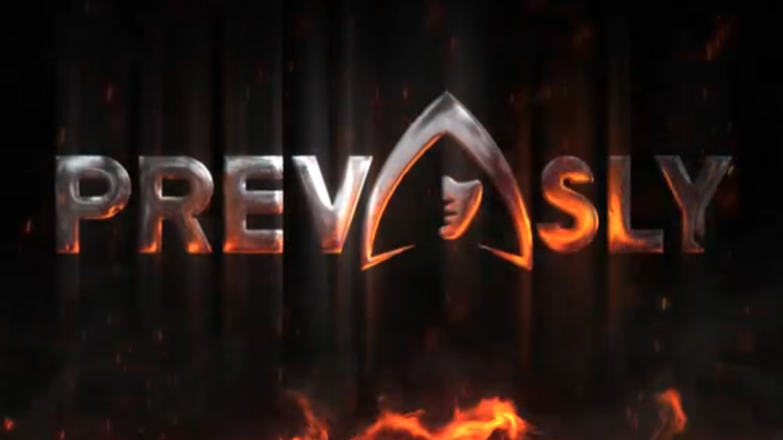
PREV-IOU-SLY (Image credit: BBC)Is the logo an IOU?
At first I thought it didn’t work. The logo doesn’t look like the letters ‘iou’. If anything it looks like an ‘a’. But then once you capitalise those letters, and get ‘IOU’ (I owe you), things start to seem a bit more intentional. Is the IOU a nod to the treacherous gameplay of The Traitors? But what exactly would that mean? Is it an IOU revenge because you’re a traitor? I owe you a favour as a faithful? It still feels like a bit of a stretch.
You may like
And that leaves me with more questions. Does the logo really stand for IOU and we just didn’t notice before? Or is it such a good logo that it can be used in multiple ways in multiple places, and most of us don’t even notice?
And with the IOU isolated by the logo, we’re also left with ‘SLY’ at the end of the word. And as one Redditer pointed out, being sly is what the game is all about, isn’t it?
What do you think? Is the The Traitors logo’s ‘PREVIOUSLY’ a clever part of the show’s visual identity? Or is it where the logo falls flat?
PREVIOUSLY around the world
The NZ version has ‘previously’ without the logo in the middle. Is this better? (Image credit: BBC)
How do the other series deal with ‘previously’? The UK Celebrity version follows the same pattern as the civilian one, with the ‘IOU’ replaced by the logo, the US and Australian versions don’t have the word appear at all but just have the host say it.
The New Zealand version has the word ‘previously’ flash up but without the logo replacing the IOU (above). This does arguably look cleaner, but is it as fun?
I’ll leave you to ponder all that while I try and guess who’s going to win. And though I can’t predict if it’s going to be a victory for faithfuls or traitors this year, I still think that the UK visual identity for The Traitors is an absolute winner.