In the NHL, jerseys are more than just uniforms; they are symbols of a legacy, history and pride for teams and their fan bases.
Throughout the years, teams have revealed jerseys that have stood the test of time. On the other side, there have also been some duds that teams couldn’t ditch soon enough.
This week, The Athletic asked its NHL staff for the best and worst jerseys for every club in franchise history. Writers were asked to be as specific as they wanted in their selections.
What do you think your favorite team’s best and worst jerseys are? Let us know in the comments below.
Anaheim Ducks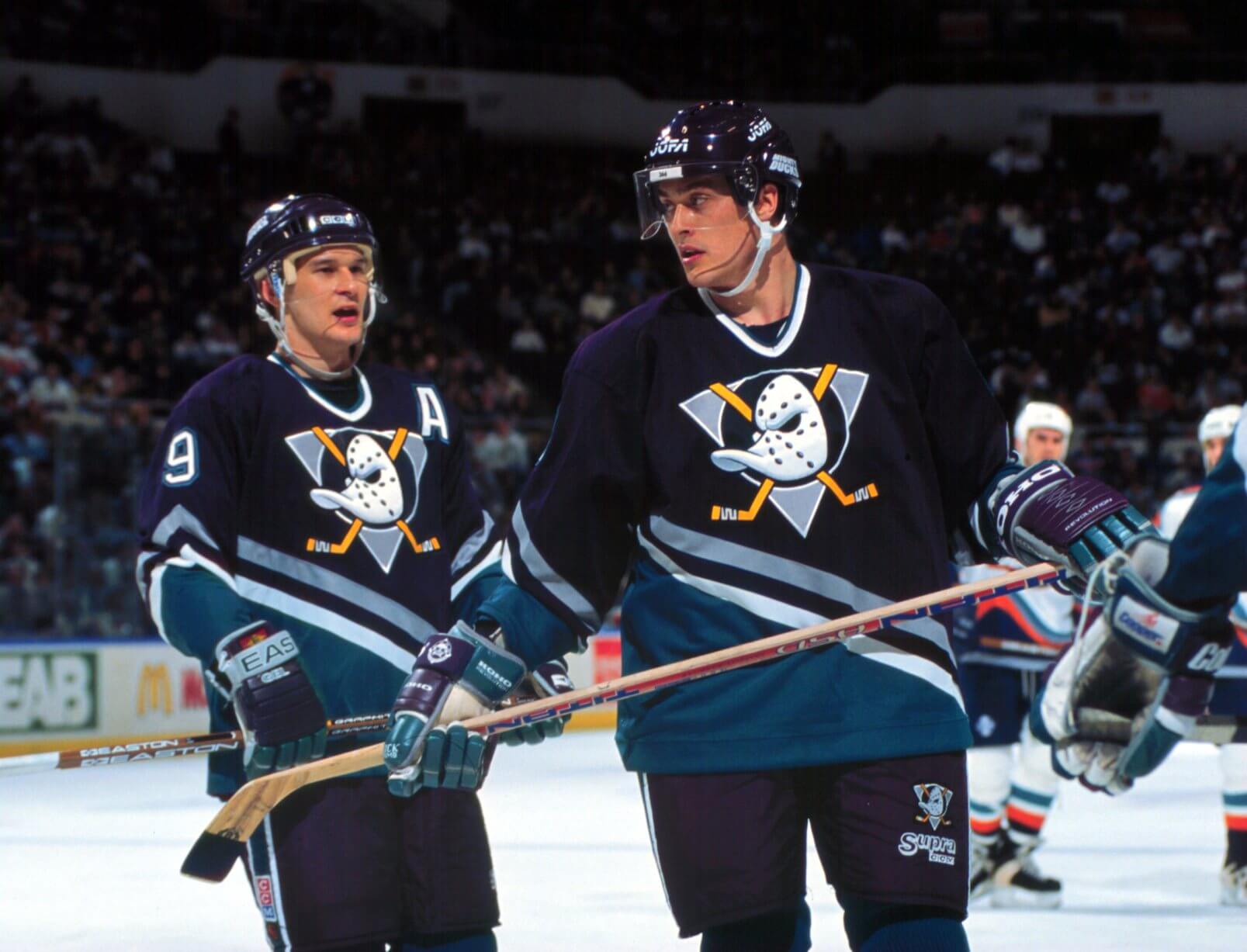
Teemu Selanne and Paul Kariya, while playing for the Ducks in 2000. (Bruce Bennett Studios via Getty Images Studios / Getty Images)Best: 1993-2006 Mighty Ducks
Long live the eggplant. The Ducks have only brought it back on rare and special occasions since retiring it as their regular jersey in the 2006 rebrand, and the current orange duds with the retro logo combine the Disney and Henry Samueli ownership eras. But the eggplant and jade combination remains a unique one that worked so well.
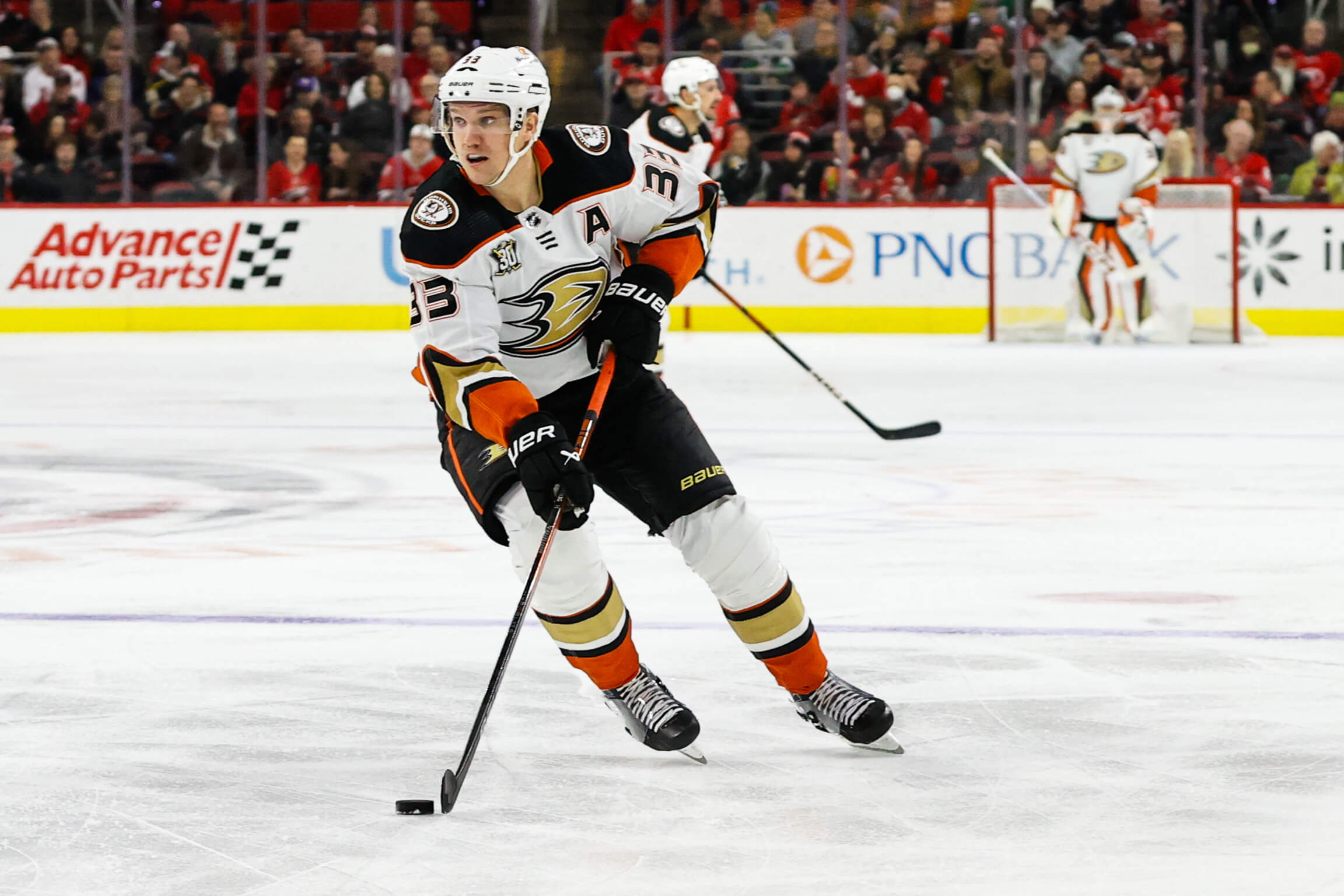
Jakob Silfverberg, while playing for the Ducks in 2024. (Jaylynn Nash / Getty Images)Worst: 2014-24 road
You might think that Wild Wing busting through the ice is a slam-dunk choice. That infamous alternate from 1995-96 has a love-hate element thanks to the return for the NHL’s 2021 Reverse Retro series because of its comical weirdness. But the white road threads from 2014-24 weren’t clean at all. Too much going on. Way too much. — Eric Stephens
Boston Bruins
Tuukka Rask, while playing for the Bruins in 2021. (Christian Petersen / Getty Images)Best: 2021 Reverse Retro
The gold jersey and gold socks played quite nicely against the black pants.
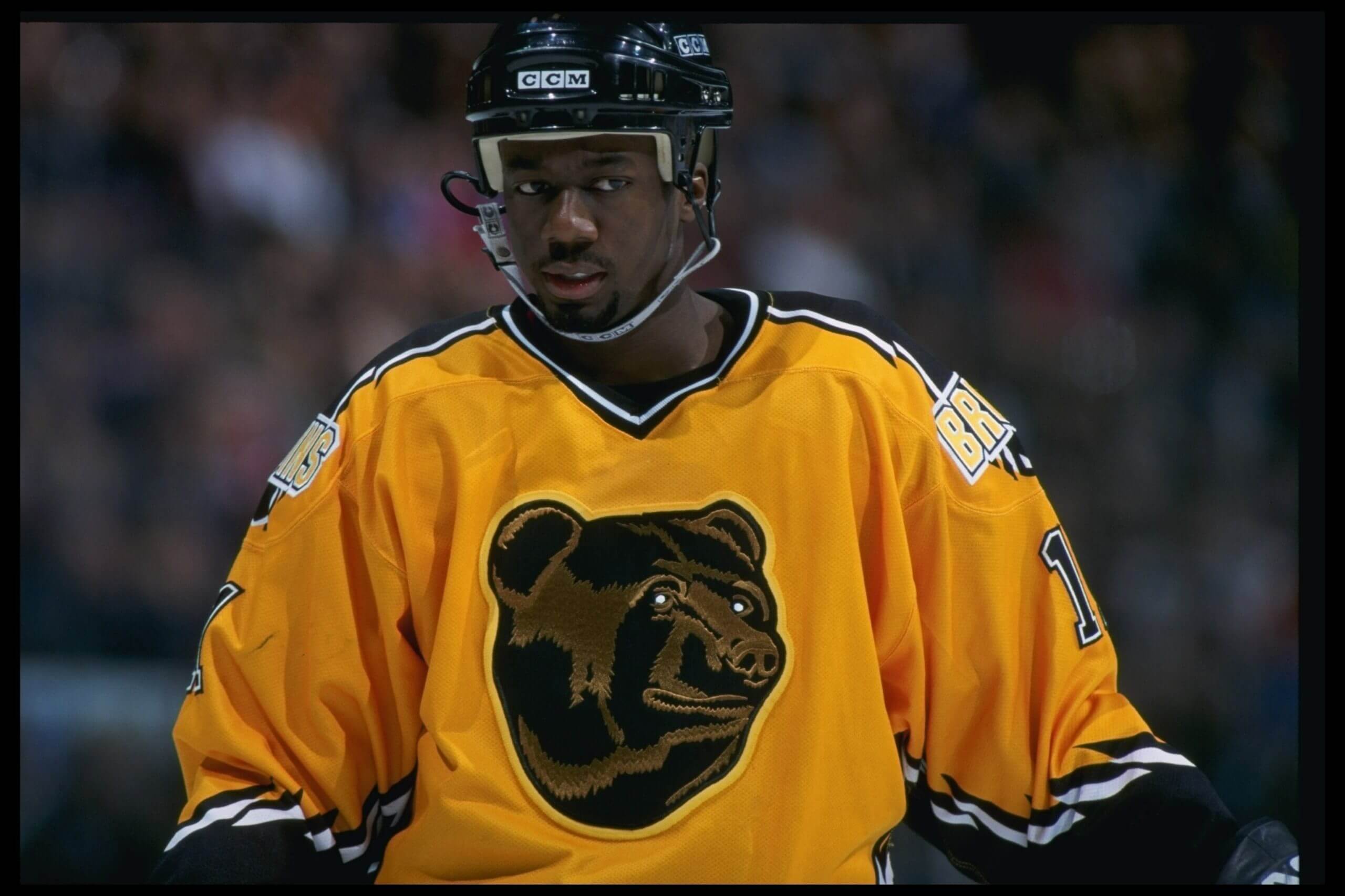
Anson Carter, while playing for the Bruins in 1997. (Robert Laberge /Allsport)Worst: 1995-2006 “Pooh Bear” alternate
It’s a cartoon. — Fluto Shinzawa
Buffalo Sabres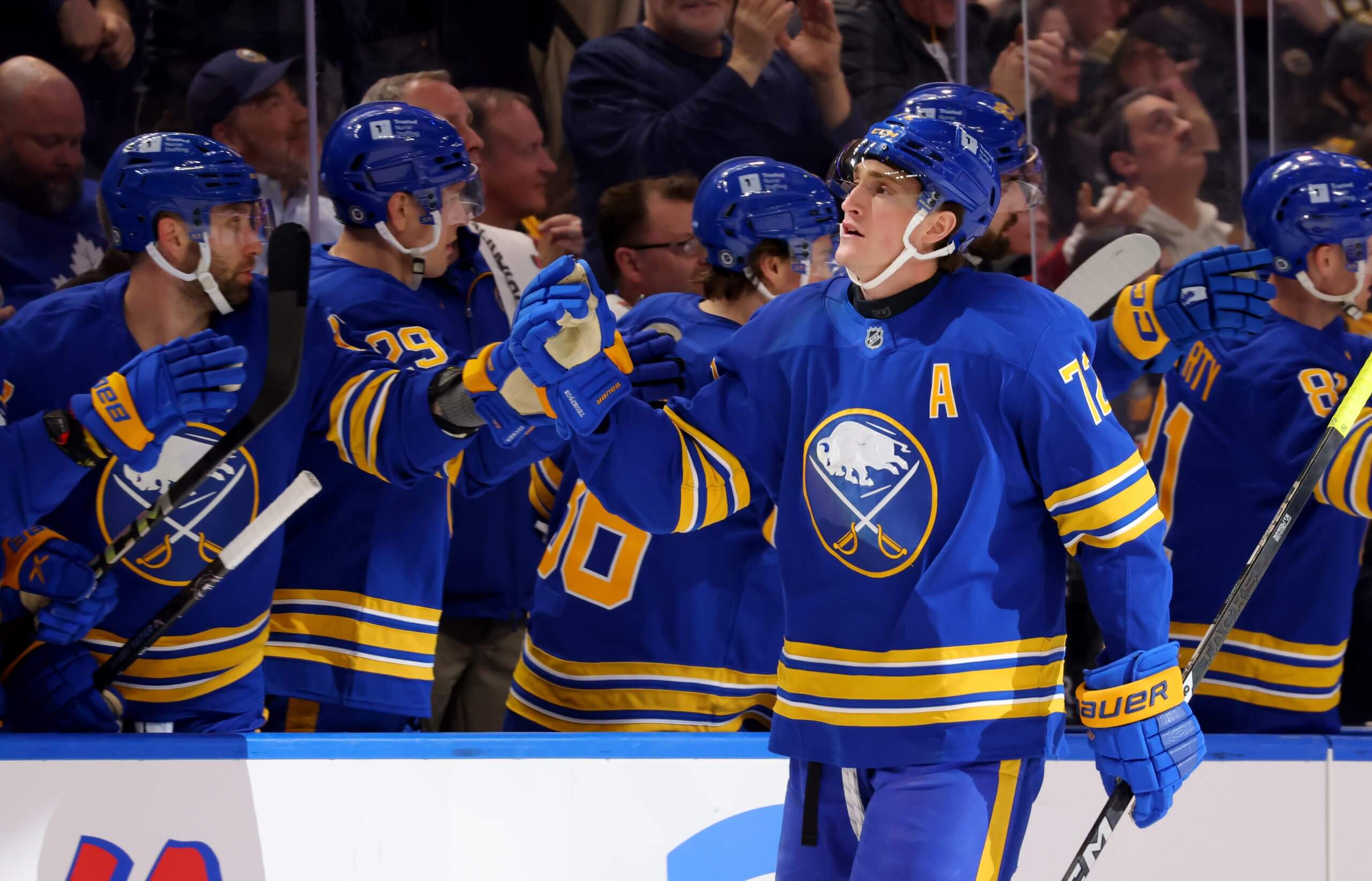
Tage Thompson, while playing for the Sabres in 2025. (Timothy T. Ludwig / Imagn Images)Best: Original royal blue (1970-1996 and current day)
The Sabres brought back this classic look for a reason. After trying a different color scheme, a different logo and a different shade of blue, this jersey has proven to be timeless.
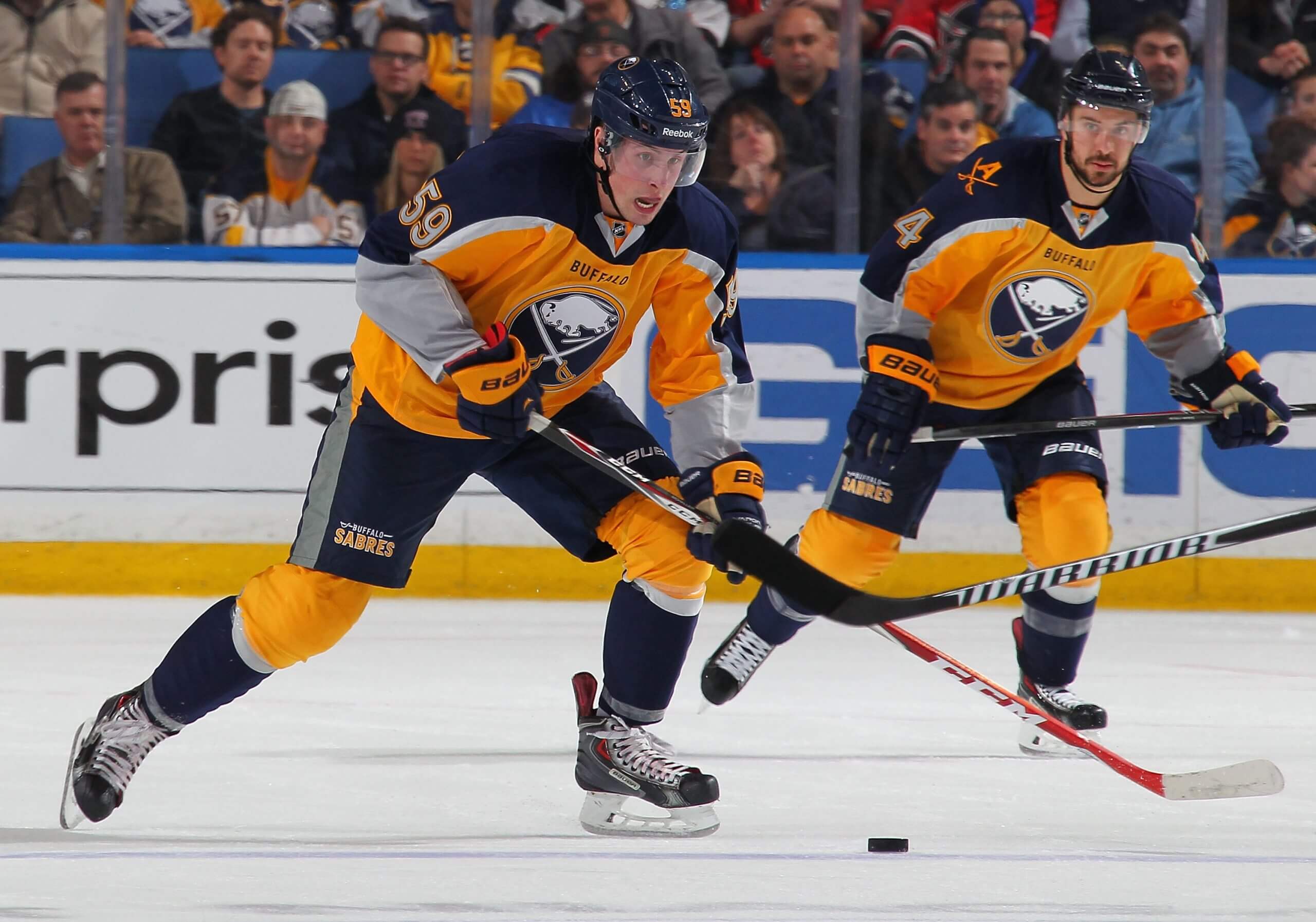
Tim Schaller and Josh Gorges, while playing for the Sabres in 2014. (Bill Wippert / NHLI via Getty Images)Worst: 2013-15 yellow alternate
Then Sabres president Ted Black said of this alternate jersey, “If it’s a turd burger, I’ll have to eat it.” And thus the “turd burger” nickname for these jerseys was born. Yellow as a primary color for a Sabres jersey hasn’t been attempted since. — Matthew Fairburn
Calgary Flames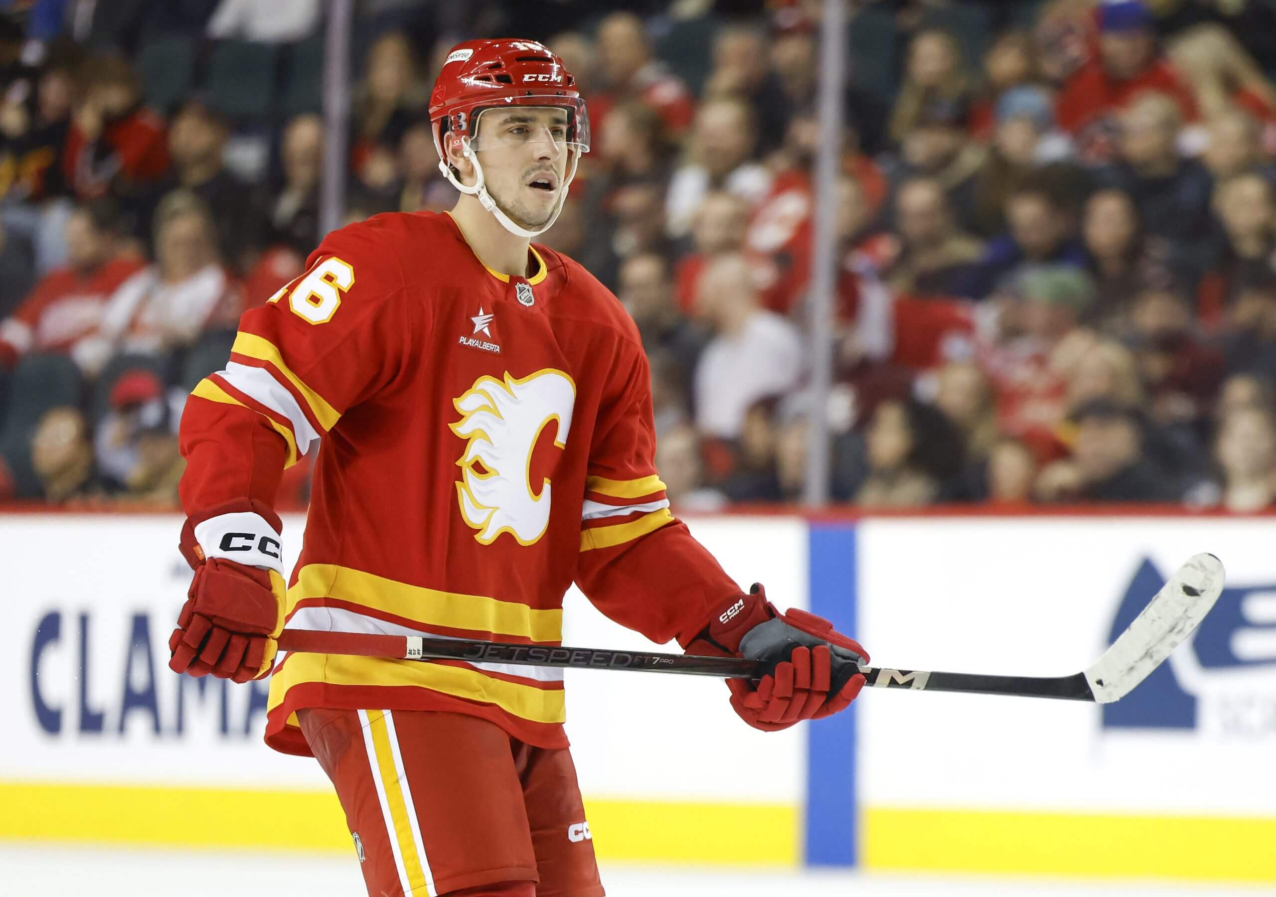
Morgan Frost, while playing for the Flames in 2025. (Leah Hennel / Getty Images)Best: Current
In 2009, Calgary experimented with a red homage to the 1980s. What started as an alternate jersey eventually turned into their home jerseys. Their road whites were worn during the 2019 Heritage Classic, also a slam dunk. Personally, I’m also a big fan of the “Blasty” jersey, their current alternates.
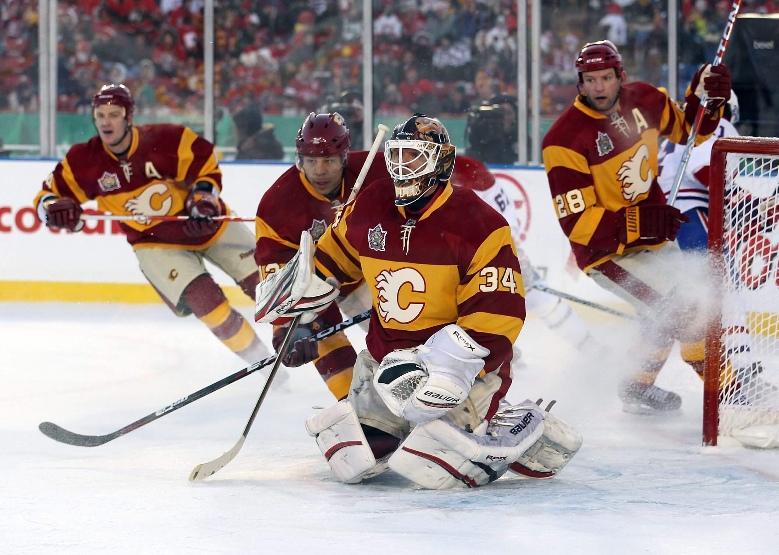
Jay Bouwmeester, Jarome Iginla, Miikka Kiprusoff and Robyn Regehr, while playing for the Flames in 2011. (Mike Ridewood / Getty Images)Worst: 2011 Heritage Classic
There are way too many stripes and the color scheme is similar to an old candy you’d find in your grandma’s purse. Calgary won their outdoor game in these jerseys, though, so who am I to judge? But there are way better jerseys in their arsenal. Honorable mention: the “Pedestal” jersey of the mid-1990s. — Julian McKenzie
Carolina Hurricanes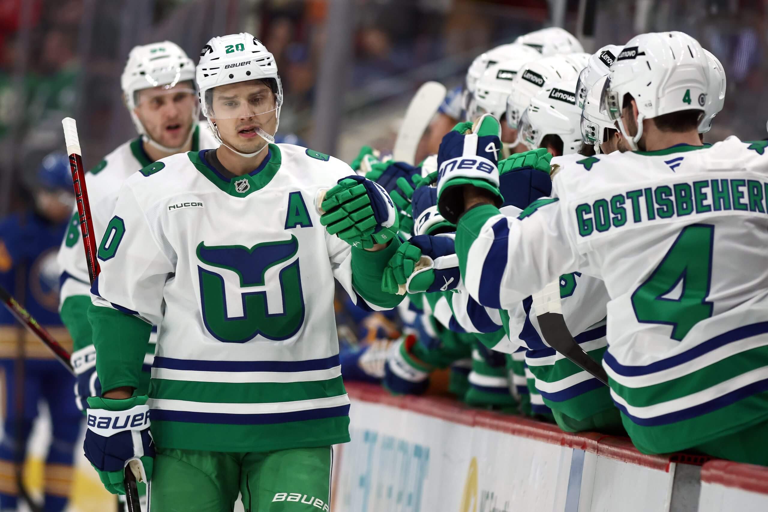
Sebastian Aho, while playing for the Hurricanes in 2025. (Jared C. Tilton / Getty Images)Best: 2024-25 white Whalers alternate
The Whalers’ logo and colors are iconic, and the white jersey really pops with the green pants. While the franchise has been in Raleigh longer than it was in Hartford, it’s likely the team will never get out from under the uniform shadow cast by The Whale.
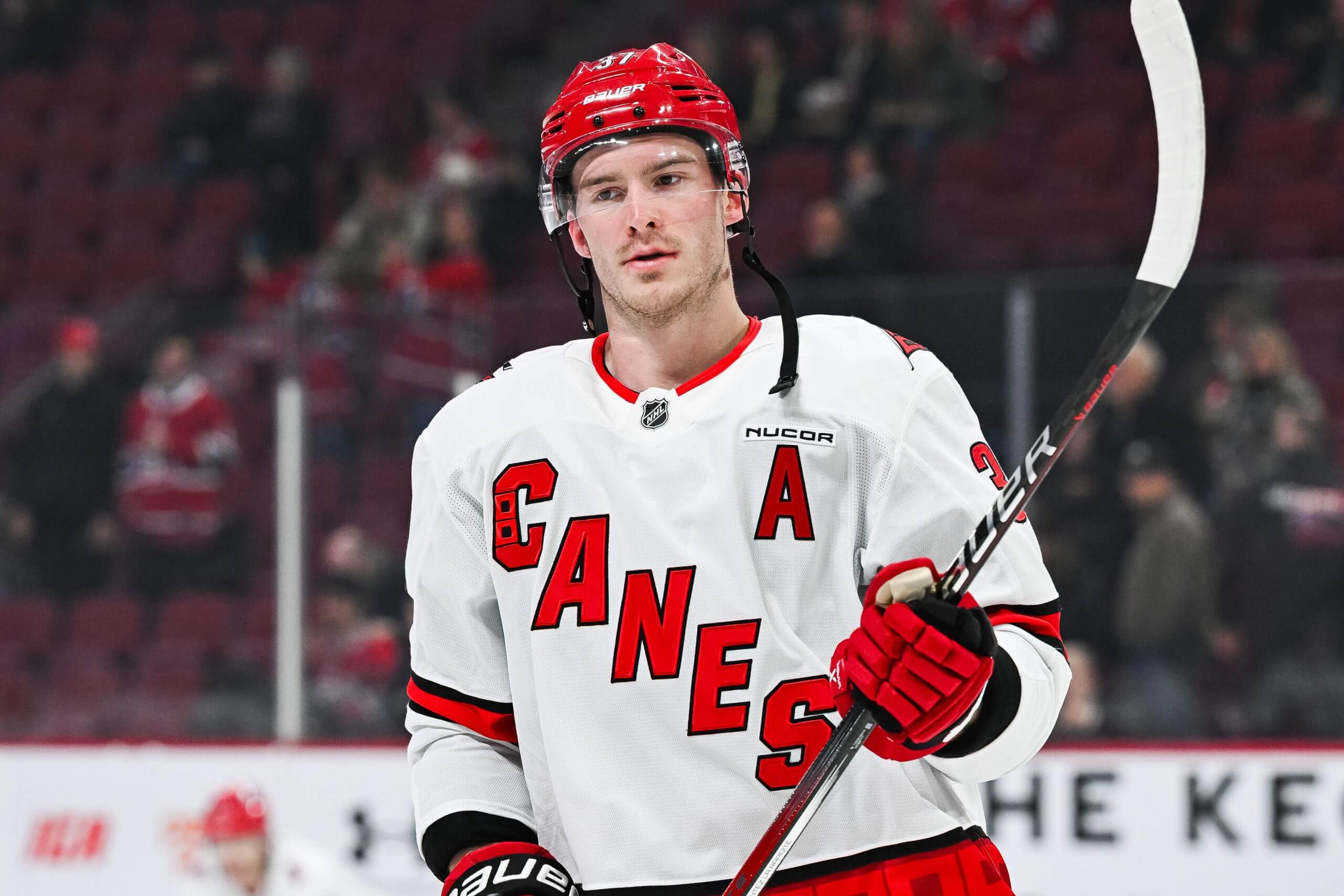
Andrei Svechnikov, while playing for the Hurricanes in 2025. (David Kirouac / Imagn Images)Worst: 2024-25 white road
The diagonal “CANES” logo never really hit its mark, and Carolina seems to have a bit of an identity crisis by not using their main logo as the crest on either of their main jerseys. The white jersey looks particularly bad when occasionally paired with the team’s black helmet. The entire road uniform is in desperate need of a refresh. — Cory Lavalette
Chicago Blackhawks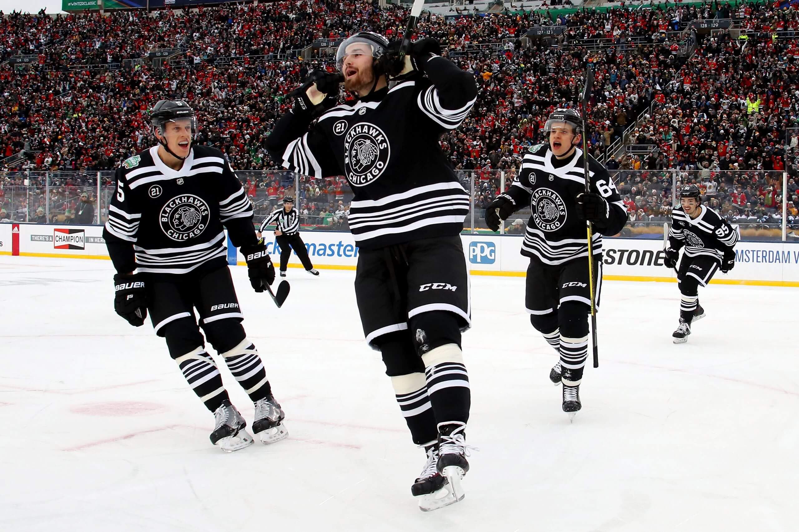
Connor Murphy, Brendan Perlini, David Kämpf and Dylan Sikura, while playing for the Blackhawks in 2019. (Gregory Shamus / Getty Images)Best: 2019 Winter Classic
The Blackhawks’ traditional red jerseys are most people’s favorites. That’s fair. But for me, the 2019 Winter Classic jersey just popped, especially in that outdoor setting, with the black jersey and white stripes. It was a great look.
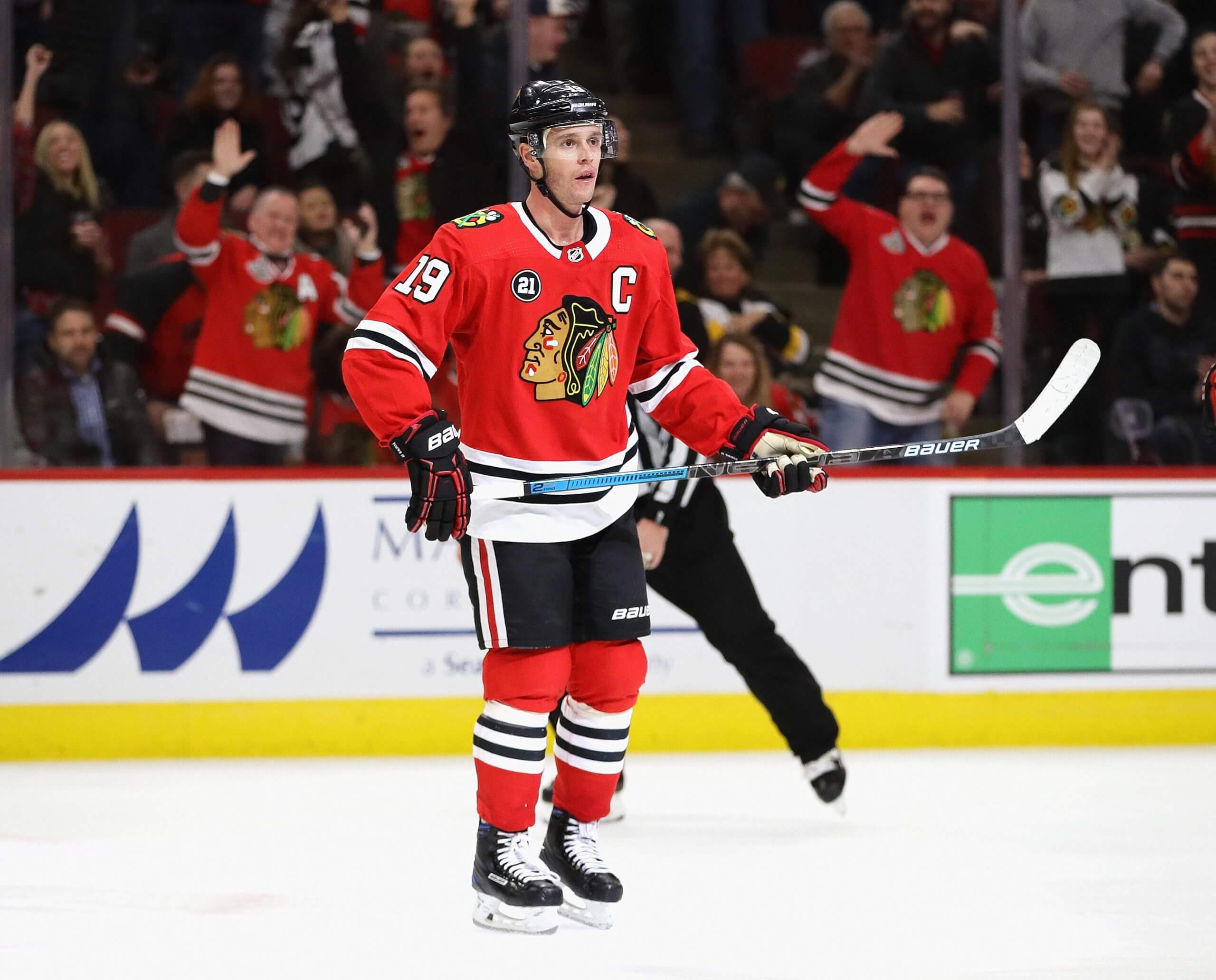
Jonathan Toews, while playing for the Blackhawks in 2018. (Jonathan Daniel / Getty Images)Worst: 2017-19
Nobody on the Blackhawks seemed to want to acknowledge publicly back then how bad the Adidas jerseys were, but what they did to the collars was unforgivable. Players and fans were pleased when the team moved on from them. — Scott Powers
Colorado Avalanche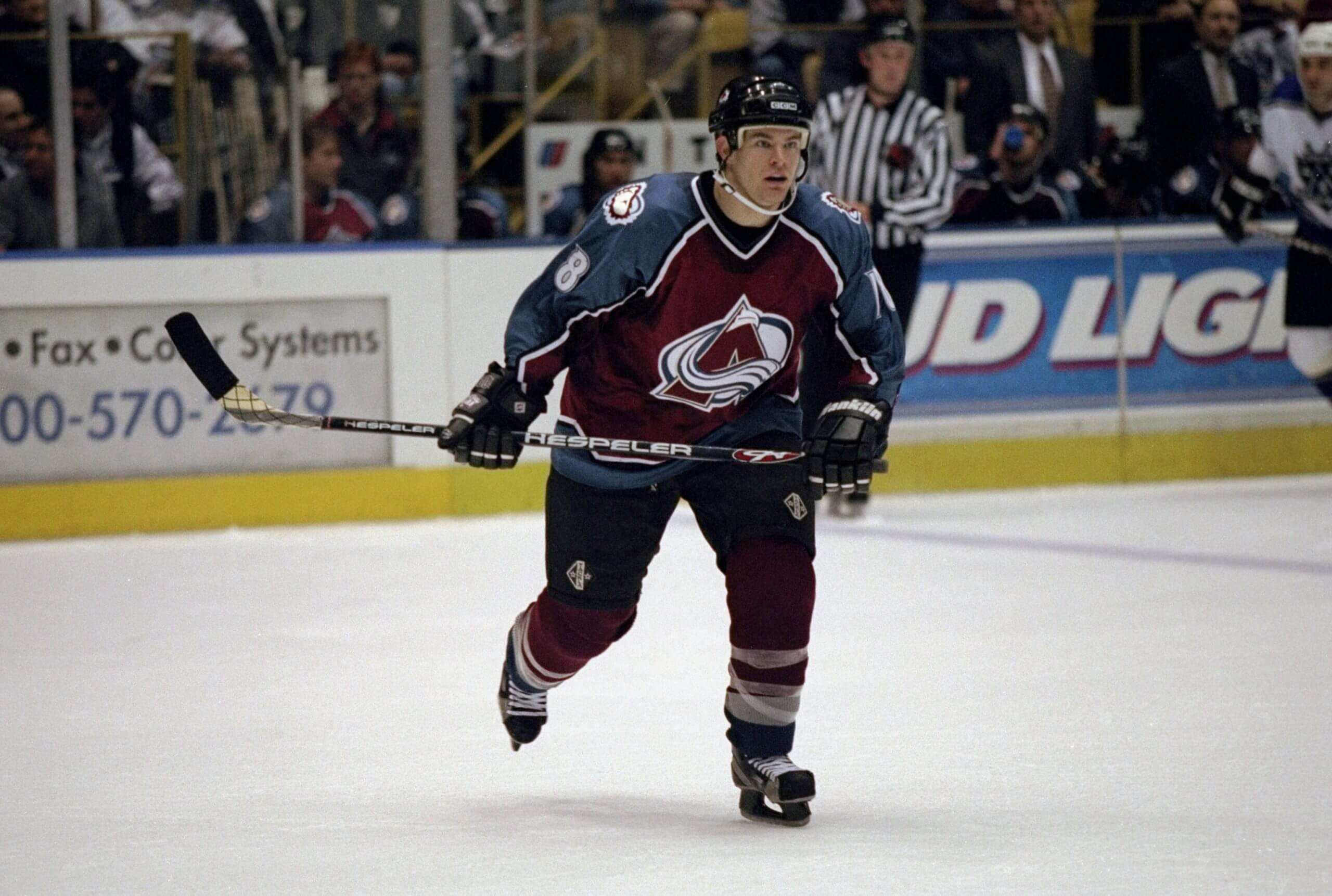
Adam Deadmarsh, while playing for the Avalanche in 1999. (Kellie Landis / Allsport)Best: 1997-2000
The Avalanche have had a lot of good alternate jerseys over the years. As a Colorado native, I love the 2022-23 Reverse Retro with the state flag color scheme, and the 2021 Reverse Retro ode to the Nordiques worn at Lake Tahoe looked great. But nothing compares to the classic look with the Yeti foot on the shoulders from the late ’90s.
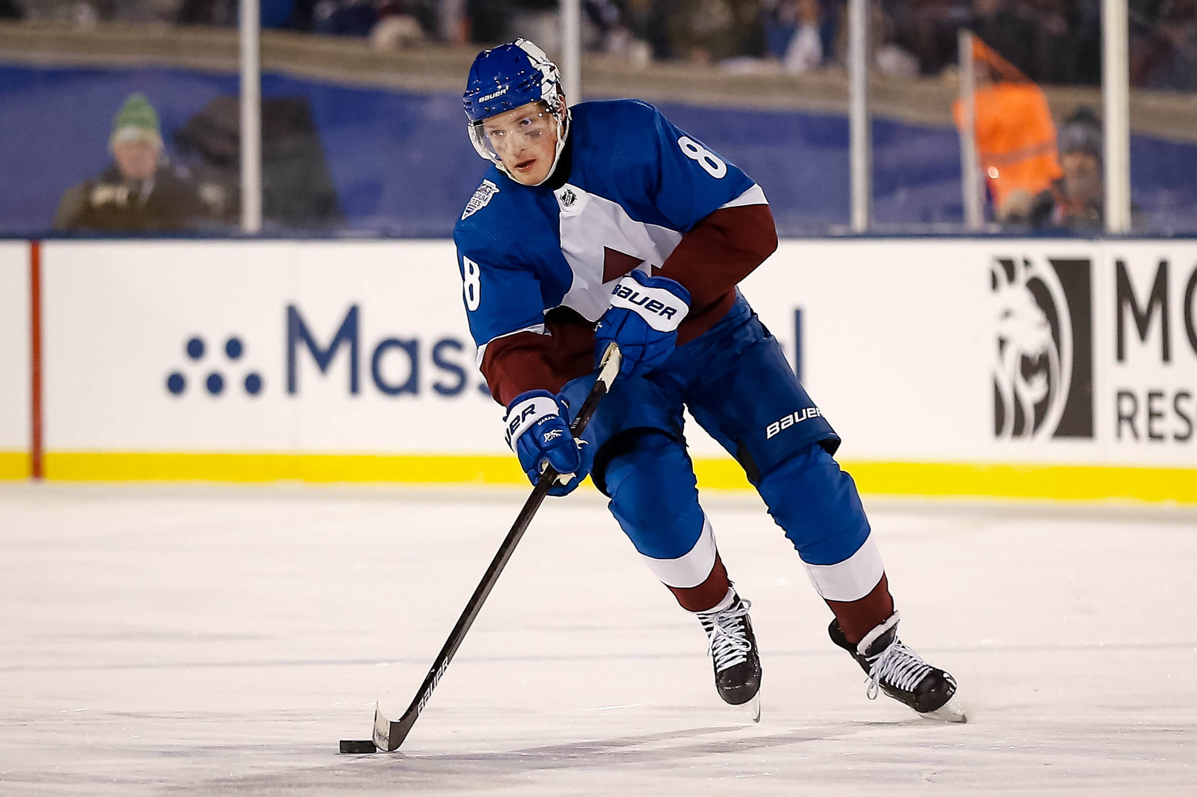
Cale Makar, while playing for the Avalanche in 2020. (Isaiah J. Downing / USA Today)Worst: 2020 Stadium Series
These are bad. I appreciate the attempt to spice up the helmet, but nothing about this design looks good. The thought was there, trying to pay homage to the Air Force Academy Cadet Chapel with the giant triangle, but it ended up looking like the players were wearing giant napkins tucked into their collars as if they were about to eat a seafood boil. — Jesse Granger
Columbus Blue Jackets
Rick Nash, while playing for the Blue Jackets in 2008. ( Gregory Shamus / Getty Images)Best: 2007-10
Nothing against Stinger, the Blue Jackets’ human-sized bug mascot, but his lime green-ness has no place on an NHL sweater, especially a crisp red, white and blue classic. In 2004, Stinger was removed as a shoulder patch, a good first step. In 2007, the Jackets left behind their original “CBJ” kit with a lime green stick jutting through the middle.

Rostislav Klesla and Andrew Cassels, while playing for the Blue Jackets in 2002. (Elsa / NHLI via Getty Images)Worst: 2000-03
We should start by thanking original GM Doug MacLean, because if it weren’t for him — gasp! barf! — the franchise’s first sweater would have had a green bug for the primary logo. Appalling. These first-year sweaters hold up well as a retro “oh my God, they wore that” look, but they couldn’t have moved on from them soon enough. — Aaron Portzline
Dallas Stars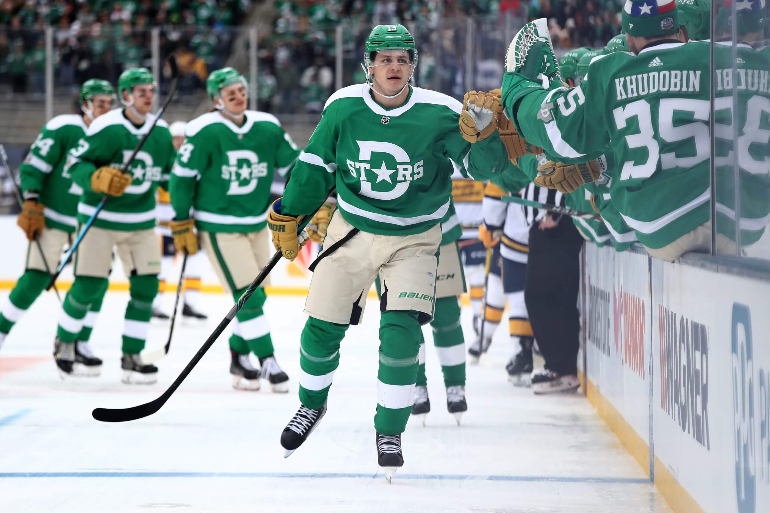
Mattias Janmark, while playing for the Stars in 2020. (Ronald Martinez / Getty Images)Best: 2020 Winter Classic
This one is a toss-up for me between a few different options, but I’ll go with the innovative look they had at the outdoor game five years ago. It was a bit based on the old Dallas Texans of the United States Hockey League and involved beige pants and old-time leather-looking gloves. The Big Star jerseys from their Cup win also rank up there, too.
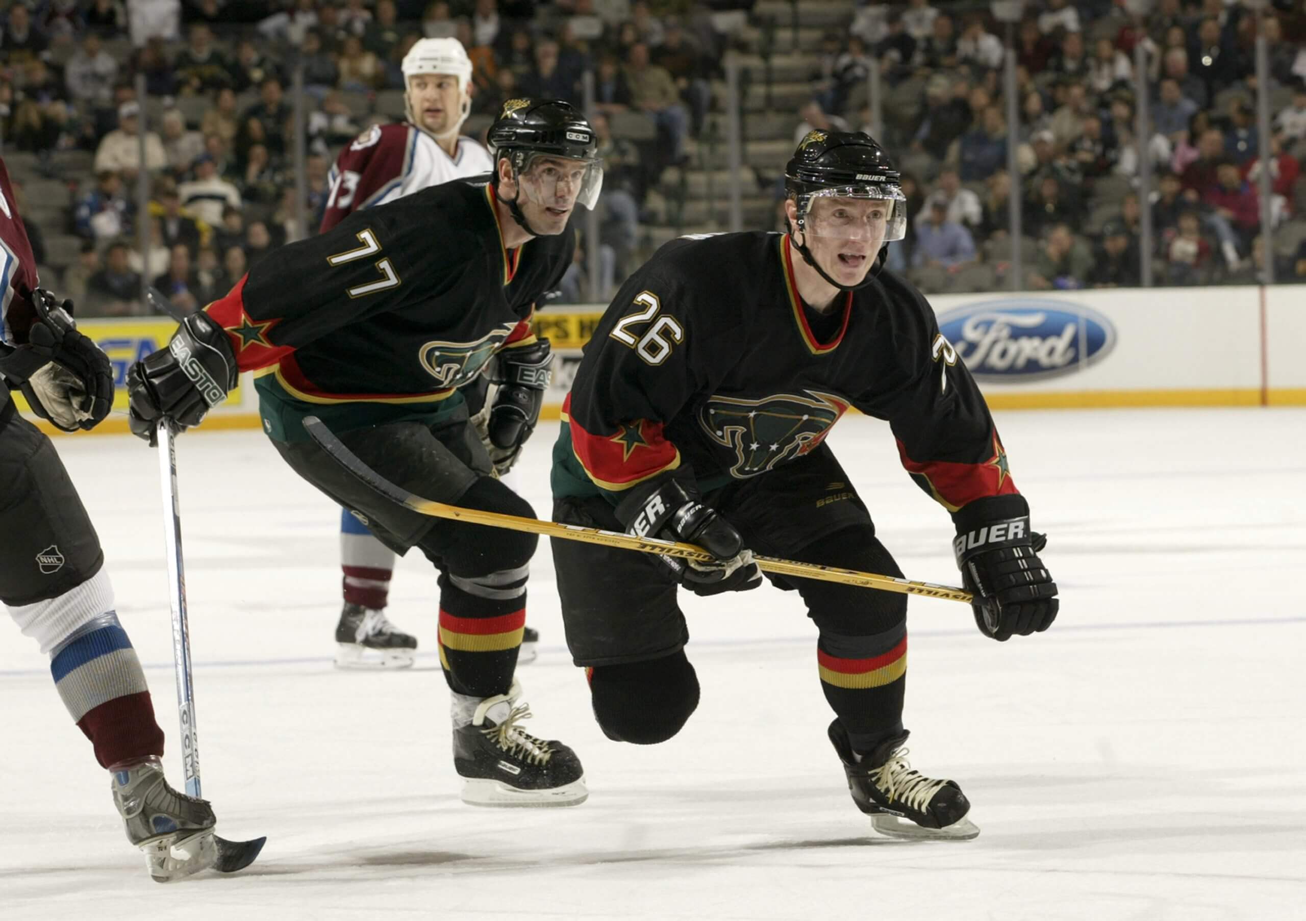
Jere Lehtinen and Pierre Turgeon, while playing for the Stars in 2003. (Ronald Martinez / Getty Images)Worst: 2003-06 “Mooterus” alternate
The Stars’ short-lived black alternates became the subject of ridicule for the weird star cow logo thing, but the red, yellow, black and green with swooshes combined to make this probably one of the worst jerseys in modern NHL history. Moo. — James Mirtle
Detroit Red Wings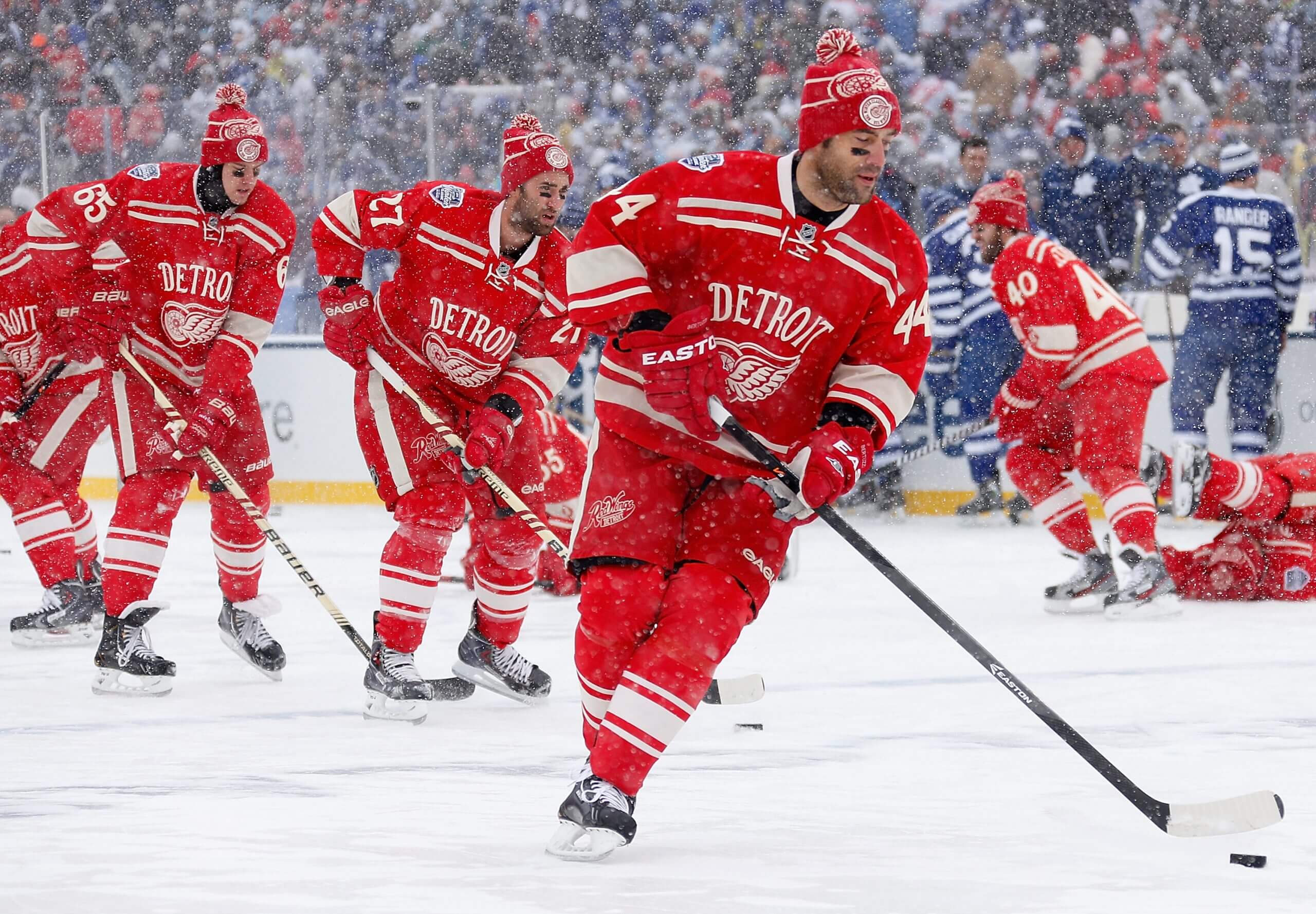
Danny DeKeyser, Kyle Quincey and Todd Bertuzzi, while playing for the Red Wings in 2014. (Gregory Shamus / Getty Images)Best: 2014 Winter Classic
The Red Wings’ main uniforms are iconic, likely why they don’t have many alternates (and rather bland ones when they do). But the 2014 Winter Classic jerseys were sublime, incorporating history and legacy with a distinct look that jumps off the sweater. We’ll see what Detroit has planned for its centennial season, but these will be hard to top.
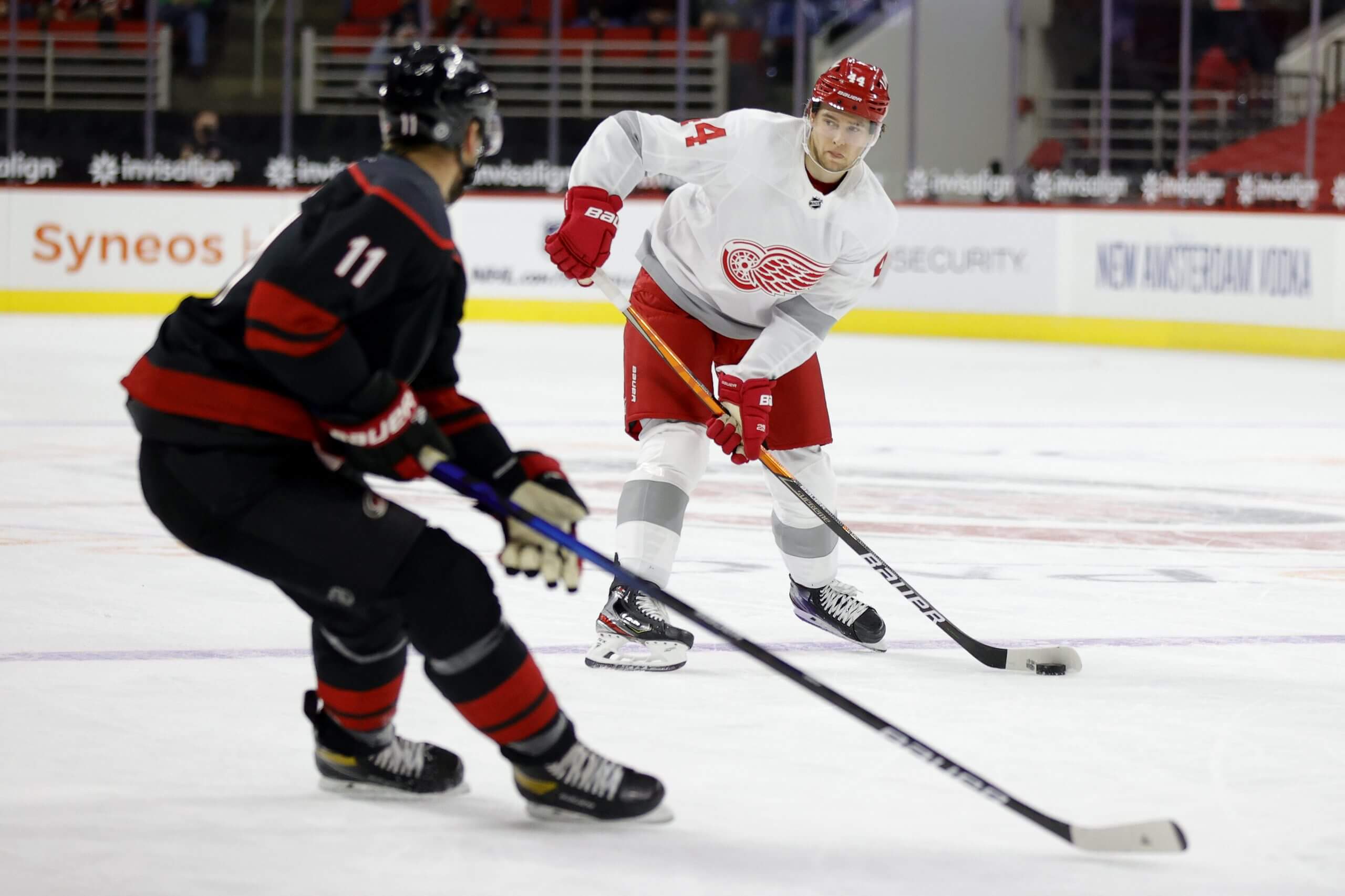
Christian Djoos, while playing for the Red Wings in 2021. (Jared C. Tilton / Getty Images)Worst: 2021 Reverse Retro
It’s not the most offensive-looking jersey in the world, but it’s so boring. It’s hard to go wrong with a logo as good as the winged wheel, but this jersey puts that to the test by doing basically nothing else. Frankly, it looks like a practice jersey. — Max Bultman
Edmonton Oilers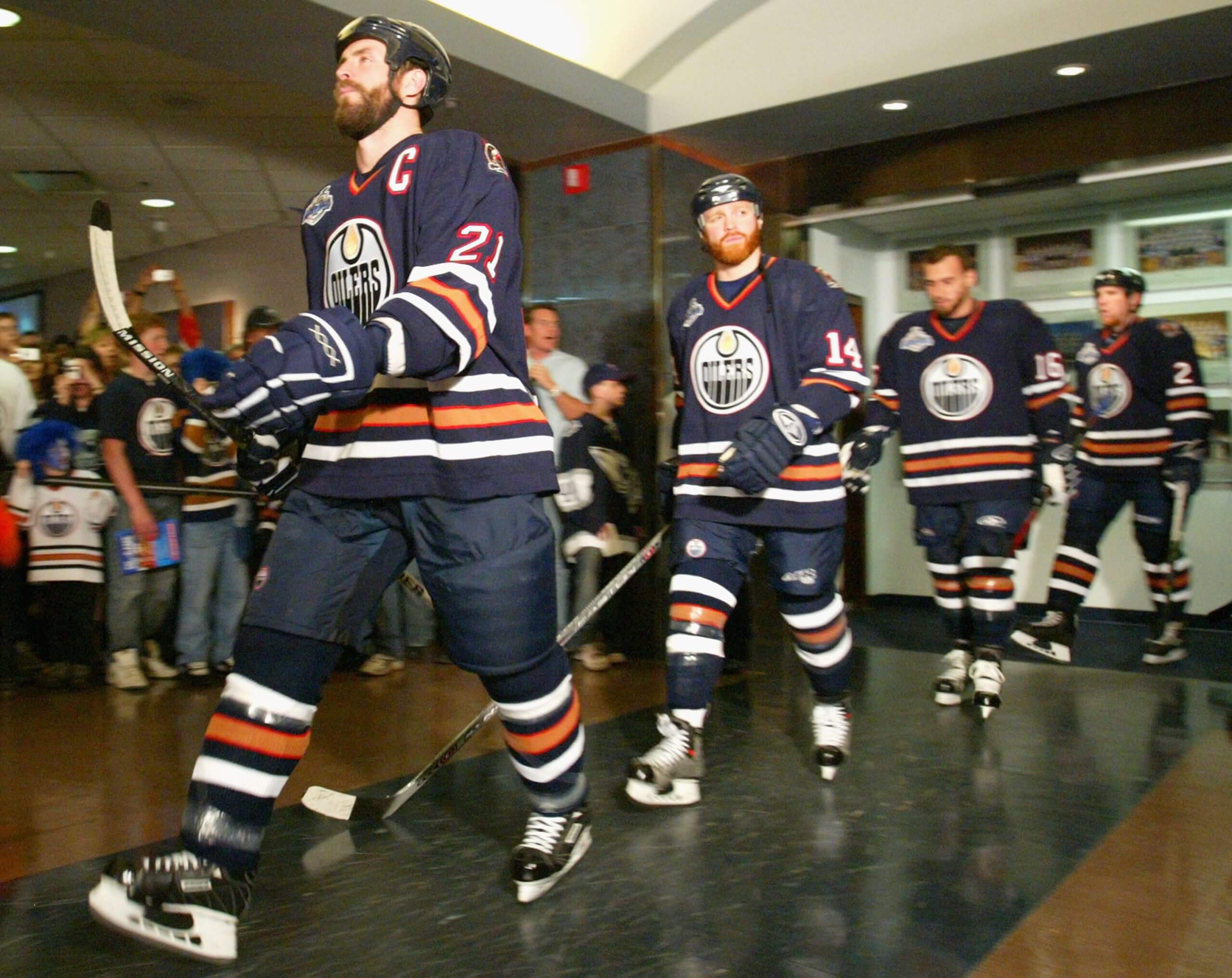
Jason Smith leading out the Oilers in 2006. (Dave Sandford / Getty Images)Best: 1996-2007 home and road
The Oilers never won wearing these jerseys, but they had some epic moments. They reached Game 7 of the 2006 Stanley Cup Final. Curtis Joseph, Todd Marchant and Kelly Buchberger all came up with defining postseason plays. The copper color is more emblematic of oil compared to orange. The oil driller with a hockey stick on the shoulder is a nice touch.

Tom Gilbert, while playing for the Oilers in 2010. (Christian Petersen / Getty Images)Worst: 2007-2011 home and road
The NHL came out with new jerseys ahead of the 2007-08 season. The Oilers were one of the teams that suffered the most. The vertical piping down the front is off-putting. Cutting off the arm bands under the numbers is bizarre. No stripes at the bottom make them look plain. These were awful and fittingly worn during the worst era in franchise history. — Daniel Nugent-Bowman
Florida Panthers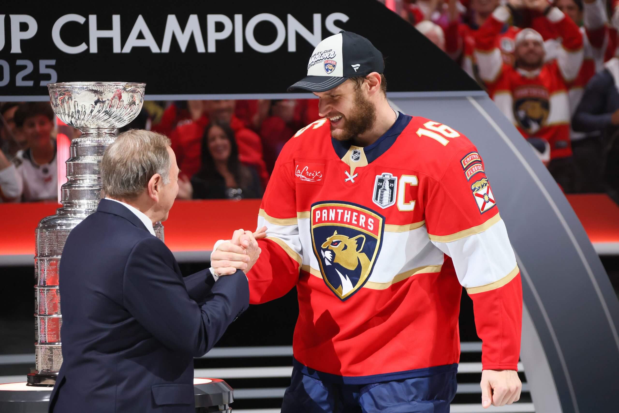
Aleksander Barkov, while playing for the Panthers in 2025. (Bruce Bennett / Getty Images)Best: Current
It’s a tough call because the retro Panthers jersey was a strong option and one I think many would choose here. But the rebrand under new owner Vinnie Viola has modernized the look, and the ’90s one feels better as a good third jersey.
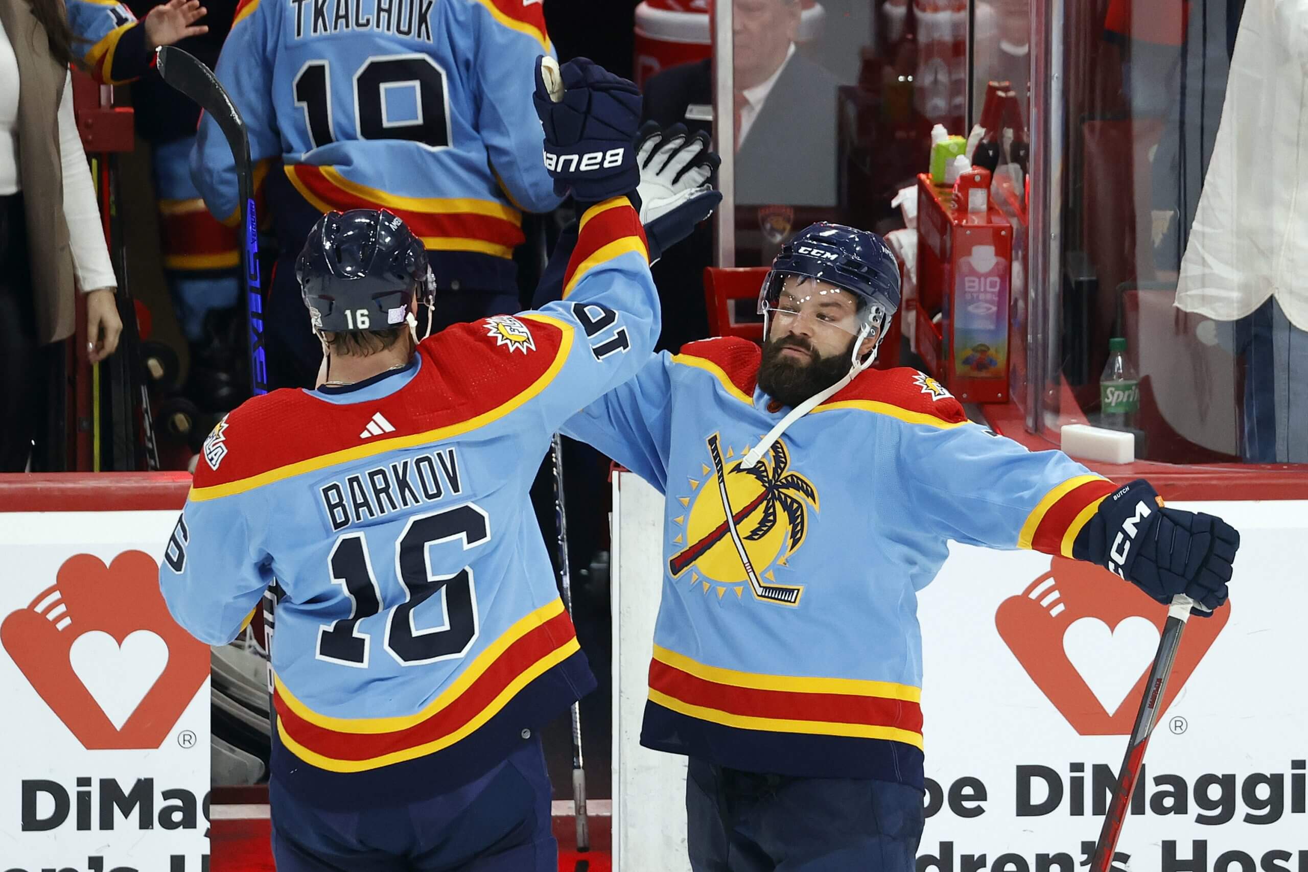
Radko Gudas and Aleksander Barkov, while playing for the Panthers in 2022. (Joel Auerbach / Getty Images)Worst: 2022-23 Reverse Retro
There’s a lot going on here, and that baby blue is pretty wild for a main color. The palm tree might help bring in free agents, though. — James Mirtle
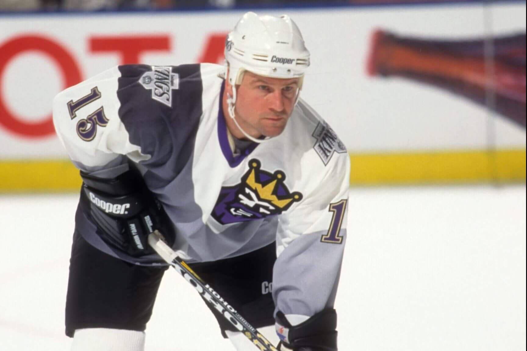
Los Angeles Kings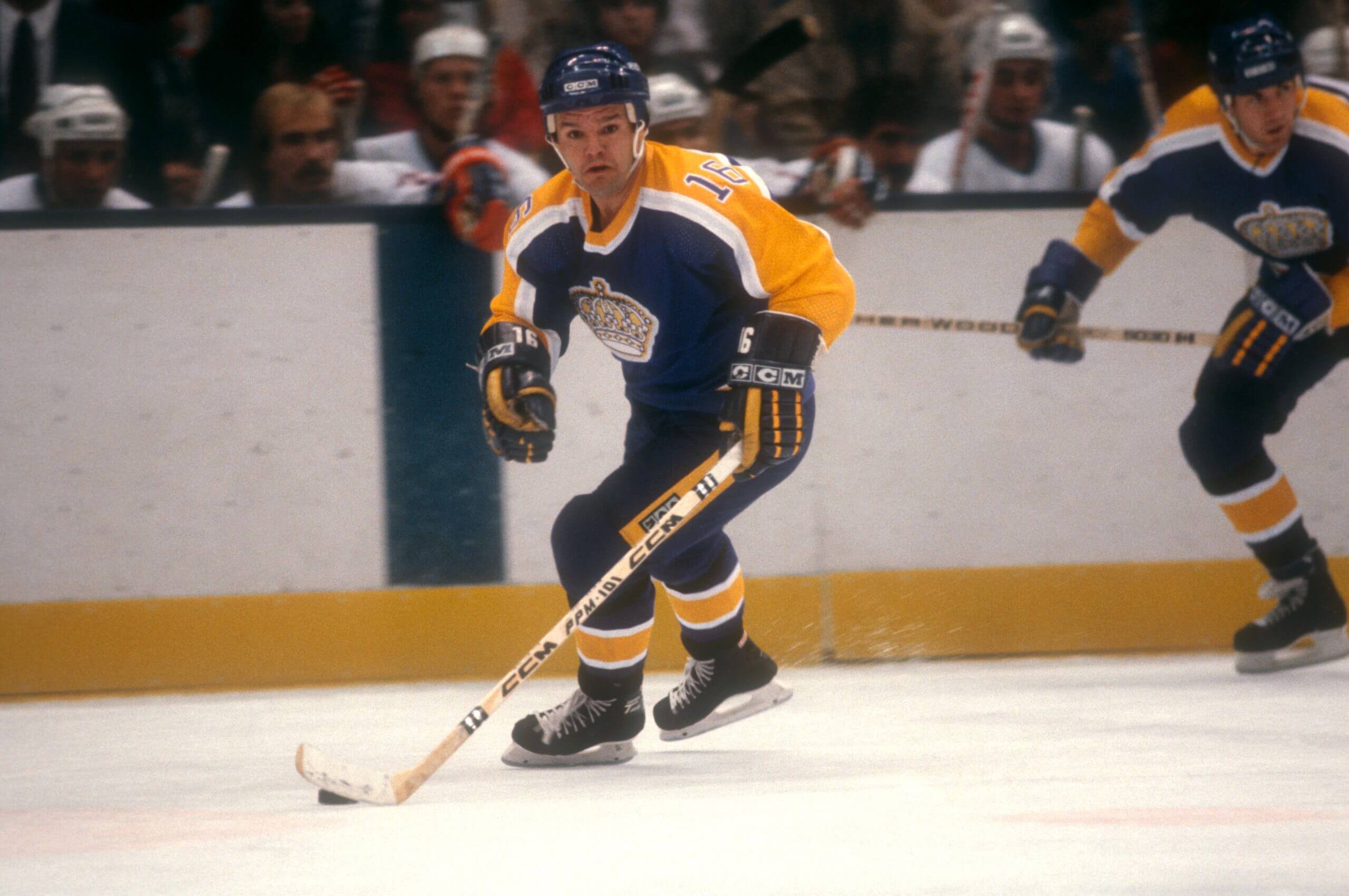
Marcel Dionne, while playing for the Kings in 1982. (Bruce Bennett Studios via Getty Images Studios / Getty Images)Best: 1967-88 road
It’s true that the black-and-white color scheme with the home plate/chevron logo represents their most successful period, but the “Forum blue” and gold era still rules. Variations were made in the early years, especially in the shoulder yokes, to better incorporate both colors in the home and road sets. Even the white 2022-23 Reverse Retro was sharp.
Pat Conacher, while playing for the Kings in 1996. (W Roberts / Bruce Bennett Studios via Getty Images Studios / Getty Images)Worst: 1995-96 “Burger King” alternate
I will not have it this way. No. A thousand times no. (Honorable mention: The 2020 Stadium Series threads. Not good.) — Eric Stephens
Minnesota Wild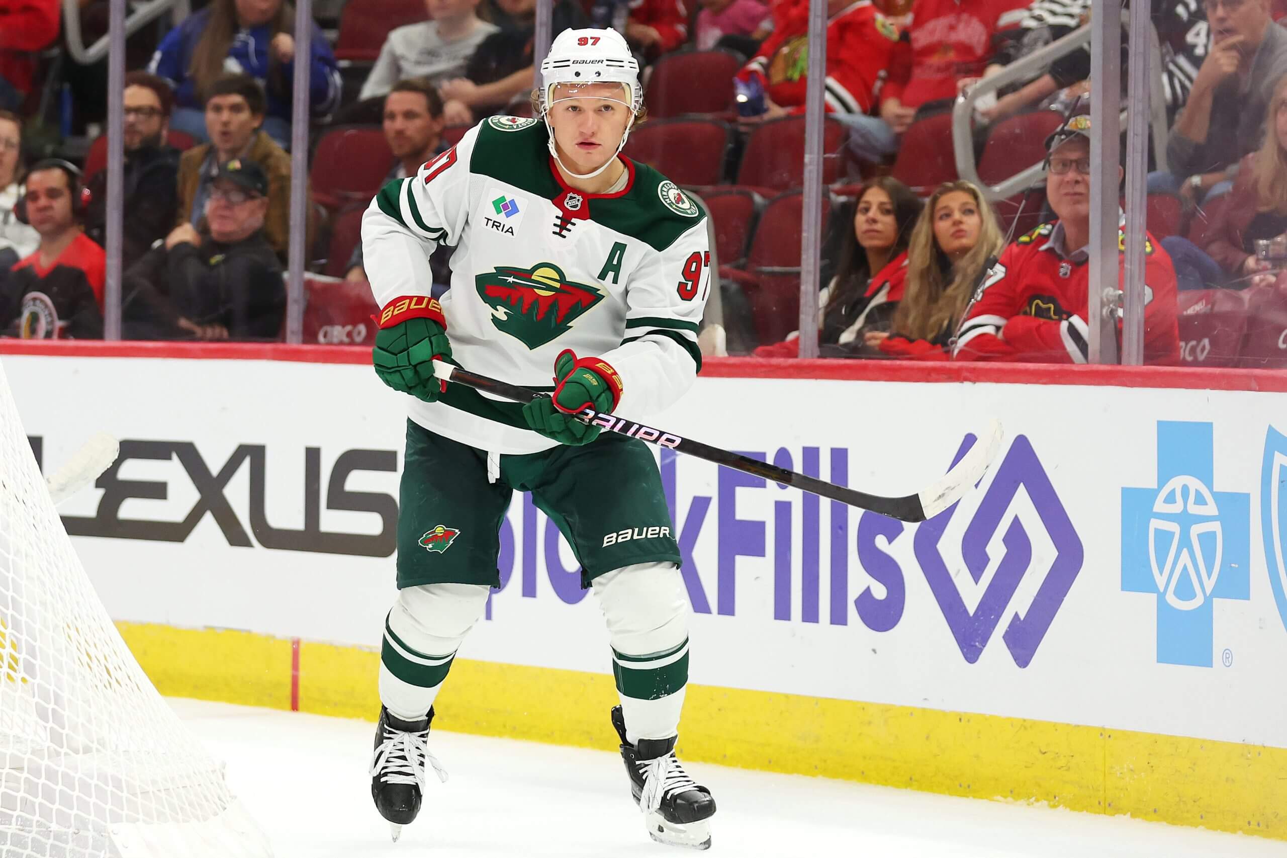
Kirill Kaprizov, while playing for the Wild in 2024. (Michael Reaves / Getty Images)Best: Current white road
I’m one of the rare people who loved the old red Christmas jerseys. In fact, there are a number of Wild players who have told me they wish they still wore them. I also loved the green classic sweaters back in the early 2010s with ‘Minnesota Wild’ in script. But the current whites look so clean and neat and perfect close up and on the ice.
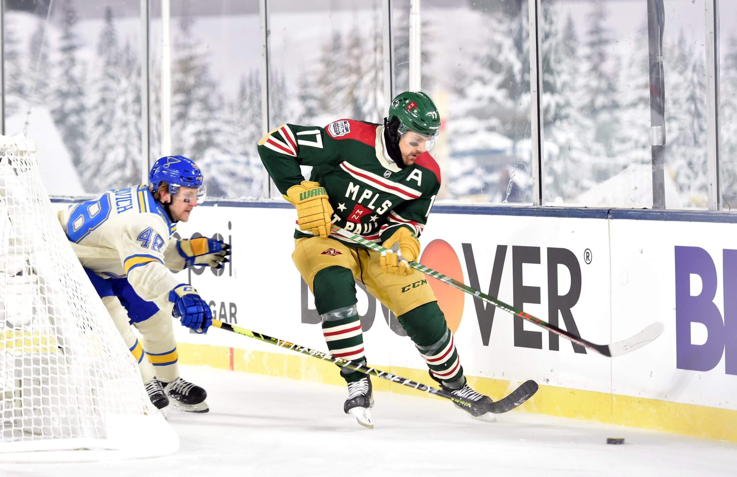
The Wild’s Marcus Foligno skates with the puck against the Blues’ Scott Perunovich in 2022. (Jeffrey Becker / USA Today)Worst: 2022 Winter Classic
I’m tempted to go with the North Stars-inspired Subway-looking third jerseys to rile you up, but the Winter Classic ones were worse thanks to the weird beige elbow pads and pants that looked like diapers from afar in the sub-zero Minnesota temperatures. It didn’t help that the Blues’ jerseys looked so good and that the Wild played poorly in the game. — Michael Russo
Montreal Canadiens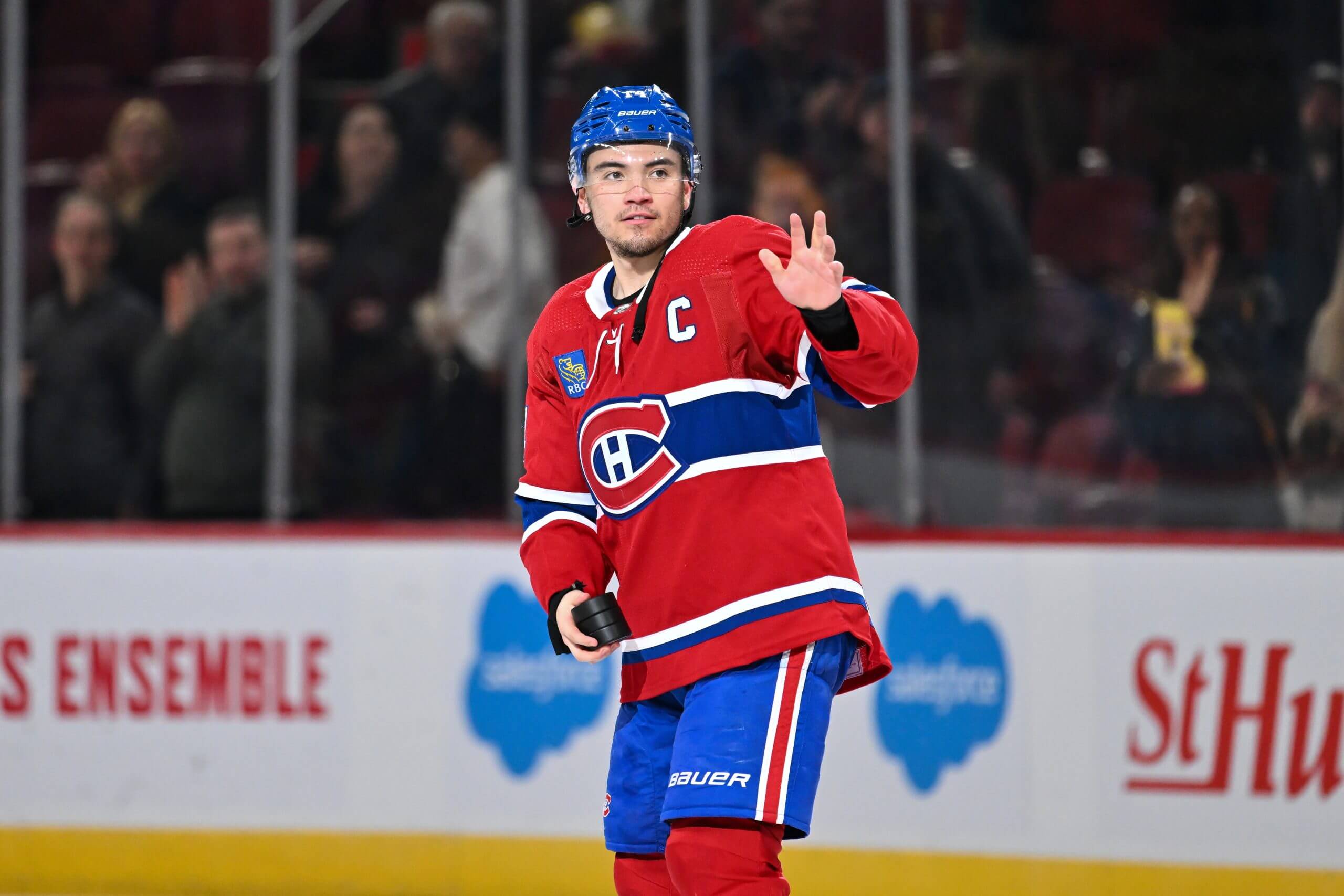
Nick Suzuki, while playing for the Canadiens in 2024. (Minas Panagiotakis / Getty Images)Best: Current
This question does not really apply to the Canadiens. There have been a handful of moments in more than 100 years of team history where the sweater has changed, but the look has largely been extremely consistent. There’s a reason for that.
Maxim Lapierre, while playing for the Canadiens in 2009. (Andre Ringuette / NHLI via Getty Images)Worst: 2008-10 Centennial “Barber Pole”
These sweaters, originally worn in 1912-13, brought the Canadiens such bad luck, they stopped using them earlier than they were supposed to as part of the team’s interminable centennial celebrations. — Arpon Basu
Nashville Predators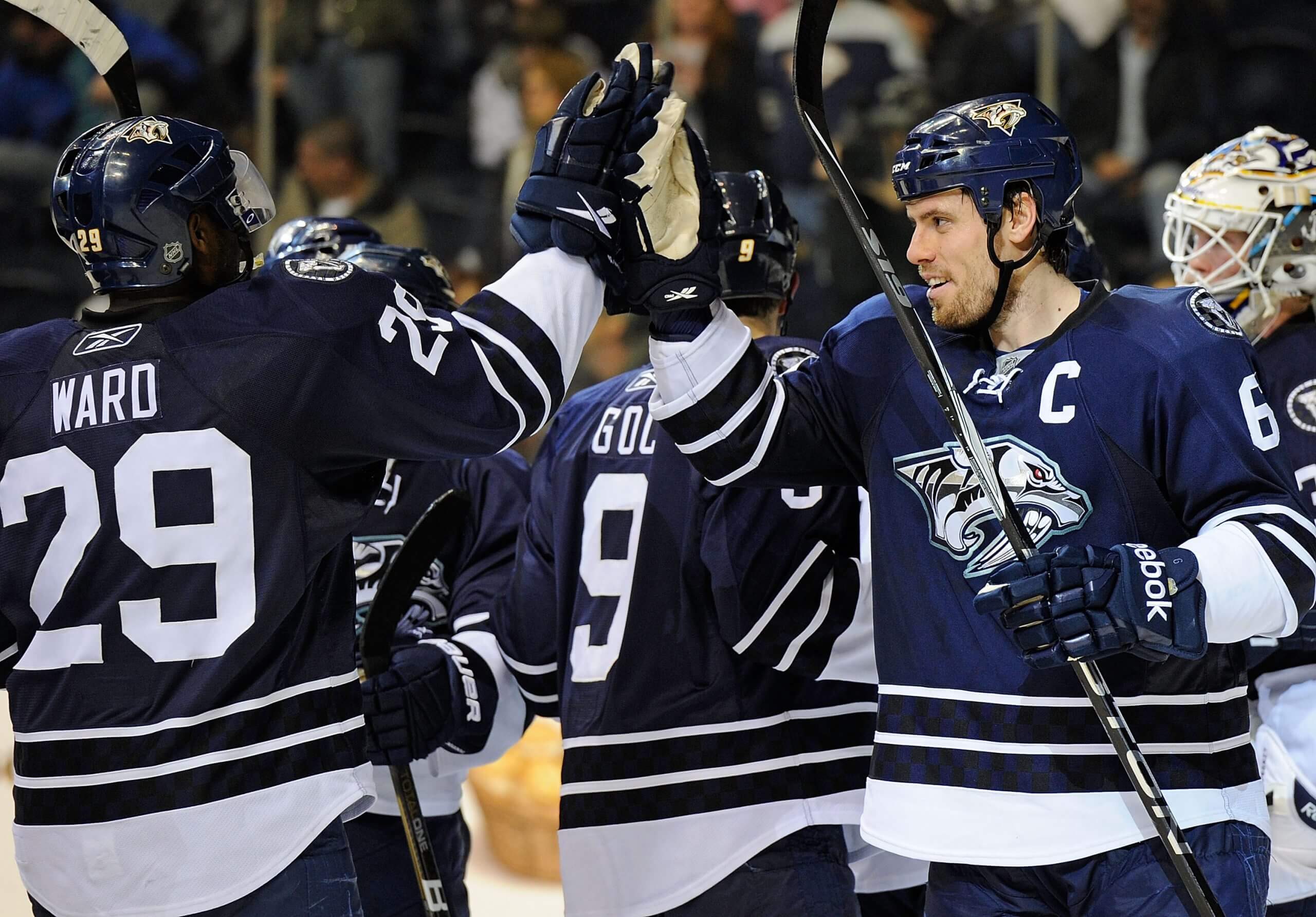
Shea Weber and Joel Ward, while playing for the Predators in 2010. (Frederick Breedon / Getty Images)Best: 2009-11 alternate
These beauties, worn in the 2009-10 and 2010-11 seasons, had a navy base, the Predators’ main logo in the center, a checkerboard pattern along the waist and tiger skulls on the shoulders. They are icy, clean and good enough that the franchise should have adopted them full-time and eliminated gold as a primary color.
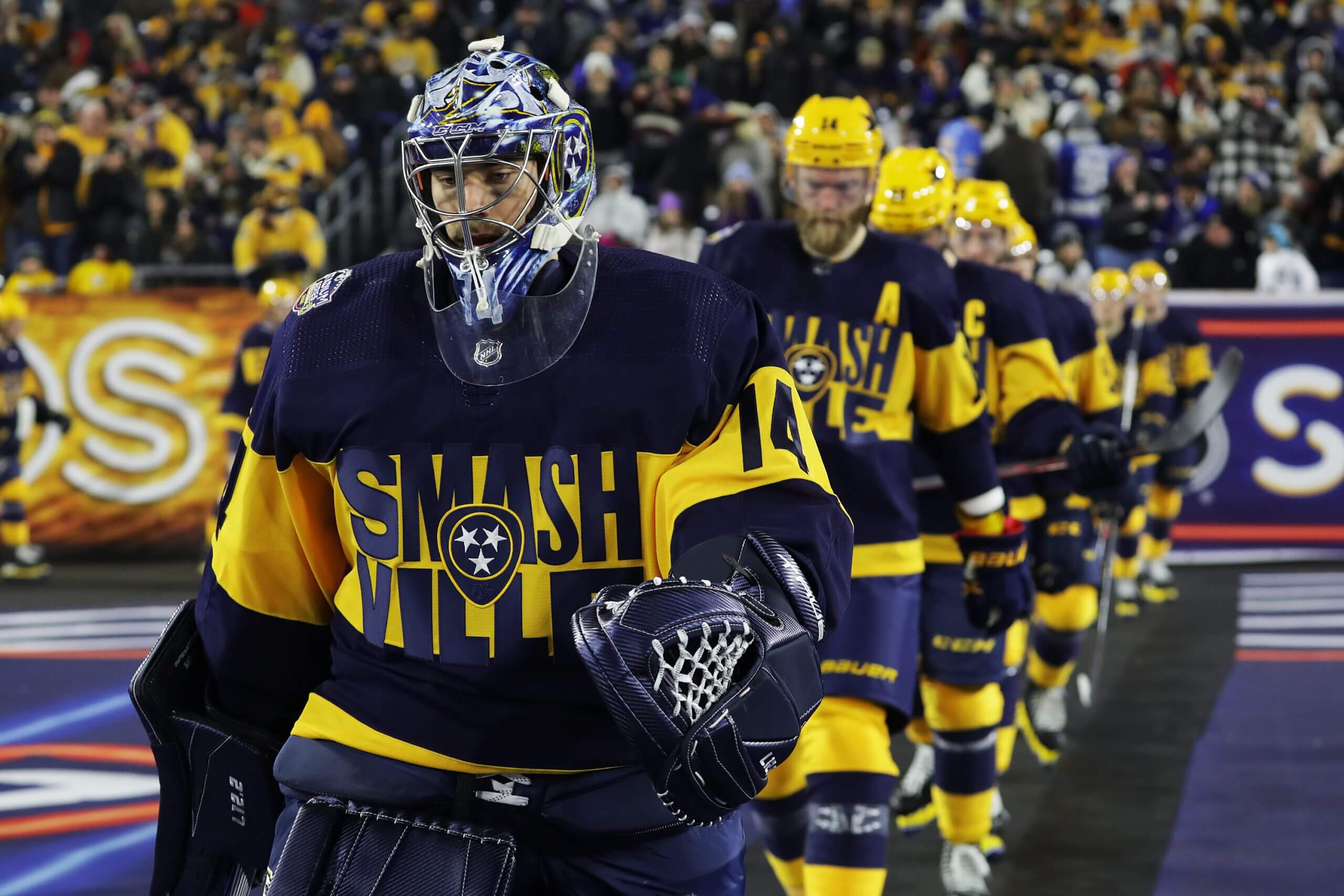
Juuse Saros, while playing for the Predators in 2022. (Donald Page / Getty Images)Worst: 2022 Stadium Series
Just awful. “SMASHVILLE” in all caps on two lines, with the tri-star logo of the Tennessee state flag in the center. The color scheme of navy on top, gold in the middle and navy on the bottom isn’t bad, but the lettering ruins everything. Fashion is cyclical, but some things — such as plaid leisure suits and these jerseys — should never see the light of day again. — Joe Rexrode
New Jersey Devils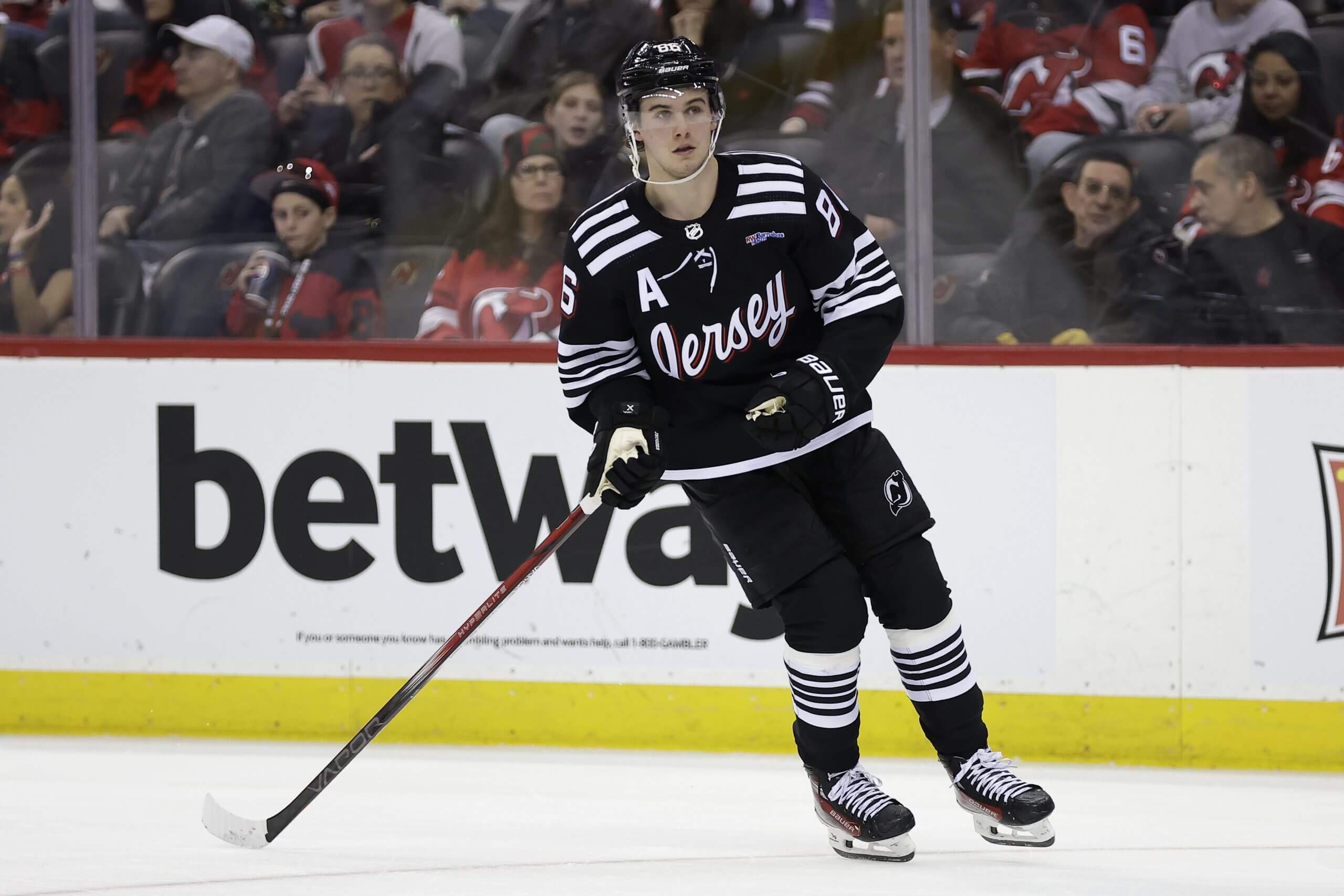
Jack Hughes, while playing for the Devils in 2024. (Adam Hunger / Getty Images)Best: 2021-present “Jersey” alternate
The black sweaters with “Jersey” on the front are sleek and pop whenever they are on the ice. The font is perfect and the bits of red still pop, which is important given the team’s branding.
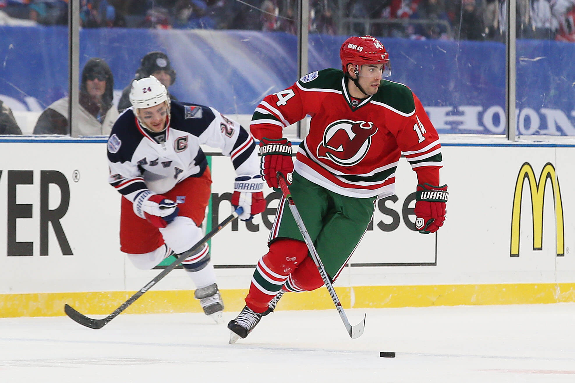
Adam Henrique, while playing for the Devils in 2014. (Bruce Bennett / Getty Images)Worst: 2014 Stadium Series
Most of the Devils jerseys look the same, so it’s hard to pick one out as dramatically worse than the others. The Stadium Series jersey was fine in 2014, but the green pants don’t always do it for me. — Peter Baugh
New York Islanders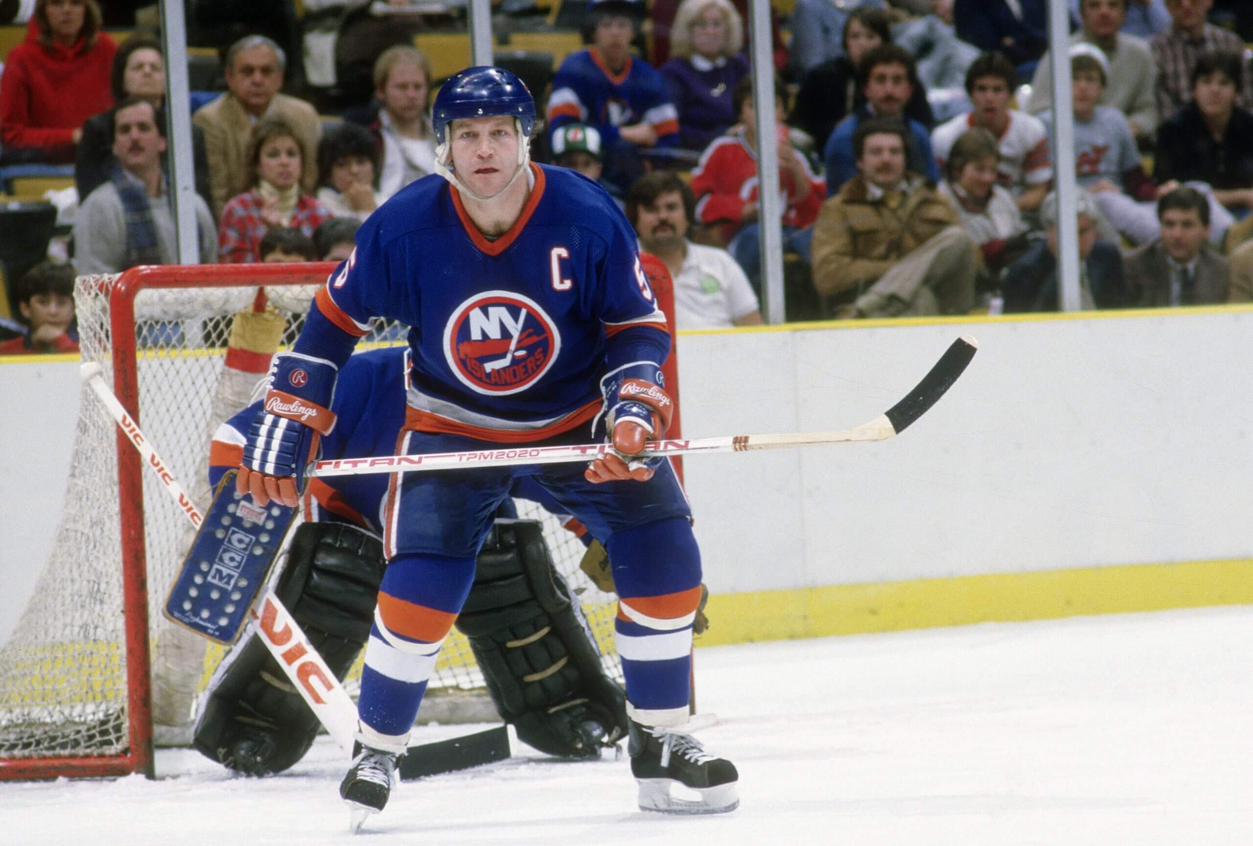
Denis Potvin, while playing for the Islanders in 1979. (Focus on Sport / Getty Images)Best: 1978-84 road
The 1996-98 home jersey is a close second, because it combines the classic Islanders logo with a really unique stripe pattern. The home jersey of the late ’70s just brings the best elements together, the orange V-neck adds a classic vibe and the orange bordering on the name/numbers adds more intrigue, without being a distraction.
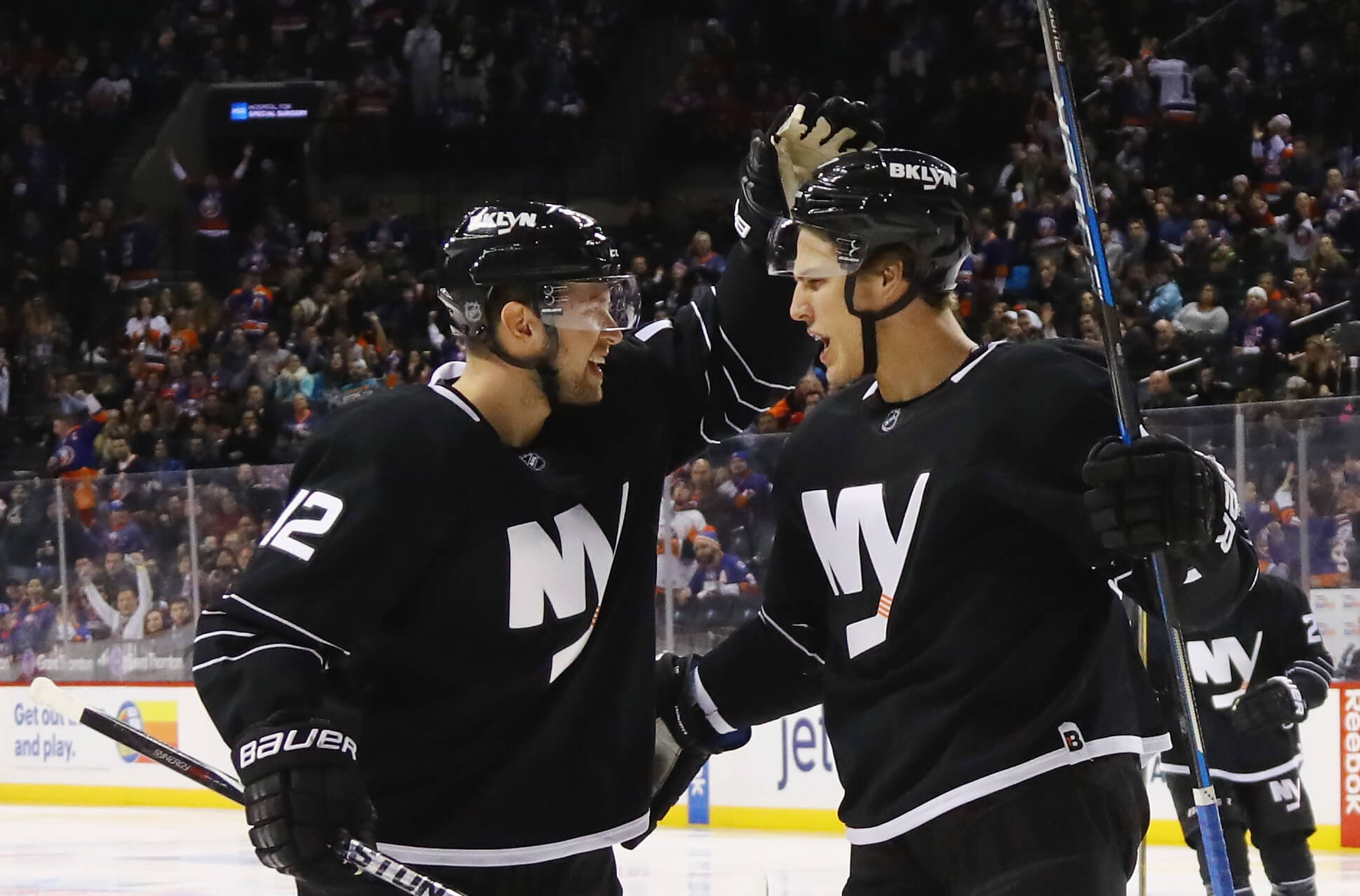
Josh Bailey and Anders Lee, while playing for the Islanders in 2016. (Bruce Bennett / Getty Images)Worst: 2015-17 black alternate
As much as a black-and-white color scheme made sense for the Islanders’ Barclays Center era, it’s a total miss. The logo is sharp, but there just isn’t enough character to make it a primary logo (versus a shoulder patch) — especially on a bland base of a jersey. There are too many black jerseys in this league, and this one was particularly forgettable. — Shayna Goldman
New York Rangers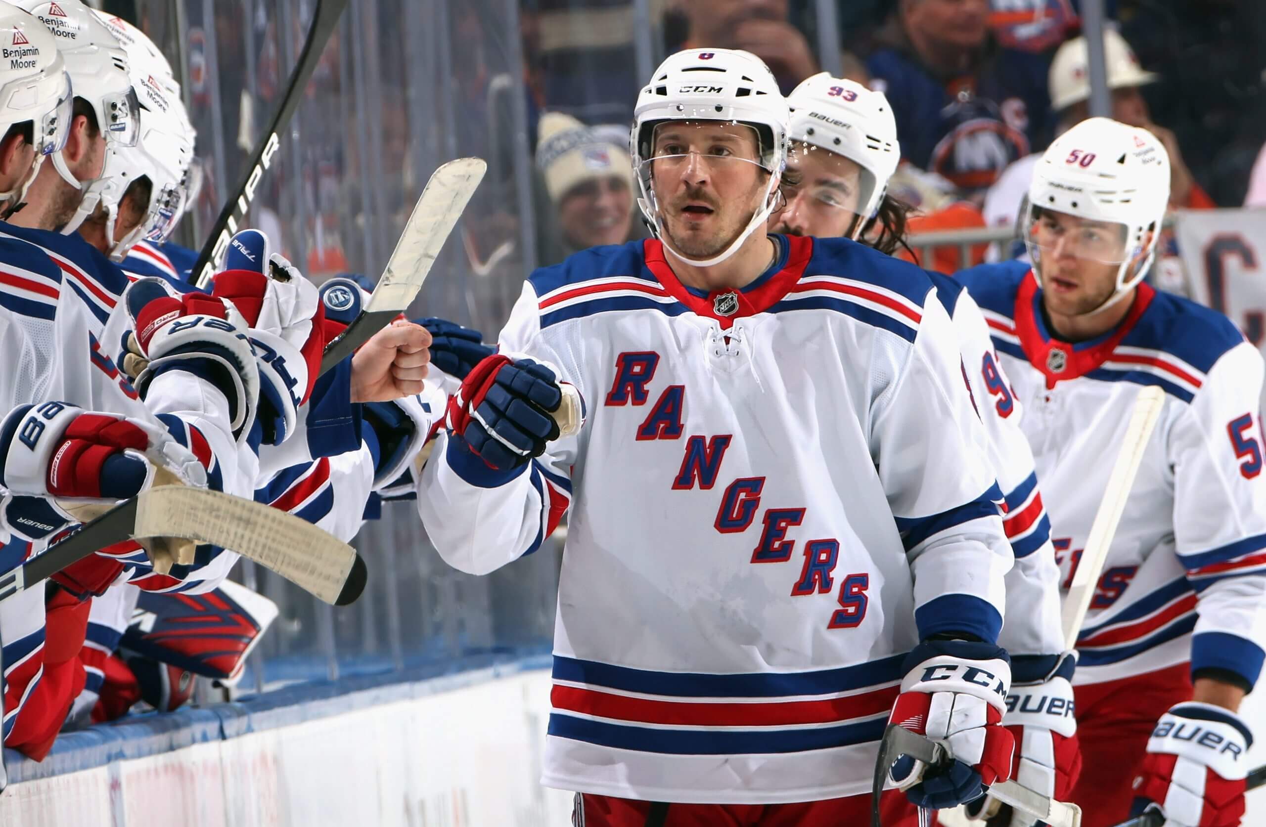
J.T. Miller, while playing for the Rangers in 2025. (Bruce Bennett / Getty Images)Best: Current road
The Rangers’ white road jerseys are simple, clean and some of the best in the league. There’s a reason the look has stuck around so long: no need to change what looks good.
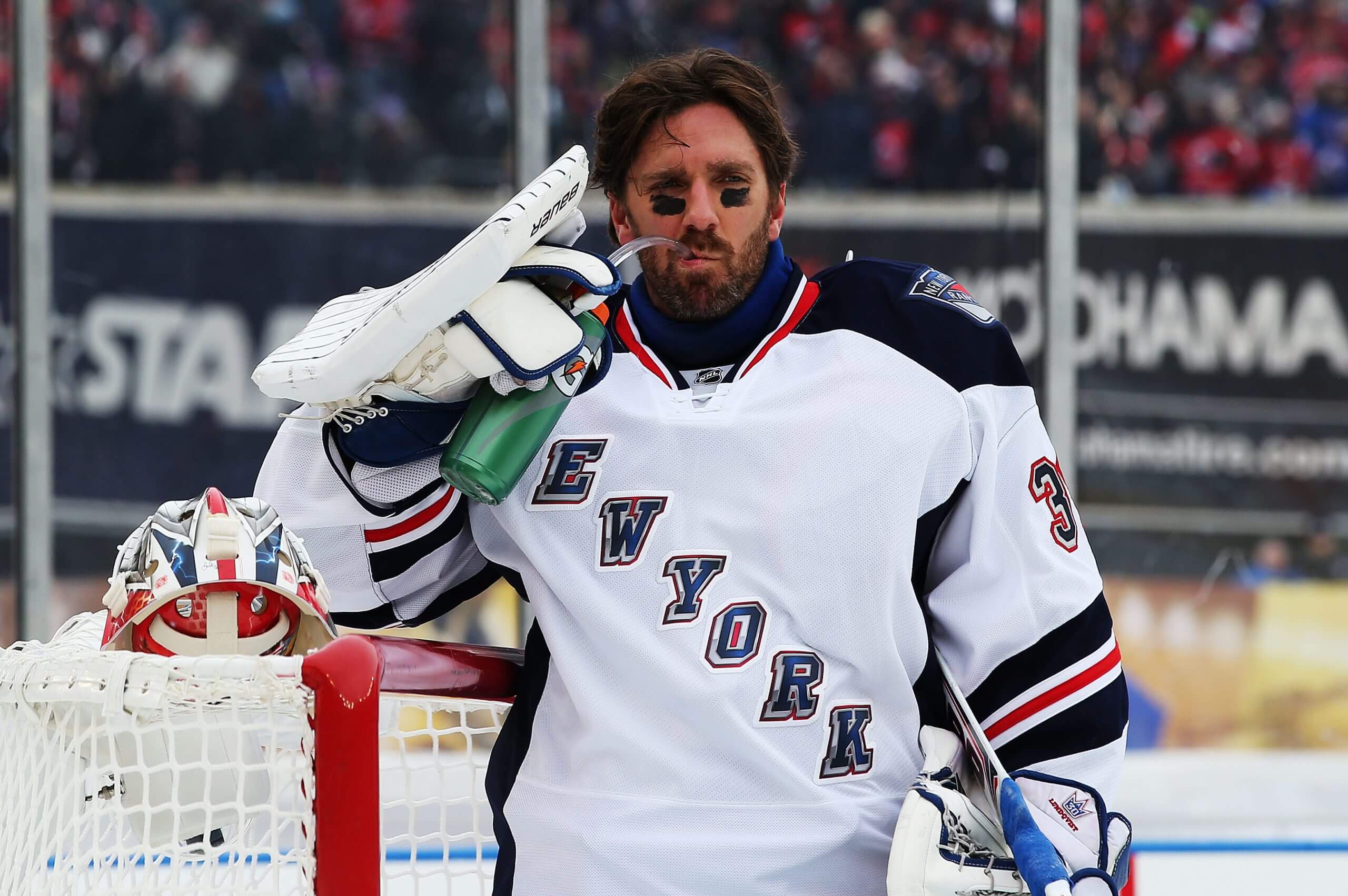
Henrik Lundqvist, while playing for the Rangers in 2014. (Bruce Bennett / Getty Images)Worst: 2014 Stadium Series
It’s not terrible, but it doesn’t look as good as the Rangers’ normal jerseys and it felt a little boring for an alternate. — Peter Baugh
Ottawa Senators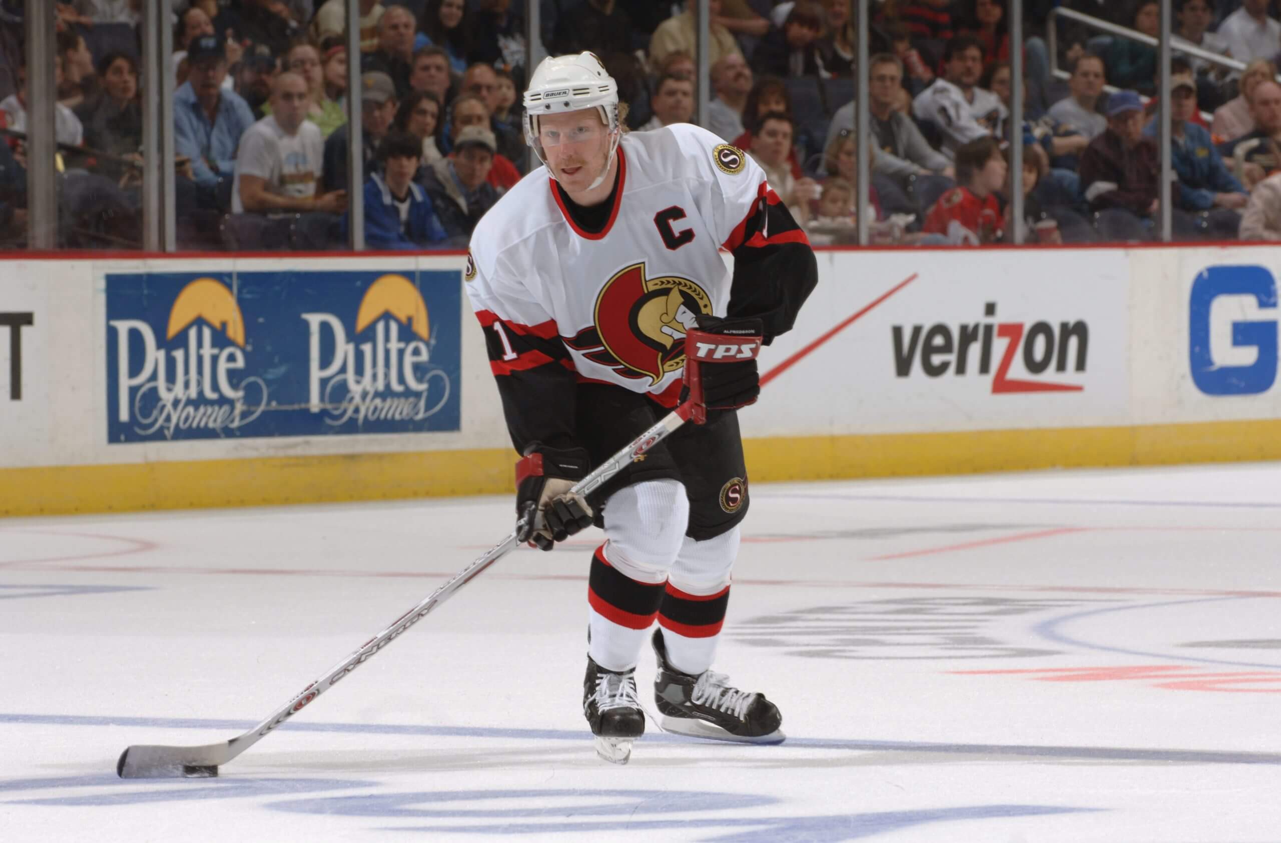
Daniel Alfredsson, while playing for the Senators in 2006. (Mitchell Layton / Getty Images)Best: 1992-2007 white road
A classic Senators jersey that stood the test of time for 15 years before they moved away from it at the start of the 2007-08 campaign. The hallmark of the jersey is the 2D logo, which should never have been taken off their jerseys. Honorable mention to their 2011-17 alternate. You know, the one Rihanna made famous?
We just hope both teams are having fun at the Rihanna concert tonight 🥰 🎶 #GoSensGo pic.twitter.com/5ibr7Py4ny
— Ottawa Senators (@Senators) February 13, 2023

Milan Michalek, while playing for the Senators in 2011. (Phillip MacCallum / Getty Images)Worst: 2008-11 alternate
I’m usually a big fan of jerseys with black as their base. But this ain’t it. A loud “SENS” on the front looks tacky and the way the red and black are assembled on the jersey just doesn’t look great. It’s not a fashionable jersey worth wearing on and off the ice. — Julian McKenzie
Philadelphia Flyers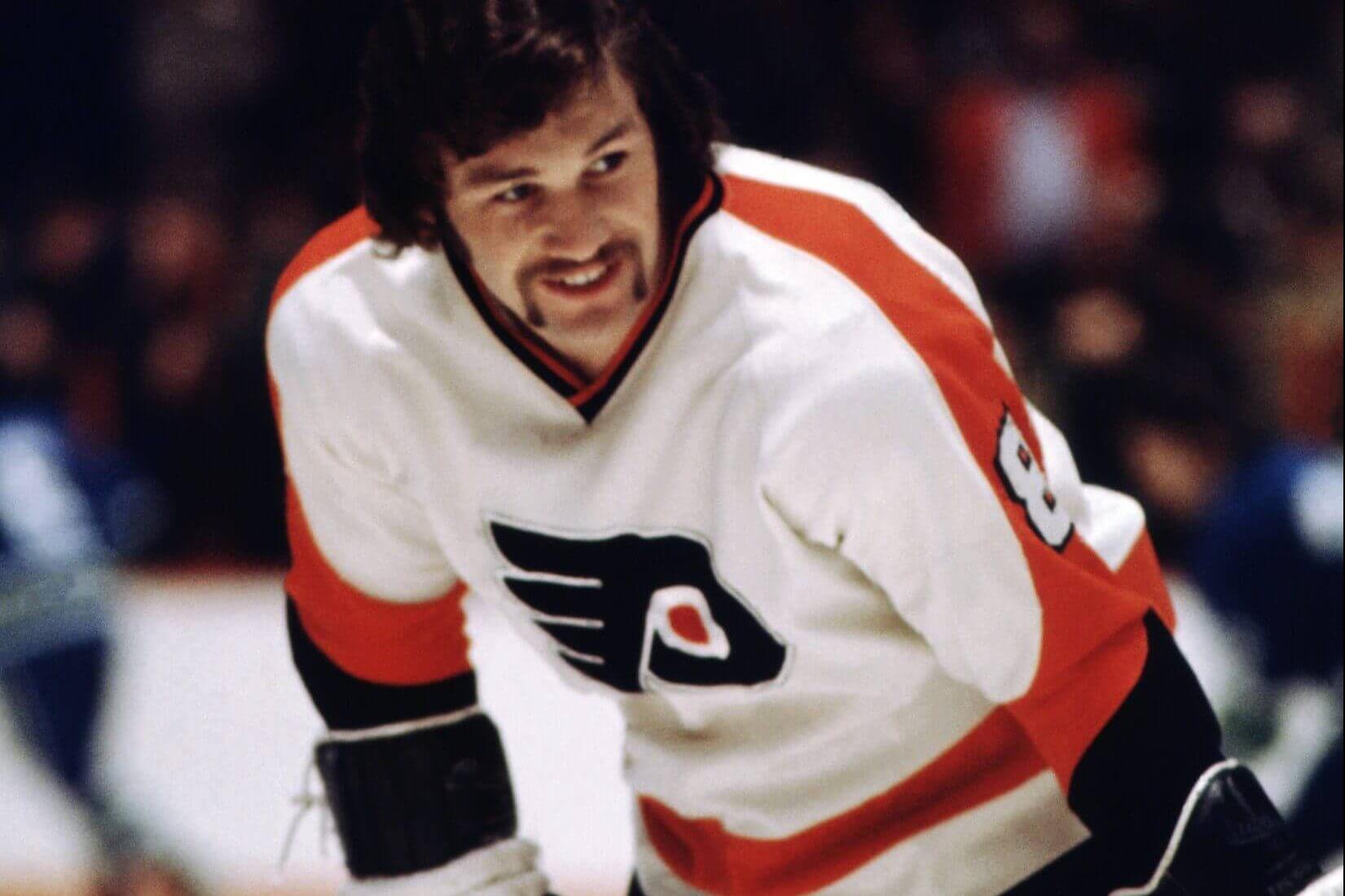
Dave Schultz, while playing for the Flyers in 1973. (Bruce Bennett Studios via Getty Images Studios / Getty Images)Best: 1972-77 white home
When the Flyers introduced new sweaters prior to the 2023-24 season, it was noticeable that they looked pretty similar to the sweaters in which they won their only two Stanley Cup championships.

Freddy Meyer, while playing for the Flyers in 2006. (Len Redkoles / Getty Images)Worst: 2002-07 alternate
The only time the Flyers messed with their classic logo came when they used these monstrosities that didn’t last very long. — Kevin Kurz
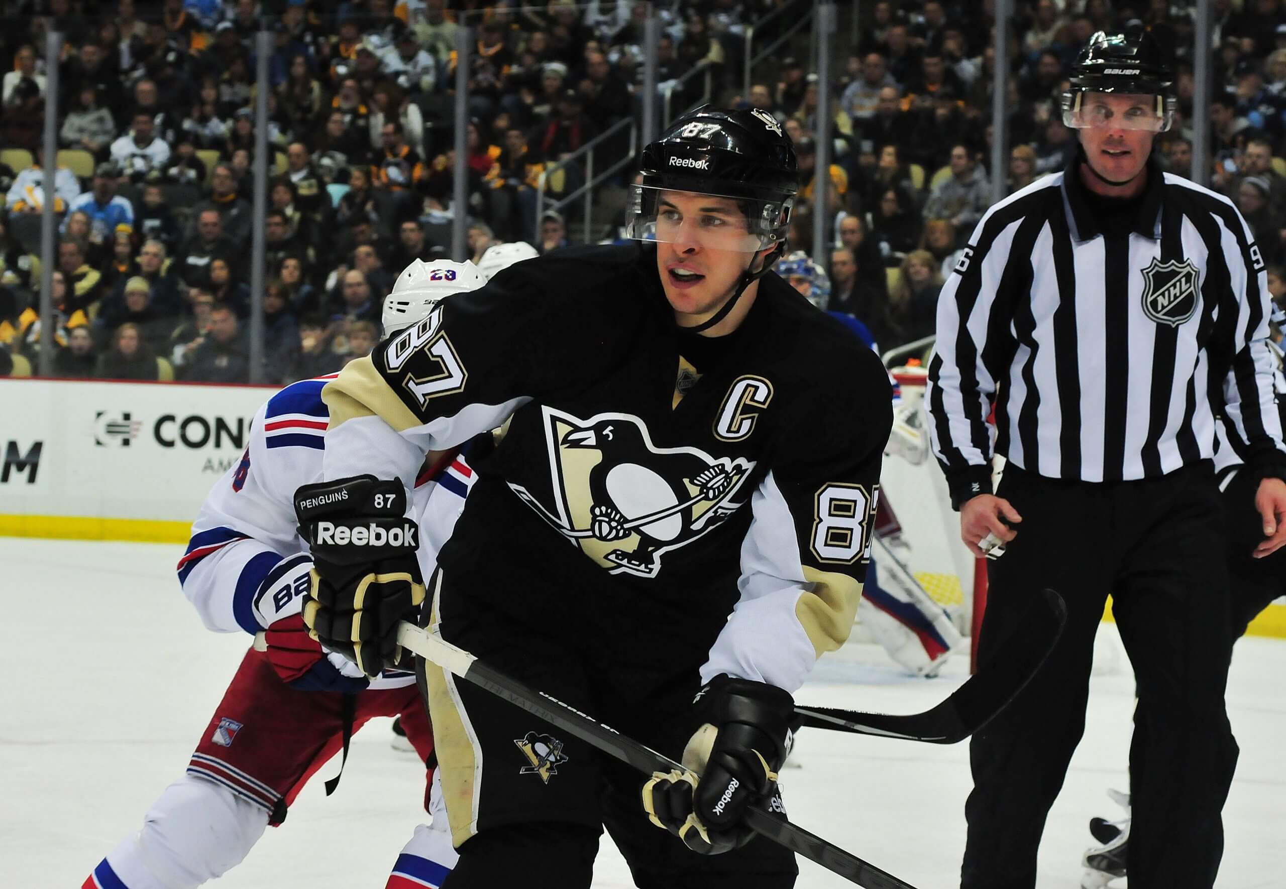
Pittsburgh Penguins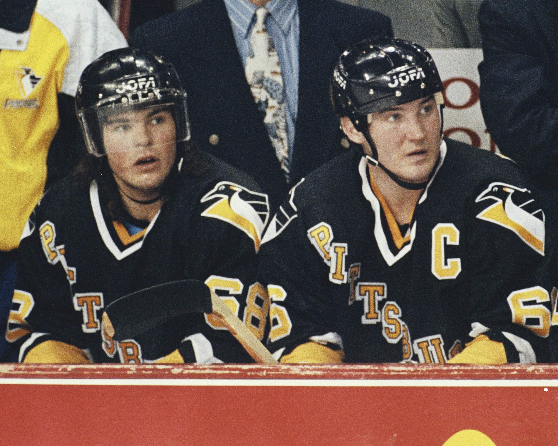
Mario Lemieux and Jaromir Jagr, while playing for the Penguins in the 1990s. (Denis Brodeur / NHLI via Getty Images)Best: 1992-97 black road
The 1992-97 sweater, made famous by Snoop Dogg in the 1994 music video for “Gin and Juice,” is an all-time classic. While it wasn’t totally original — it looks an awful lot like the Rangers sweater — something about the color scheme just pops. Prime Mario Lemieux and Jaromir Jagr in those uniforms make it even more special for Penguins fans.
Drop (that puck) like it’s hot.
Hi @SnoopDogg! 👋 pic.twitter.com/PyCCXr9zPP
— Pittsburgh Penguins (@penguins) January 13, 2019
Sidney Crosby, while playing for the Penguins in 2015. (Matt Kincaid / Getty Images)Worst: 2007-2016 black Vegas gold
The Penguins went back to their roots after a decade of these hideous uniforms and have been more visually pleasing ever since. Just a drab collection of colors that never looked right. — Josh Yohe
San Jose Sharks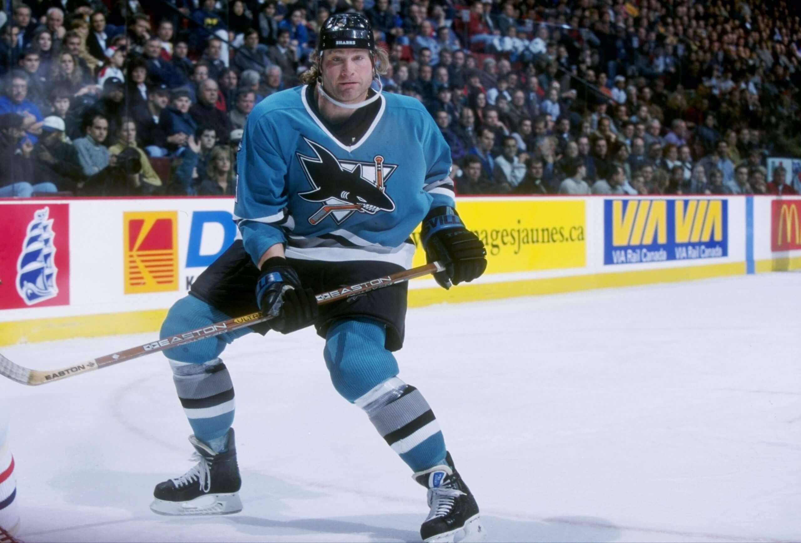
Marty McSorley, while playing for the Sharks in 1997. (Robert Laberge /Allsport)Best: 1991-98 road
Teal. For real. The Sharks were bad in those early years, but man, they managed to look so good while being horrible. Even with some changes over the decades, the color has worked so well that they’ve never gone away from it. Good call.
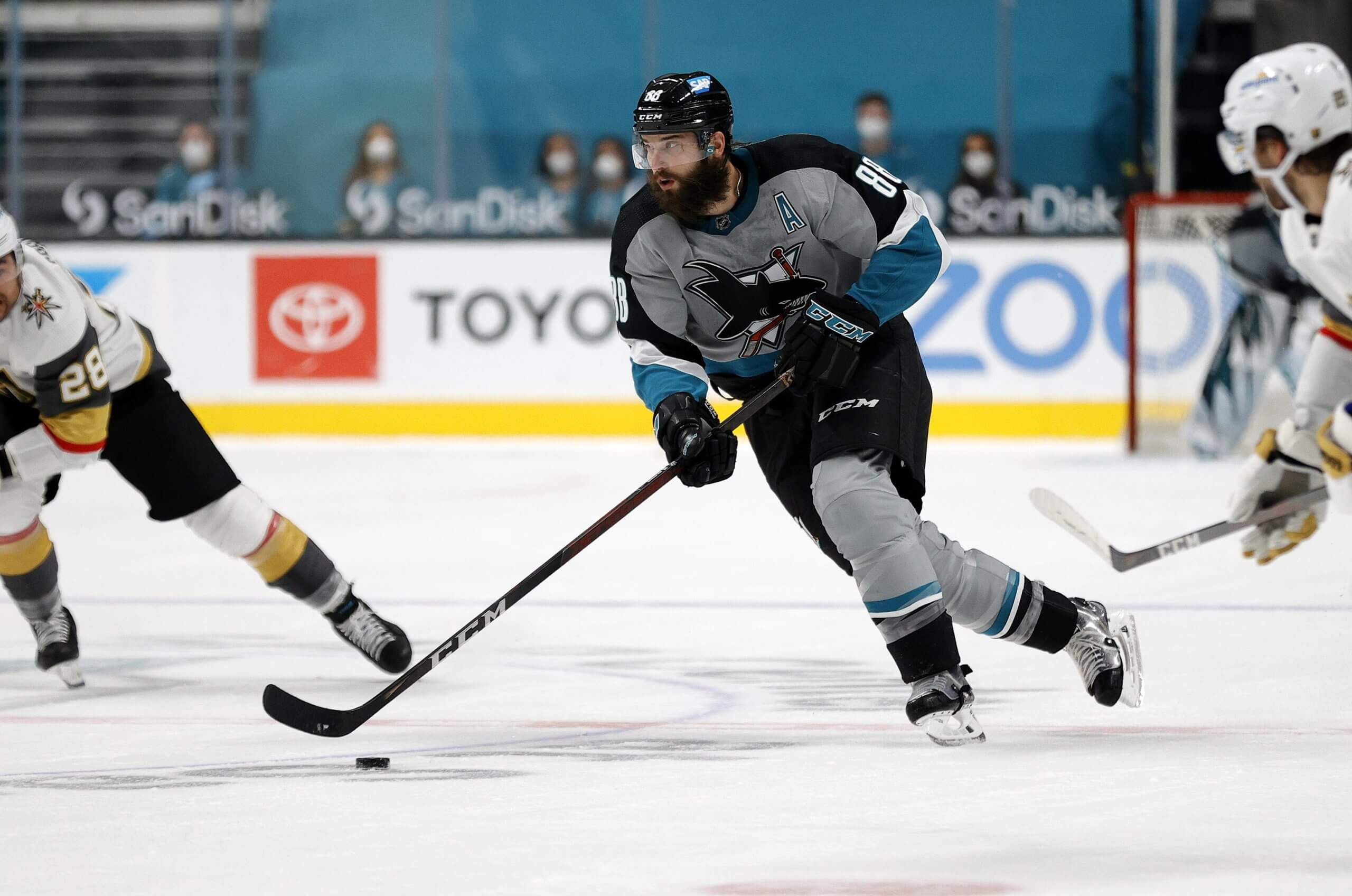
Brent Burns, while playing for the Sharks in 2021. (Ezra Shaw / Getty Images)Worst: 2021 Reverse Retro
First off, the Sharks have never had some truly awful designs. Props to them. Even the black-based alternates over the years have been solid. (Black is overdone as a uniform color, but the pops of teal helped break it up.) This combination wasn’t terrible. It just wasn’t a winner. — Eric Stephens
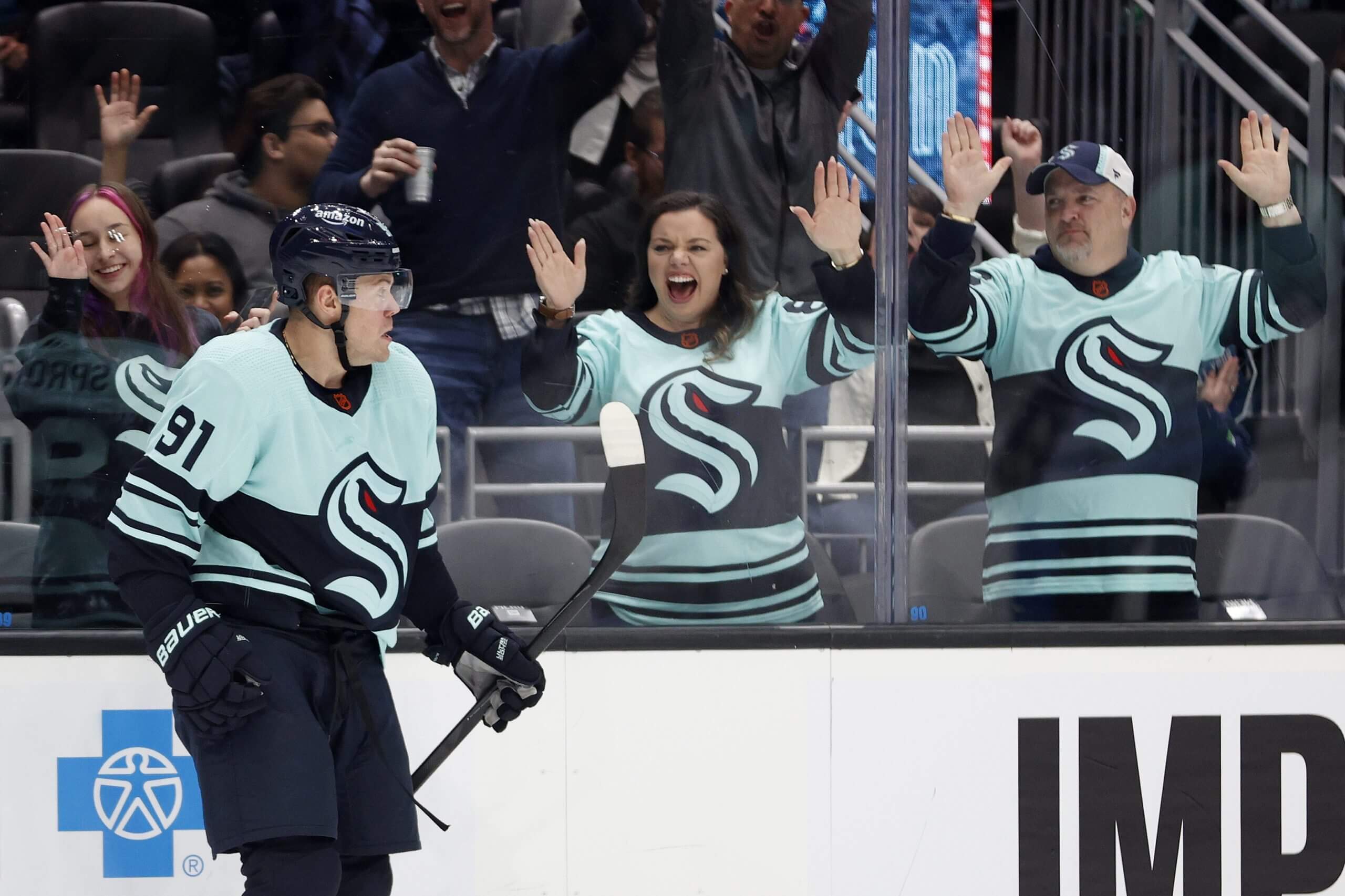
Seattle Kraken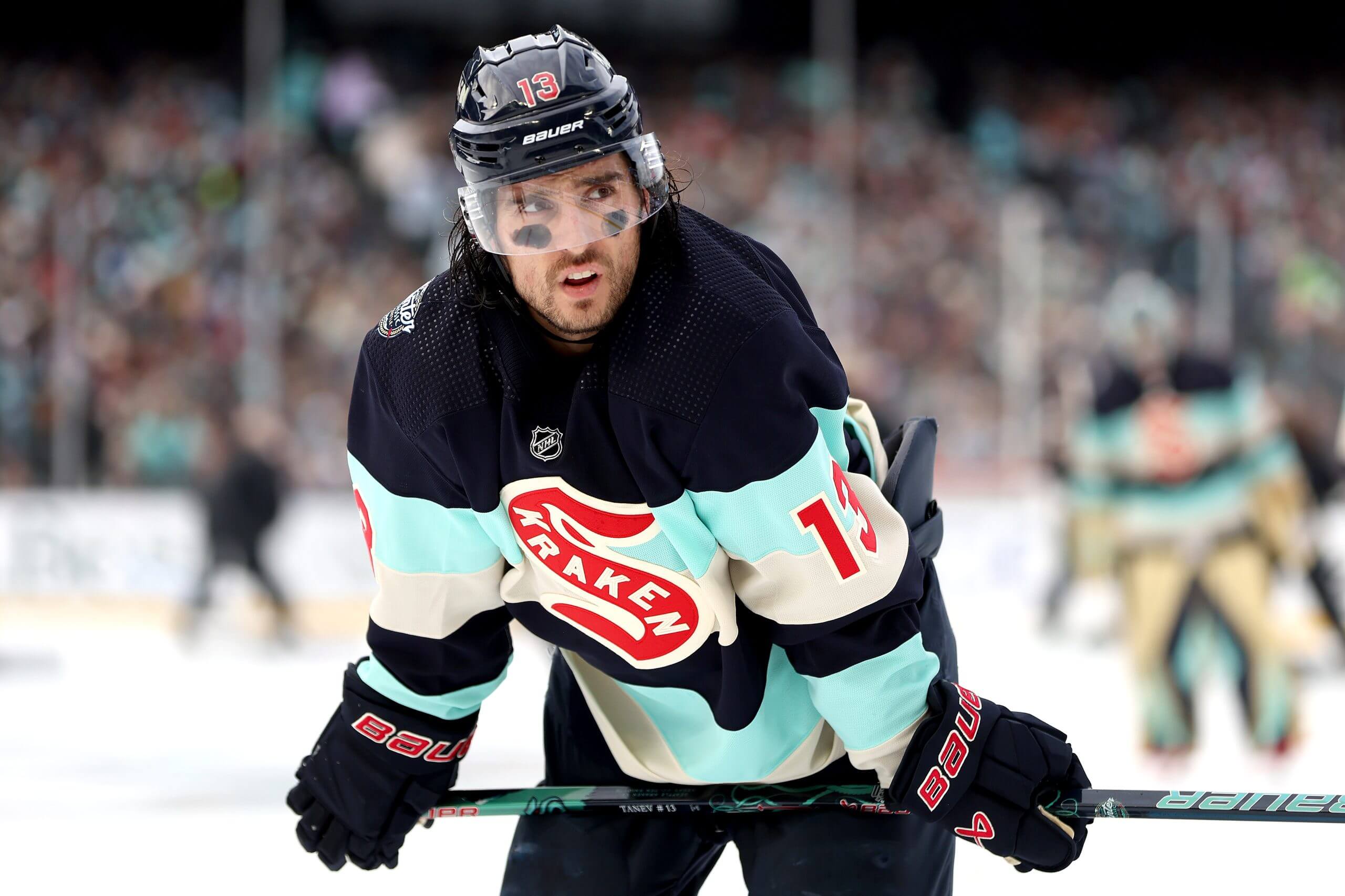
Brandon Tanev, while playing for the Kraken in 2024. (Steph Chambers / Getty Images)Best: 2024 Winter Classic
The Kraken’s 2024 Winter Classic jersey, which paid tribute to the old Seattle Metropolitans look, is one of the coolest single hockey jerseys any NHL team has worn across the past decade.
Daniel Sprong, while playing for the Kraken in 2022. (Steph Chambers / Getty Images)Worst: 2022-23 Reverse Retro
The Kraken’s 2022-23 revere retro sweater paid tribute to the 1940s era Seattle Ironmen, but in contrast with the other clean, simple Seattle looks in the franchise’s brief history, it was just a little bit too busy. — Thomas Drance
St. Louis Blues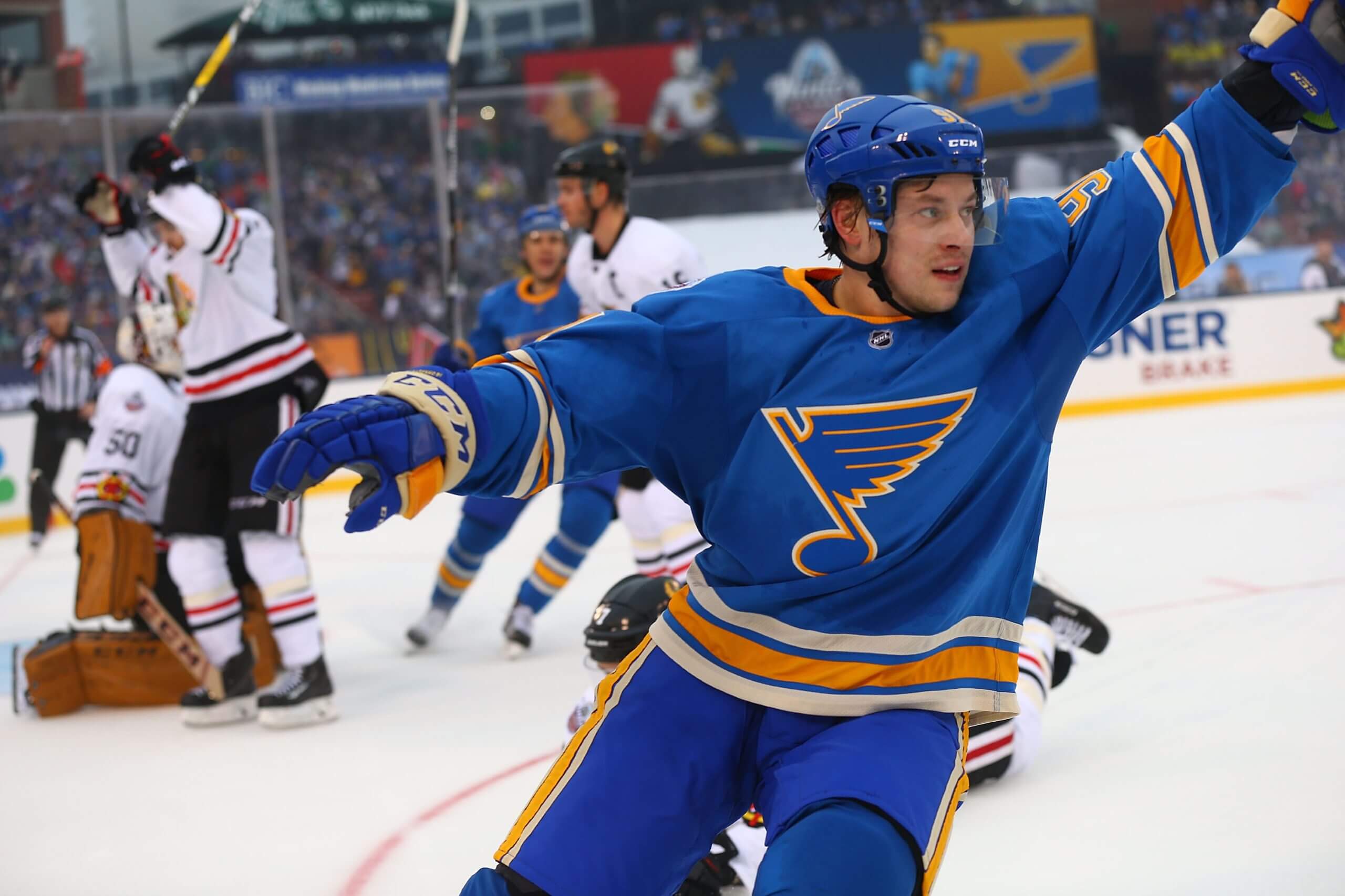
Vladimir Tarasenko, while playing for the Blues in 2017. (Dilip Vishwanat / Getty Images)Best: 2017 Winter Classic
The Blues went back to their roots with the jersey concept they wore in the 2017 Winter Classic against the Chicago Blackhawks. It’s a simple, clean look that features the heritage blue color they used from the late 1960s and early ’70s. It’s so good they’ve decided to make it their full-time uniform in 2025-26.
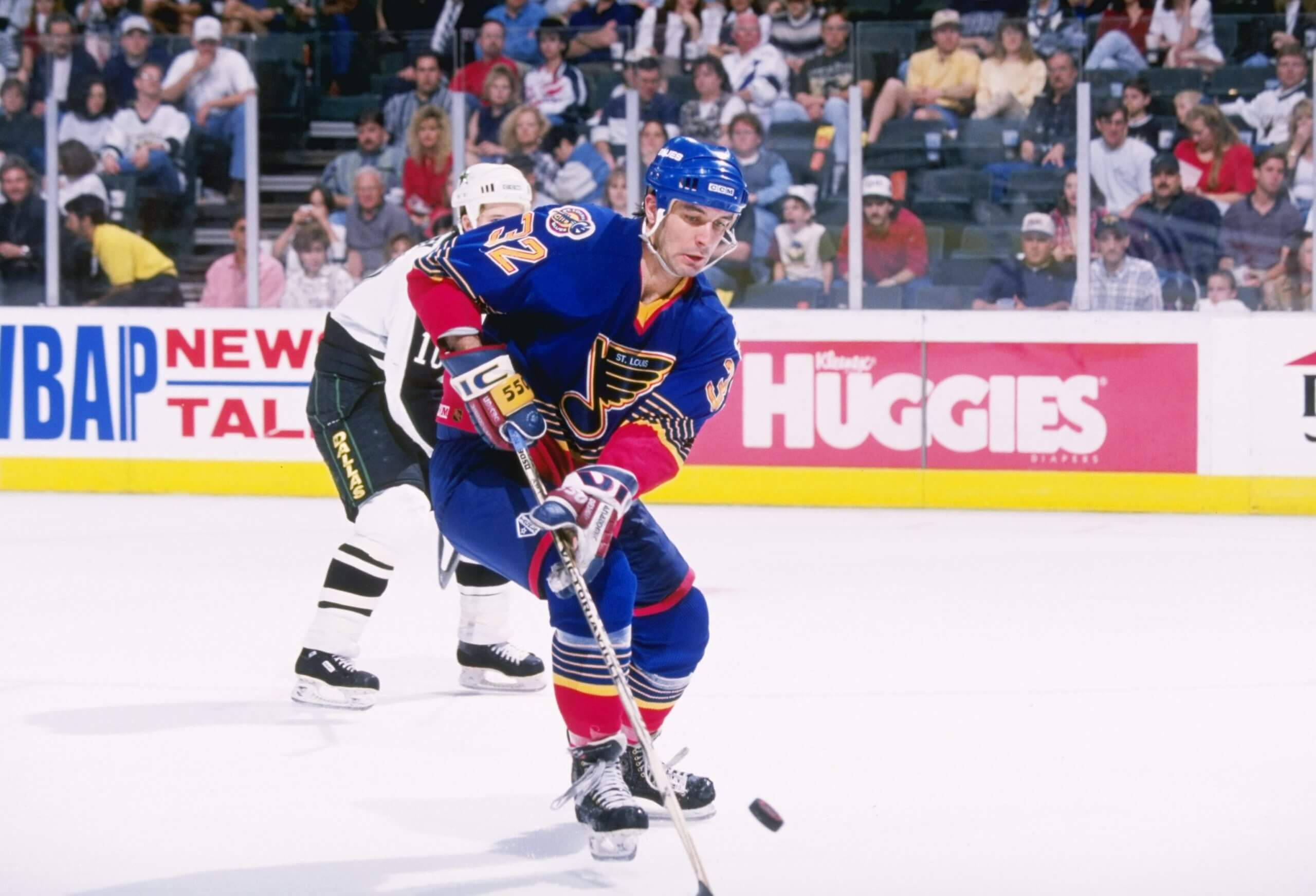
Stephane Matteau, while playing for the Blues in 1996. (Joe Patronite /Allsport)Worst: 1994-98 red/current ’90s throwback
The Blues had primarily worn two colors in their history — blue and yellow — before introducing red in the 1990s. Players and fans were mortified. In ’97, Blues executive Jim Woodcock worked wonders to return the team to blue. Interestingly, with the introduction of retros, the red is back — and some fans even like them. — Jeremy Rutherford
Tampa Bay Lightning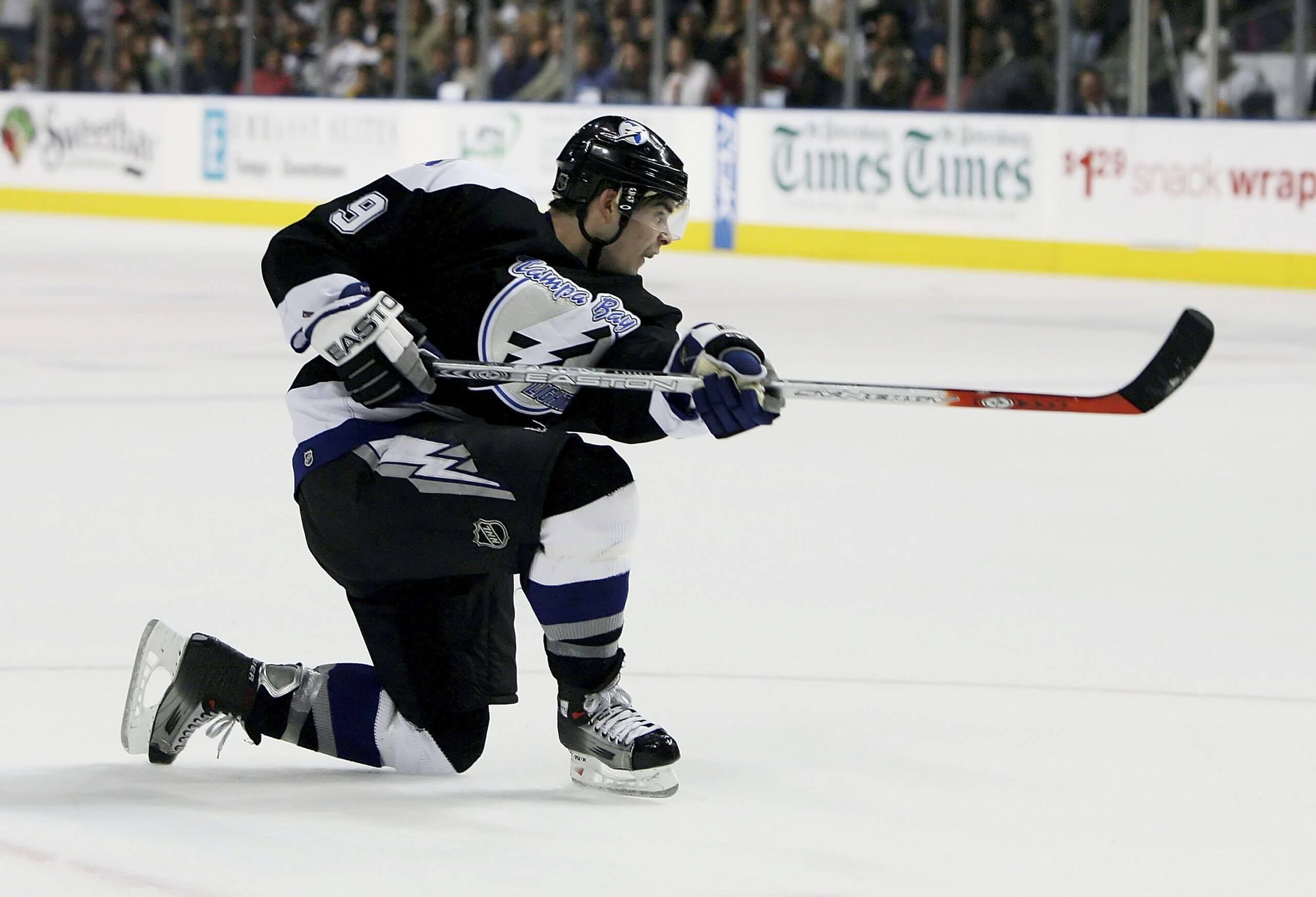
Eric Perrin, while playing for the Lightning in 2006. (Doug Benc / Getty Images)Best: 2001-07
This look is just iconic for the Lightning — especially in black. The shoulder patch with the bolt over Florida is really clean. The silver shimmer adds the perfect pop. And the blue accents tie it all together perfectly, as a border on the bottom hem, sleeves and collar. The simplified lettering on the back made the jerseys more readable by 2001.
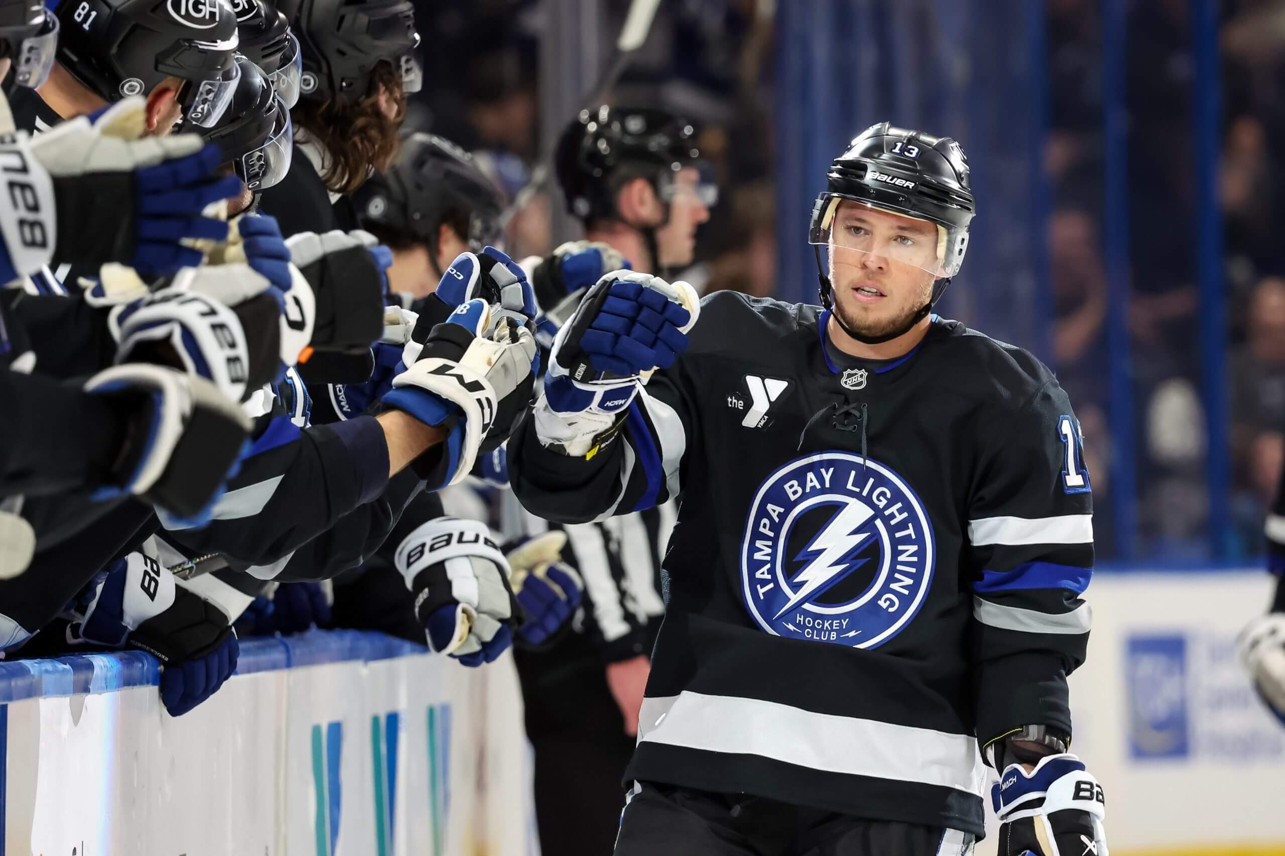
Cam Atkinson, while playing for the Lightning in 2024. (Mike Carlson / Getty Images)Worst: 2023-present black alternate
The black alternate feels like a tease of the originals, but falls short. It’s a little more interesting than the black “BOLTS” third from 2014, but with more blue accents, this should be a cooler jersey. The logo is too small and the striping pattern is just wrong. There’s so much squandered potential. — Shayna Goldman
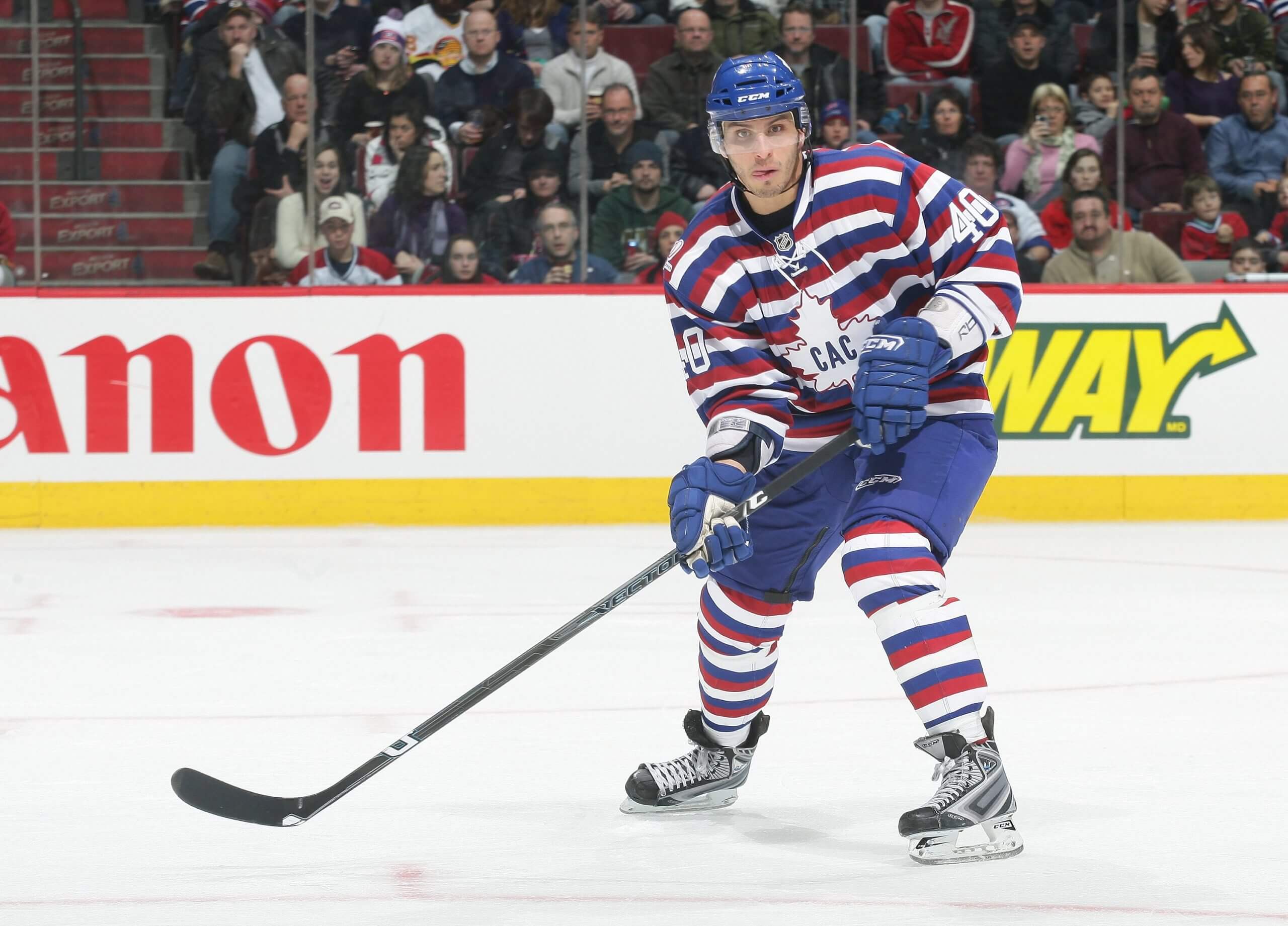
Toronto Maple Leafs
Best: 1934-37
There’s just something about these jerseys that I really dig. Clean, crisp and classic with two different versions of the old-school Leafs logo. I especially like the white edition, with the horizontal blue lines. Bring these back!
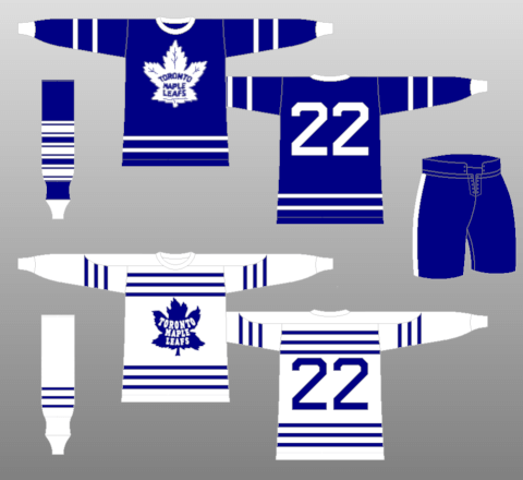
Peter Ing, while playing for the Maple Leafs in the 1990-91 season. (Ken Levine / Allsport)Worst: 1978-1992
It’s mostly about the logo, which screams corporate. There’s no soul to this look either. It’s bland and boring. — Jonas Siegel
Utah Mammoth
Caleb Desnoyers, the No. 4 pick in the 2025 NHL Draft by the Utah Mammoth. (Matt Winkelmeyer / Getty Images)Best: 2025-present Mammoth
We haven’t officially seen these uniforms in an NHL game yet, but it was either these or their inaugural jerseys from this past season. The Mammoth name and logo are a huge upgrade compared to the generic branding from this past season.
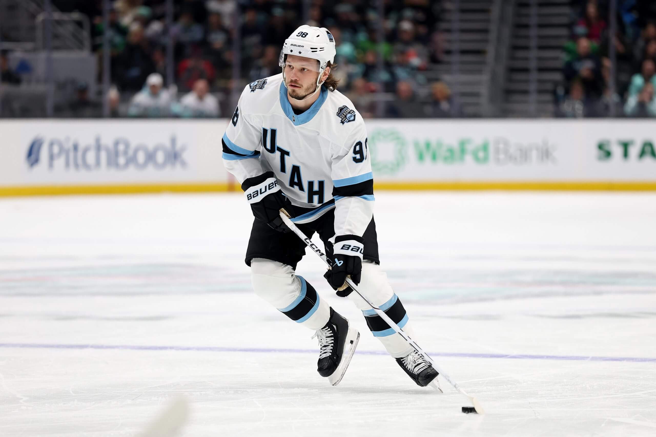
Mikhail Sergachev, while playing for Utah in 2025. (Steph Chambers / Getty Images)Worst: 2024-25 Utah Hockey Club
The color scheme of Utah’s first jerseys was nice, but these uniforms were generic-looking and lacked a clear logo. The Mammoth branding and logo will be significant upgrades this coming season. — Harman Dayal
Vancouver Canucks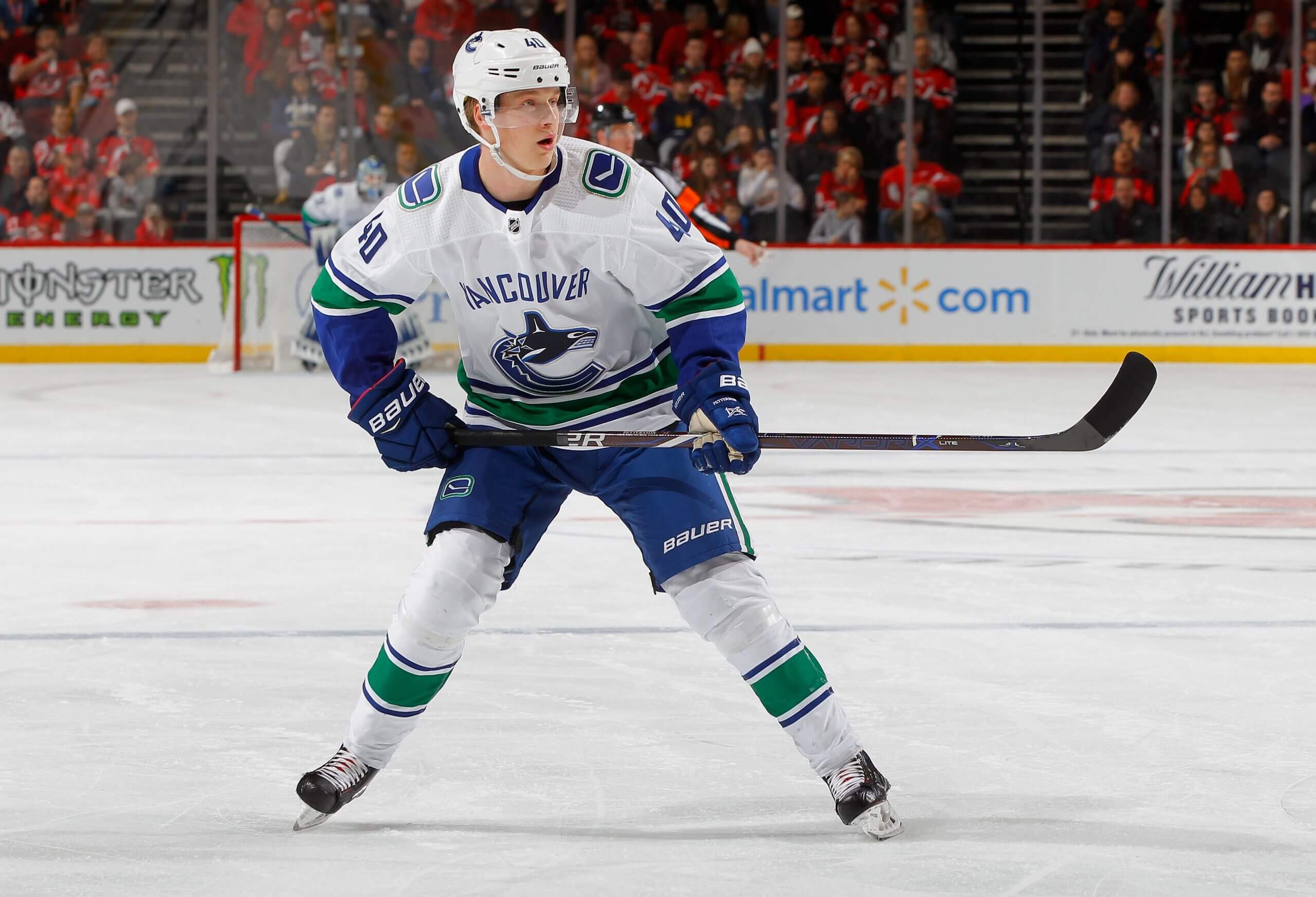
Elias Pettersson, while playing for the Canucks in 2018. (Jim McIsaac / Getty Images)Best: 2007-2019 Vancouver wordmark orca
This is an unpopular opinion in the Vancouver market, especially given Canucks fans’ refusal to see the “Flying skate” logo as the design abomination that it very clearly is. The orca jersey with the “Vancouver” wordmark on the front, combined with stick-in-rink adornments on the shoulders, is the cleanest and best jersey in franchise history.
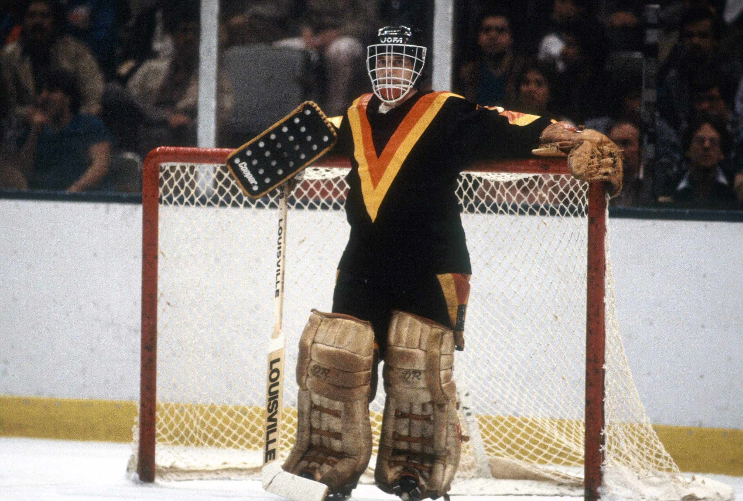
Richard Brodeur, while playing for the Canucks in 1982. (Focus on Sport / Getty Images)Worst: 1978-1985 “Flying V”
The “Flying V” was designed in consultation with snake oil salespeople psychologists to be “aggressive,” and it is definitely aggressively ugly. Mustard yellow, an unsightly two-colored V-shaped sash on the front, the spaghetti-plate flying skate on the shoulders and another “Flying V” on the pants. An absolute mess. — Thomas Drance
Vegas Golden Knights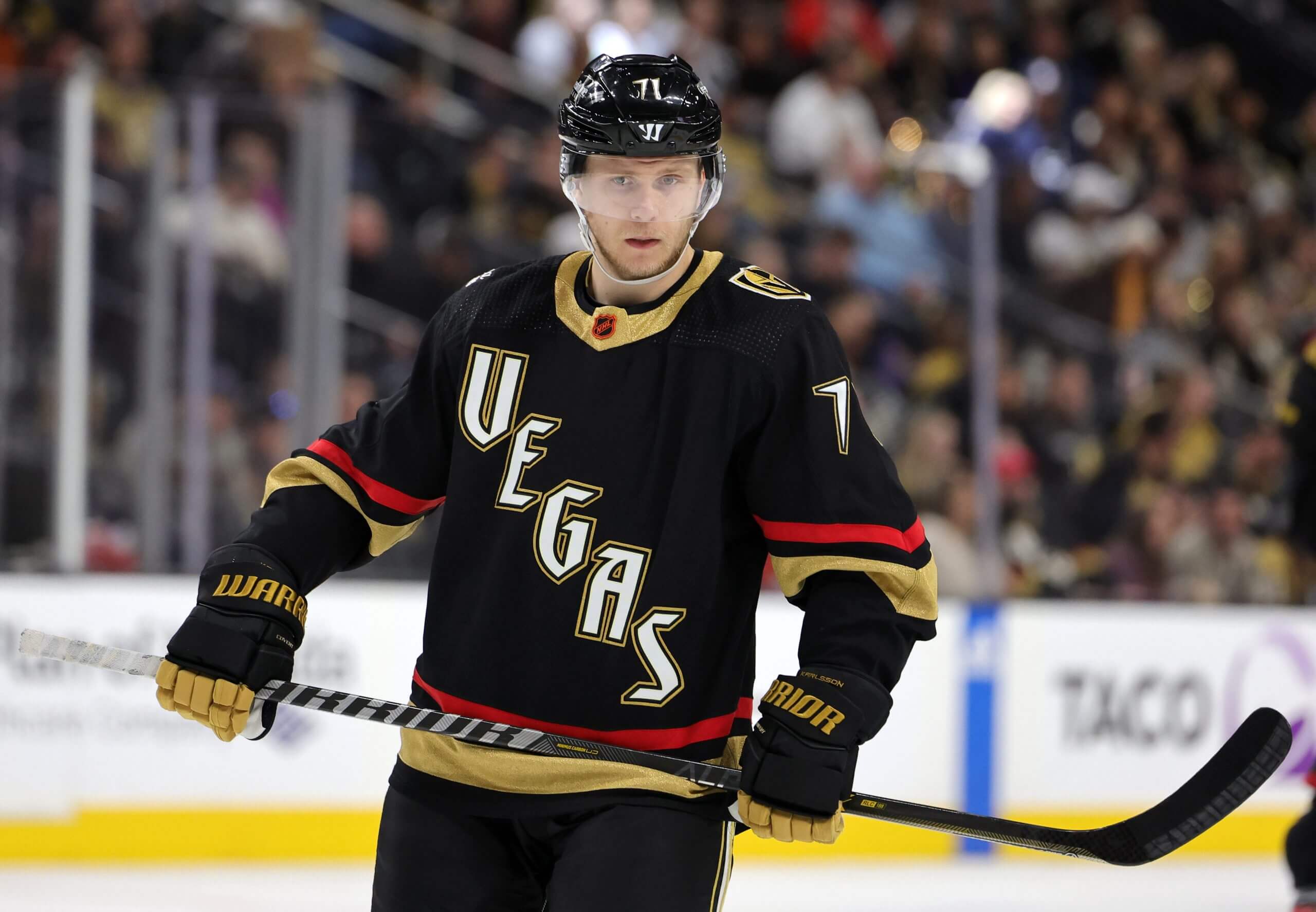
William Karlsson, while playing for the Golden Knights in 2023. (Ethan Miller / Getty Images)Best: 2022-23 Reverse Retro
Vegas has always been creative with its jerseys, but none have been cooler — or looked better — than their 2022-23 Reverse Retro jerseys with glow-in-the-dark numbers. The color scheme is good. The old-school Las Vegas casino font has such a good vibe, and it glows in the dark! They’re easily my favorite sweaters in the team’s short history.
watch out for me, I’m about to glow 🤩#GlowKnightsGlow | #ReverseRetro pic.twitter.com/NCobDnowoh
— Vegas Golden Knights (@GoldenKnights) November 27, 2022
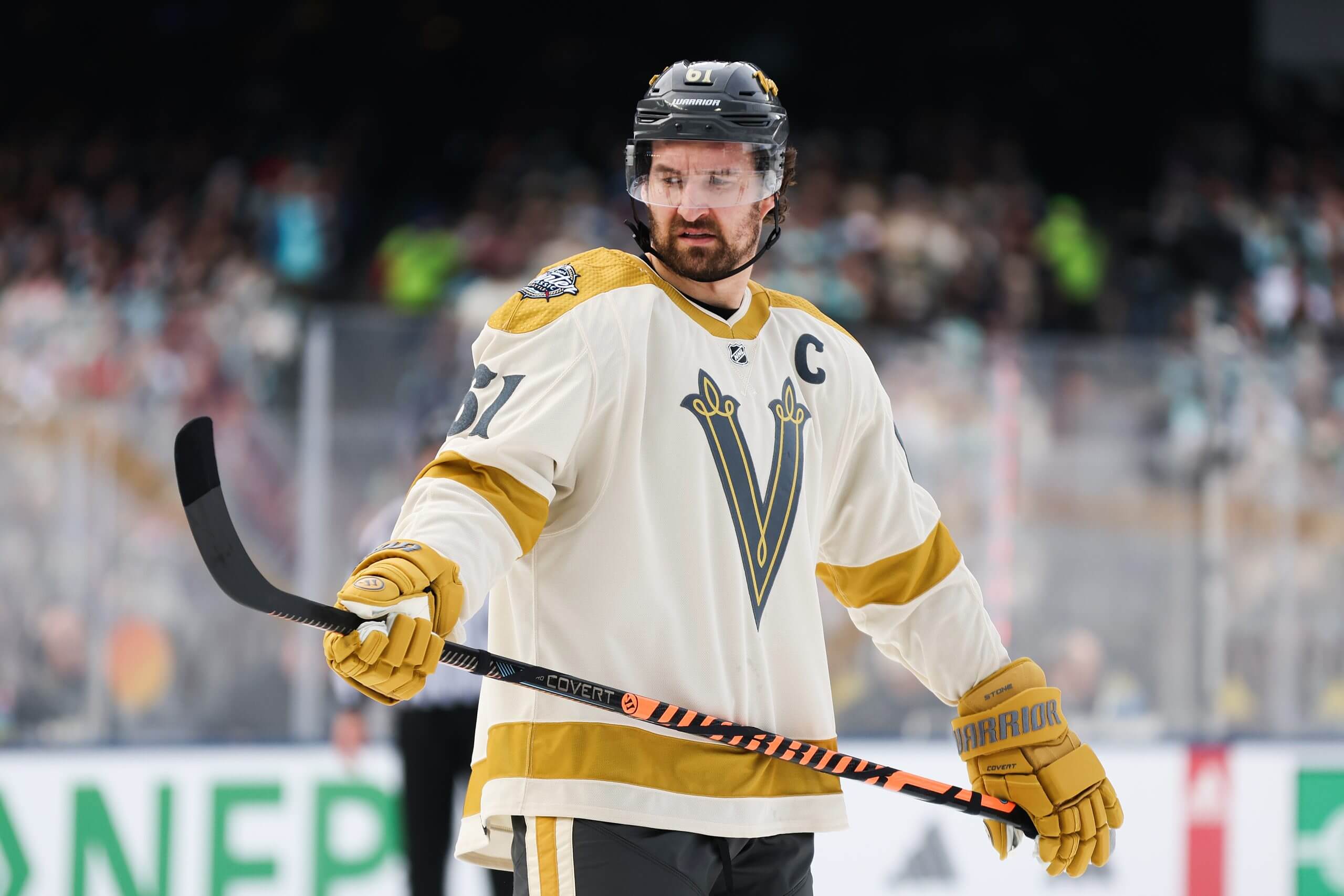
Mark Stone, while playing for the Golden Knights in 2024. (Steph Chambers / Getty Images)Worst: 2024 Winter Classic
The Golden Knights have only worn a handful of different jerseys over the last eight years, so there wasn’t a lot to choose from. The Winter Classic jerseys from 2024 are the most blah of the bunch, for my money. I understand what they were going for, with a vintage, wild west type of feel, but I’m not a fan of the cream color or the strange “V” logo. — Jesse Granger
Washington Capitals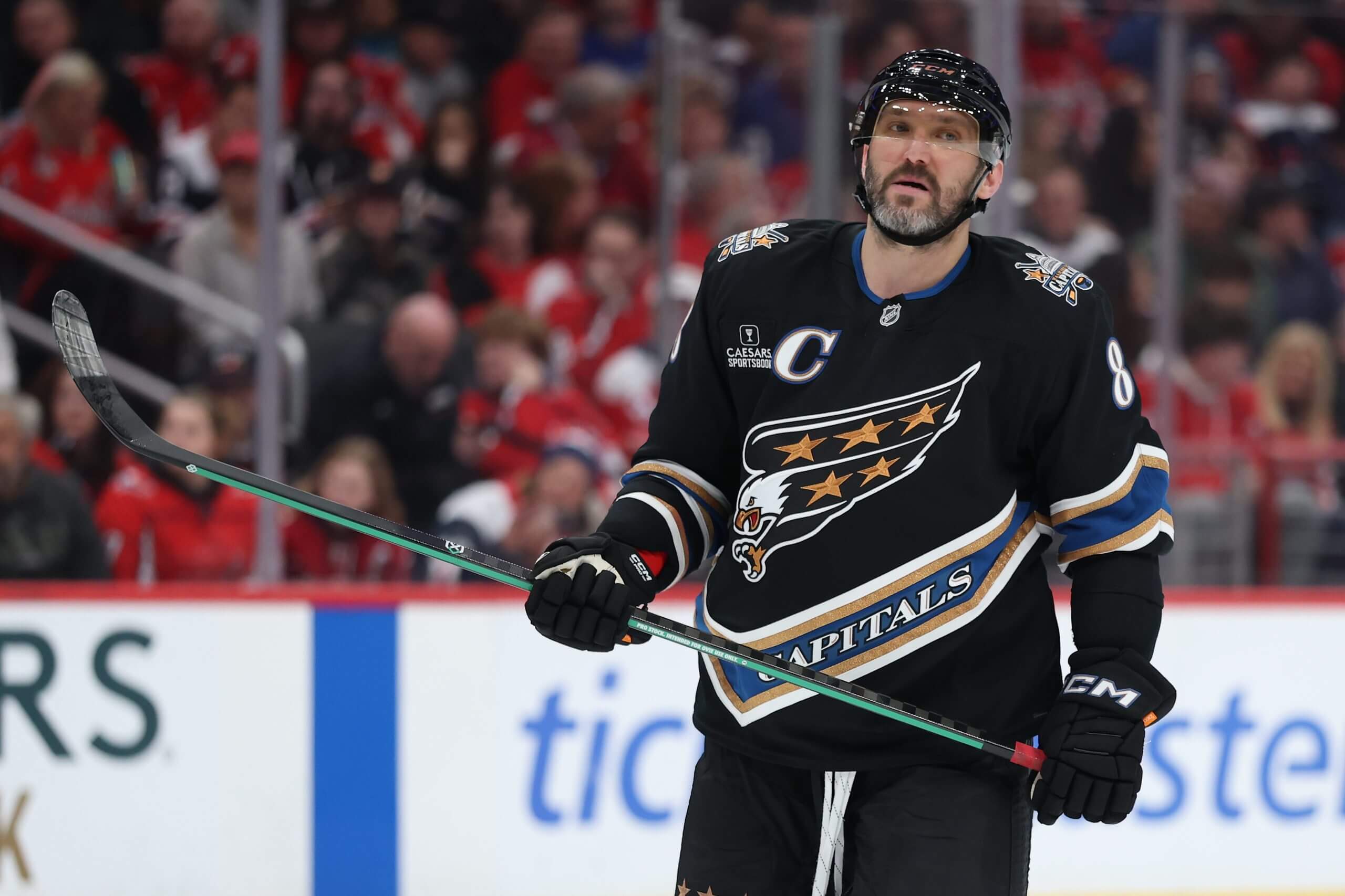
Alex Ovechkin, while playing for the Capitals in 2025. (Patrick Smith / Getty Images)Best: 2022-23 Reverse Retro/2024-present alternate
The fan base loves the “Screaming Eagle” jersey, and so does Alex Ovechkin, so it’s the pick. Washington’s alt jersey history isn’t great and its current look (successful as it’s been) is a little stale.
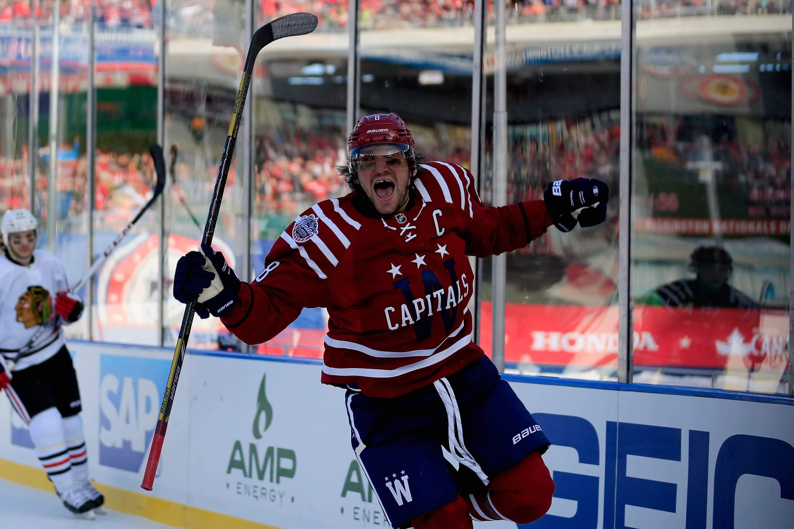
Alex Ovechkin, while playing for the Capitals in 2015. (Rob Carr / Getty Images)Worst: 2015 Winter Classic
Fauxback looks can be rough, and this one certainly qualifies. There are some historical nods, which is fine, but … maroon? For the Capitals? Nope. — Sean Gentille
Winnipeg Jets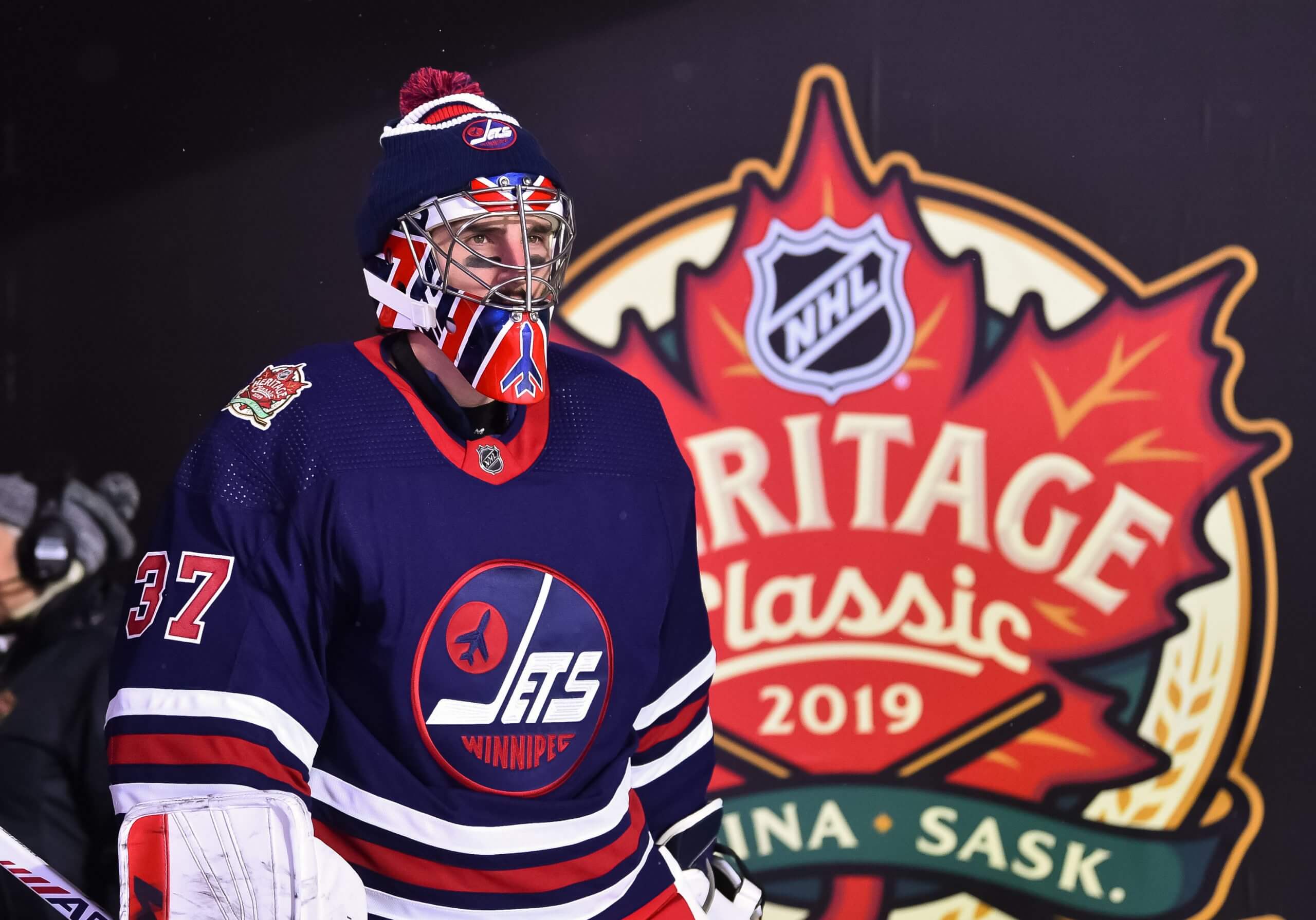
Connor Hellebuyck, while playing for the Jets in 2019. (Minas Panagiotakis / NHLI via Getty Images)Best: 2019 Heritage Classic
This is an easy, obvious answer — except it’s also agonizing, because the white version of Winnipeg’s heritage jerseys is also an all-time classic. We opt for the blue version here out of love for the depth of the blue, the red accents and fond memories of Bryan Little’s overtime-winning goal against Calgary at the 2019 Heritage Classic.
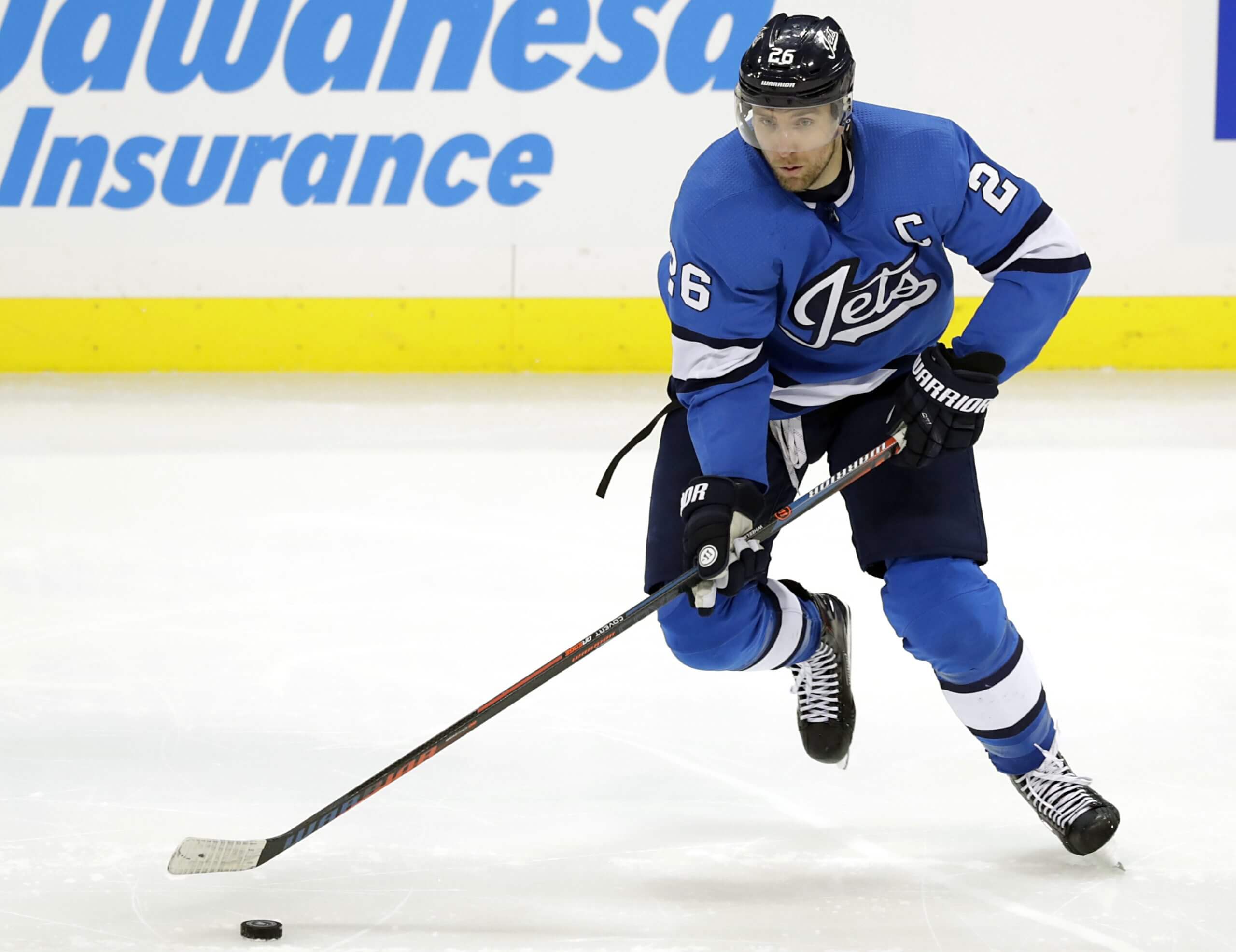
Blake Wheeler, while playing for the Jets in 2018. (James Carey Lauder / USA Today)Worst: 2018-21 “Aviator Blue”
Winnipeg was ambitious with this design, choosing a new, bright blue color palette — a bold and relatively unique choice in the scheme of NHL jerseys. There are also subtle design elements, such as an F-18 fighter hidden in the Jets’ logo. Still, the “aviator” failed to capture public imagination, feeling more like a one-off than a new Jets classic. — Murat Ates
— Research courtesy of The (unofficial) NHL Uniform Database
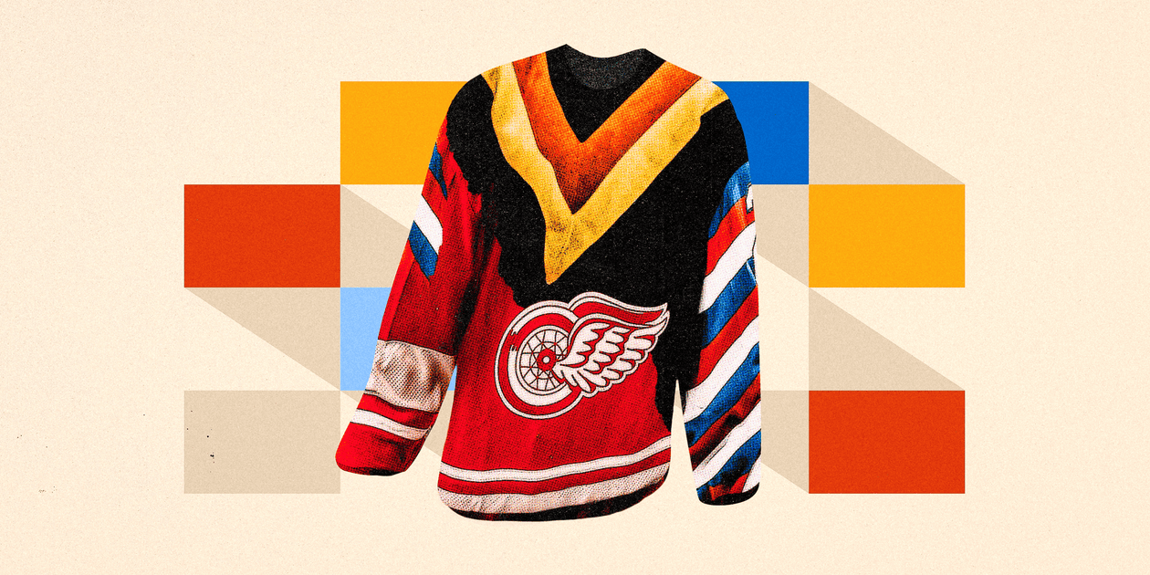
(Illustration: Dan Goldfarb / The Athletic; Andre Ringuette, Dave Sandford / NHLI, Bruce Bennett / Getty Images)