We may earn revenue from the products available on this page and participate in affiliate programs.
Sign Up for Domino’s Newsletter
Phoebe Hollond’s number one design rule is that there are no rules. “I don’t do regimented,” she says. If two patterns or colors don’t seem like they naturally go together, she’ll try it out anyway. That’s how she ends up with spaces that are joyful and a little bit over the top. Her open mindedness also stems from 10-plus years of working with Beata Heuman before founding her firm, Studio Hollond, in 2023. Since stepping out on her own, the designer has found clients who are game to push the envelope—or, at the very least, give it a little nudge.
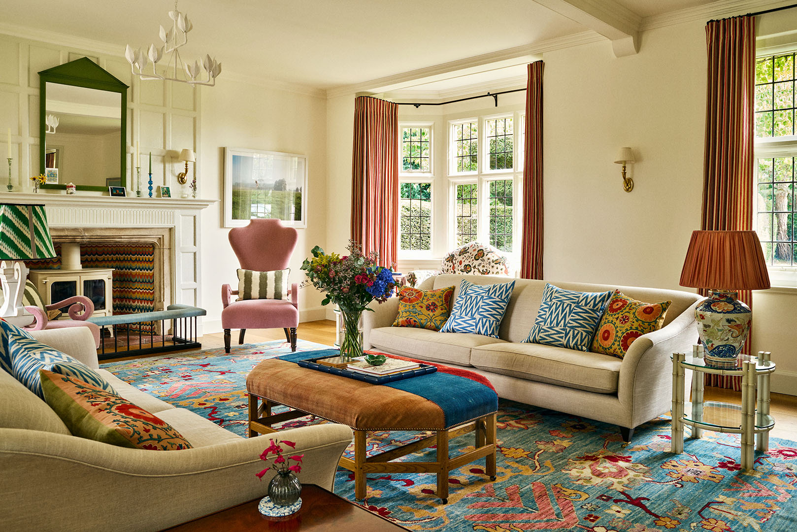
While working on this Sussex, England, home for a young family of four, Holland had to navigate the couple’s very different tastes (the wife leaned bohemian, the husband was much more of a minimalist). One compromise was to paint almost all of the walls in the house white and instead put her creative energy into custom upholstery and lighting. Hollond also had to find some middle ground between the original 15th century section of the home and the 1790s addition. “There really wasn’t a connection between the two wings. One had grand windows with high ceilings and large rooms and the older side was very low and felt quite restrictive,” she says. With the help of a structural engineer, she was able to take out a few internal walls and make way for two large central rooms: a kitchen-slash-breakfast dining area and a formal living room and library. “It made it a much more family friendly house,” says the designer.
Ahead, Hollond takes us on a tour and answers our most pressing questions about the whimsical country house.
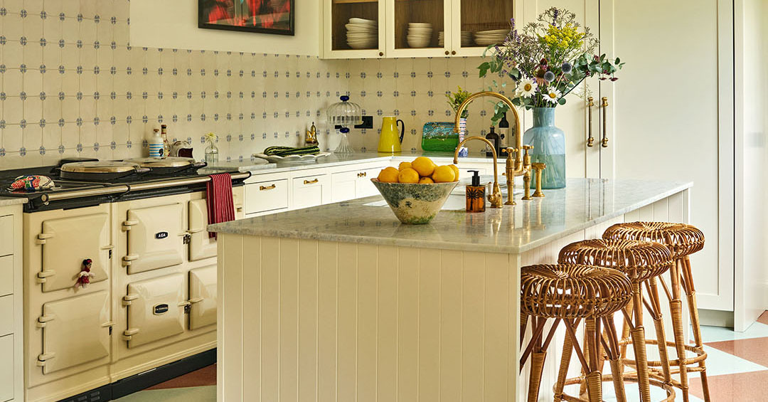
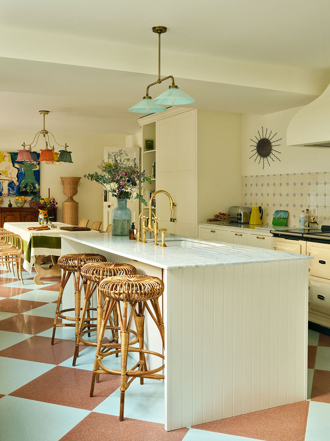 Wall Color, James White by Farrow & Ball; Flooring, Balineum.
The kitchen floors are very retro. Are they linoleum?
Actually, it’s terrazzo. Originally, we were going to have these terracotta and limestone tiles (similar to ones you might see in Sicily) but when they turned up, they were so scuffed that the floor looked dirty. We had to send them back and did a complete U-turn with this red and powder blue terrazzo. It was a crisis moment in the project but it worked out for the best.
The backsplash though feels quintessentially English. Was that a no-brainer?
My style is very much mixing French and Italian influences with the best of the English. These tiles have a slightly more traditional look, but I love that it doesn’t make it feel stuffy or old fashioned.
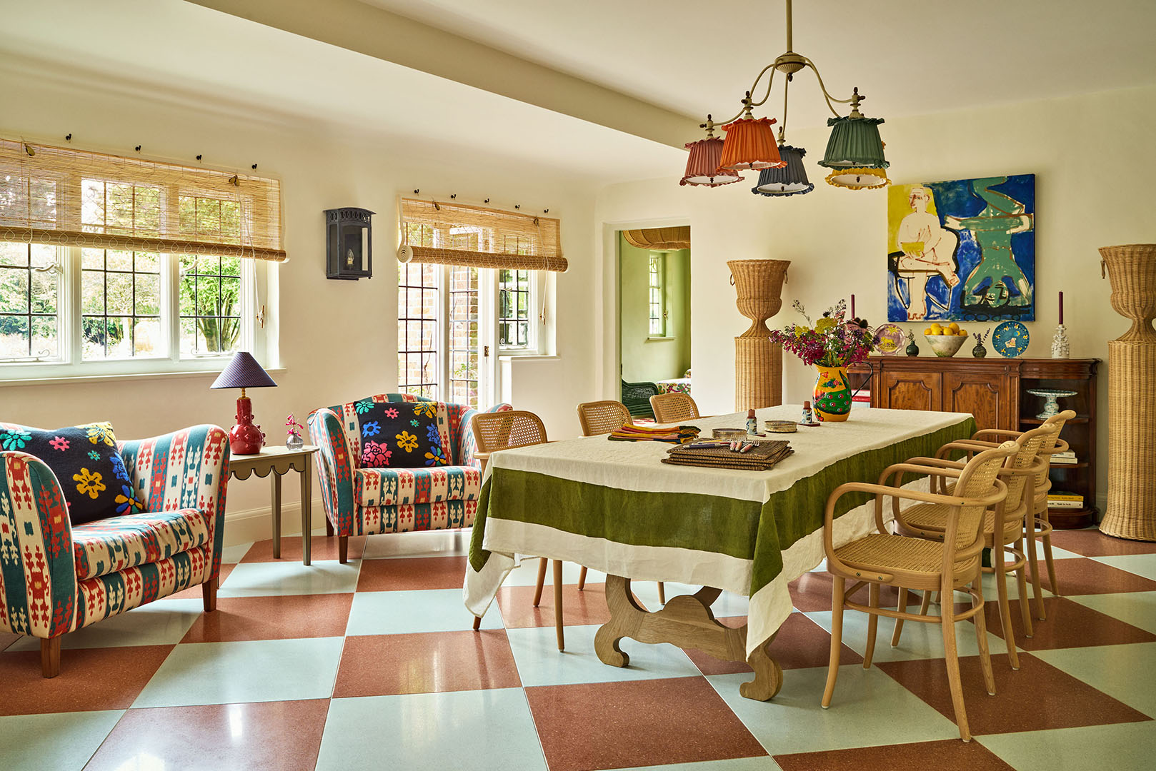 Table, Alfred Newall; Tablecloth, Summerhill & Bishop; Ceiling Light, Studio Hollond; Painting, Panther & Hall; Pedestals, Atelier Vime.
Is the purpose of the rattan pedestals to plop plants inside?
A lot of people use them as planters or for large flowers but we actually got them electrified so that they light up at night and create this lovely dappled effect during informal dinner parties.
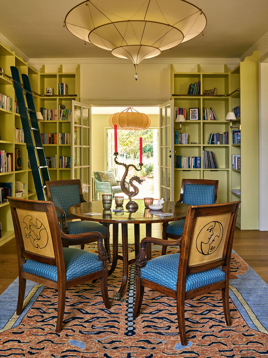 Light, Fortuny; Chair Fabric, Vanderhurd; Shelving Paint Color, Scallion by Paint & Papers.
How does the library get used by the family these days?
They love playing Monopoly and cards. When I last went there, there was a huge puzzle set up on the round table. I commissioned an artist to draw each family member’s star sign drawn on the back of the French Empire chairs.
What was your favorite paint color you used in the house?
The color on the bookshelves is called Scallion. It’s actually a brighter color, but we knocked it back to 60 percent for the husband so the hue wasn’t so intense. It has a warmth to it and brings me a lot of joy.
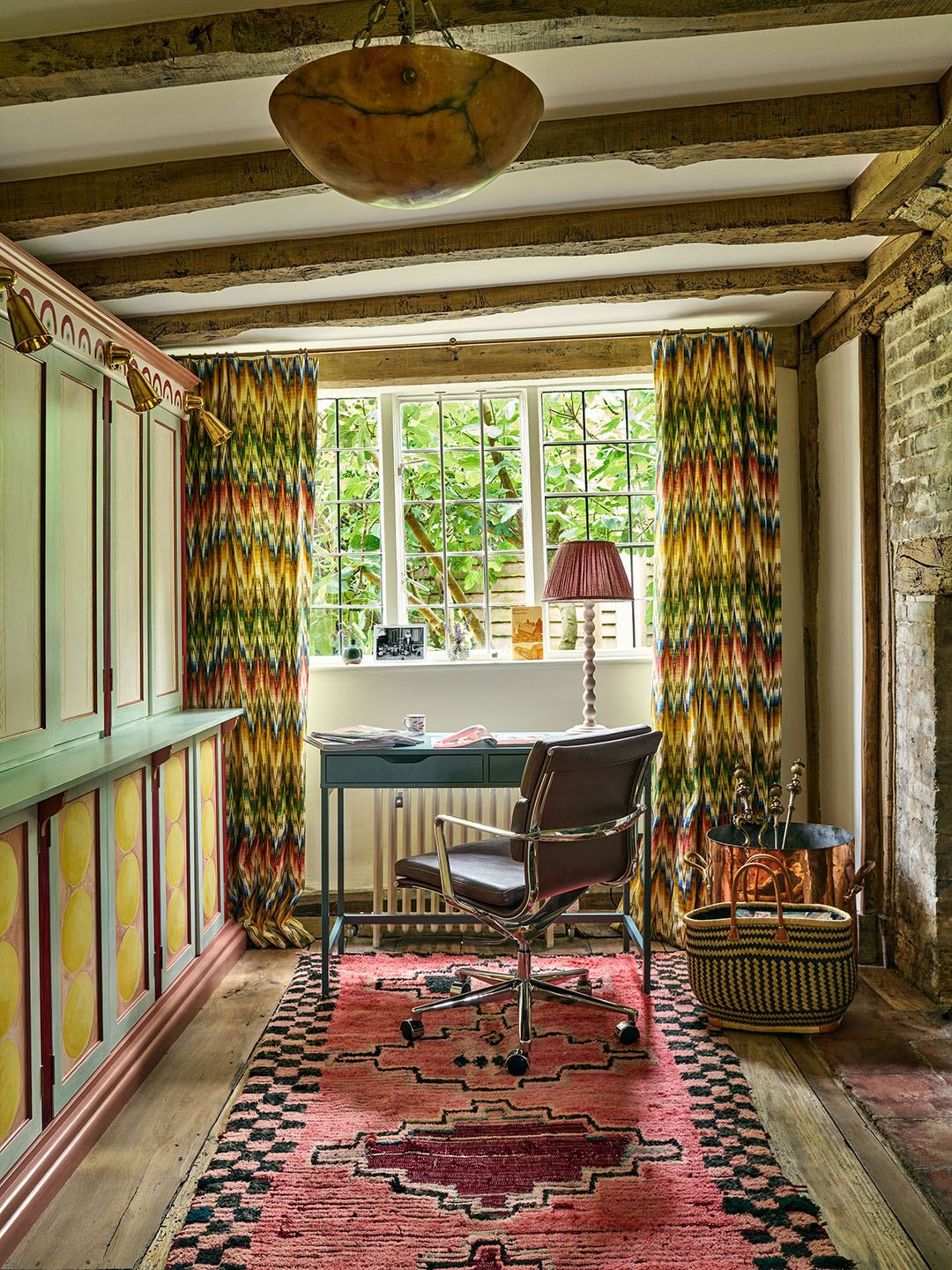
 Ottoman, Robert Kime; Bespoke Chair Fabric, Pierre Frey; Cushion Fabric, Nicky Haslam; Rug, 1stDibs; Suzani Cushions, Nushka; Lamp, Vaughan.
The curtains in the office and the firebox in the living room look like the same pattern, was that intentional?
I commissioned the same artist who designed the back of the library chairs to paint the fireplace in a scalloped design that’s inspired by an old Missoni print. They used clay paint so even when it gets really hot, it won’t melt.
This rug is pretty bold. Did it inspire all the other furniture in the room?
That was actually one of the last things we found. I had a Portuguese needlepoint rug on our moodboard that was a lot more dainty. After searching high and low, I couldn’t find the perfect piece and then I realized that was because it wasn’t right; it was too quaint. This room needed more drama, something with large motifs.
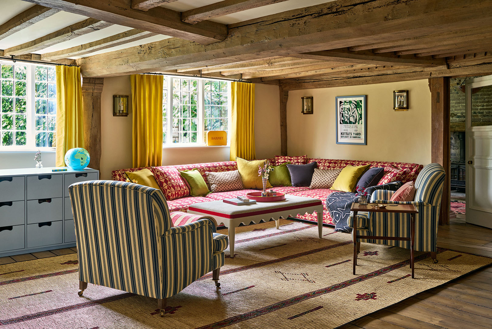 Sofa Fabric, Pierre Frey.
Do you have any advice for approaching a space with super low ceilings?
At the end of the day, there isn’t really a way around it, so you almost have to embrace it. That’s where you can be a lot more brave with color. We injected energy into this playroom with uplifting shades of yellow and red. The custom sofa is covered in La Manache fabric by Pierre Frey and had to come in quite a few pieces and assembled on site because the doorways were so narrow.
 Cabinet Paint Color, Dix Blue by Farrow & Ball.
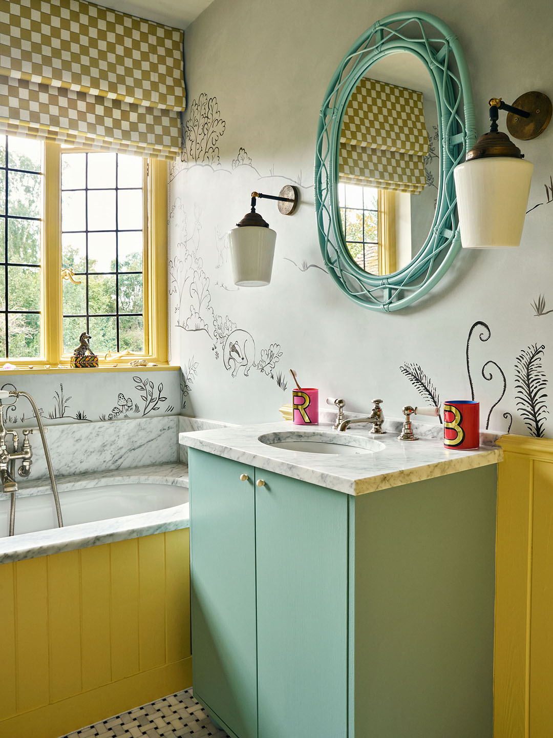
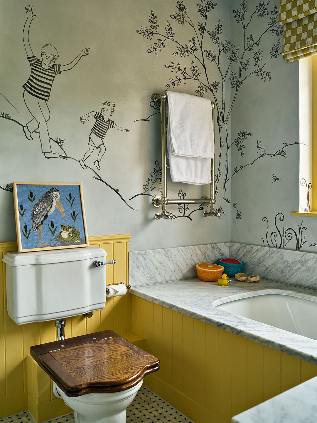
What color combination did you end up loving the most?
I really love the blue and yellow in the children’s bathroom. There’s just something so unbelievably soothing about it.
The mural is incredible—that’s all waterproof?
This was inspired by Saul Steinberg’s line drawings for The New Yorker. All the walls are polished concrete or, in the shower area, Tadelakt. We got the artist to paint in the same material, so that’s why it won’t come off in the shower. On one side, there’s a drawing of their two boys. The kids got to choose their favorite things to display, whether it was swallows or hedgehogs.
 Paint Color, Borrowed Light by Farrow & Ball; Trim Borders, Allyson McDermott; Headboard Fabric, Claremont; Cushions, Le Manach and Matchesfashion.com; Armchair Fabric, Flora Soames.
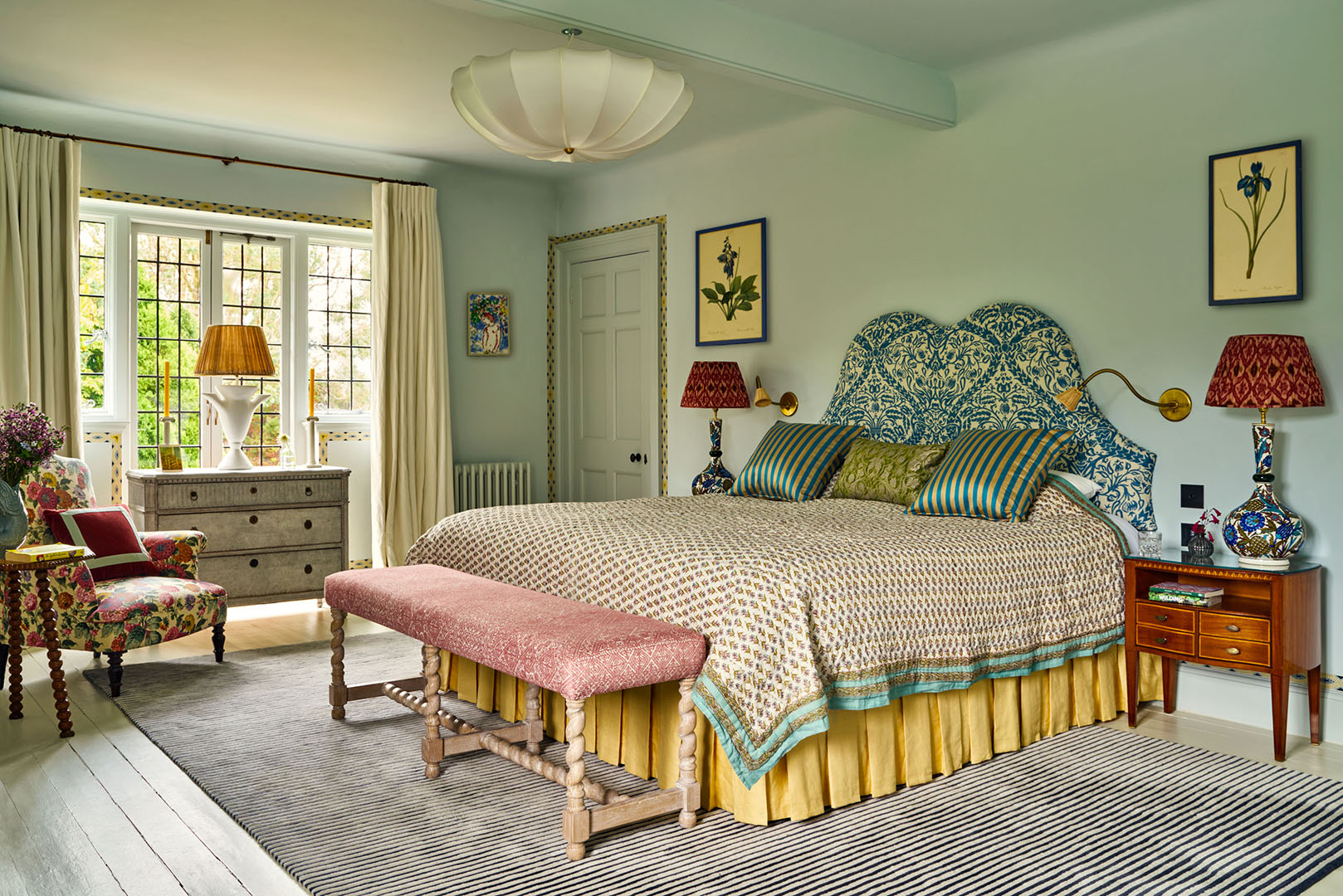
What design decision felt like the biggest risk?
Probably painting the whole primary bedroom blue. This was actually a request from the husband! Even the floorboards are blue.
What’s your secret to mixing and matching bedding?
It is so personal. I tend to love a suzani at the end of my bed, for example. Whatever you do, I think having some form of pattern on your bed is good. Otherwise, a bed can feel like quite a big thing in the middle of your space.
 Wall Color, Parma Grey by Farrow & Ball; Blind Fabric, Aleta; Bed Fabric, Tissus d’Helene.
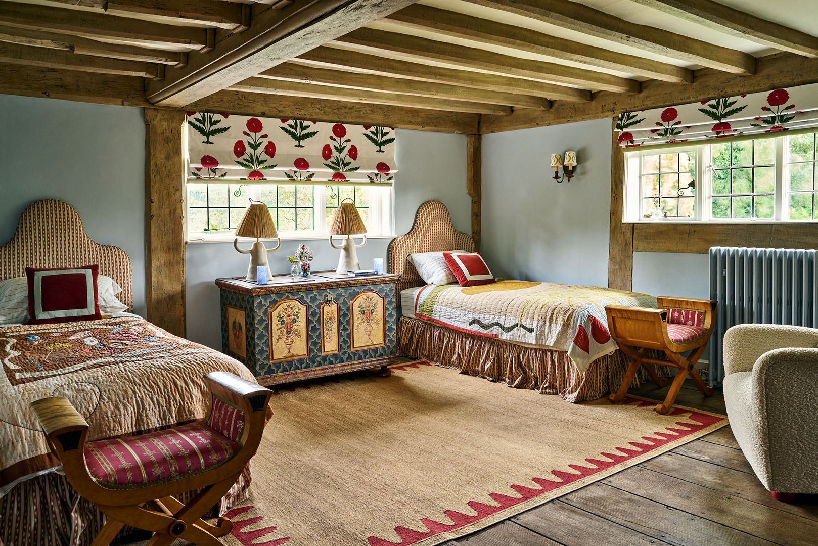
Is there a way to make twin beds feel more adult-ish?
We used quite grown-up fabric on the headboards and bed skirts in the kids’ room. I also think having the simple shape of the headboard and ruching on the skirt feels more mature. But there are playful elements, like the quilts and use of reds and pinks and greens.
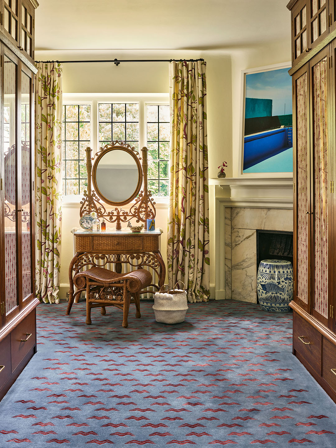
The carpeting in the closet is really fun. What’s the story behind the pattern?
It was inspired by old Nepalese antique carpets and tiger stripes. We originally chose orange and black for the colors but then we decided we should go more subtle, which is when the blue and red came in. It works beautifully with the curtains that are sewn in the windows of the cabinets.
What material were you most excited to work with on this project?
The Claremont red and white striped curtains and blinds in the two living spaces. The way they fall on those huge bay windows as well as the smaller windows is really wonderful. And then I’d say the light over the breakfast table. I was inspired by old billiard rooms. I got it made just for this but now I sell it through my site. It was definitely my pride and joy.
Lydia Geisel has been on the editorial team at Domino since 2017. Today, she writes and edits home and renovation stories, including house tours, before and afters, and DIYs, and leads our design news coverage. She lives in New York City.