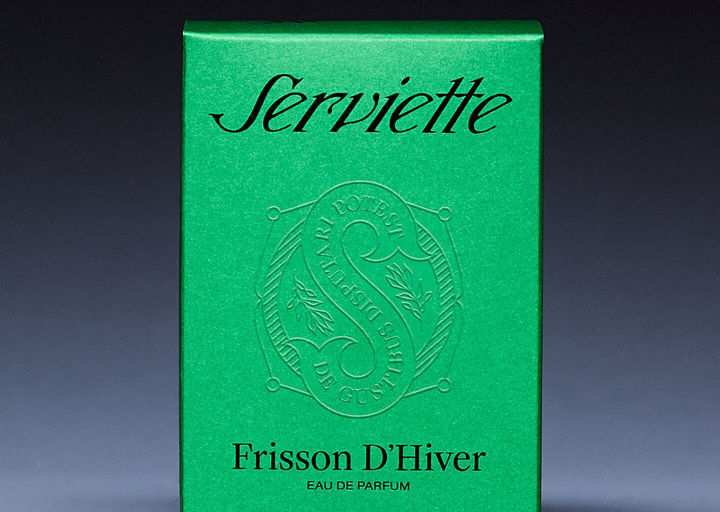
“To witness how Ben and Alicia play off of each other’s creativity, with references to old type foundries and obscure print magazines, foreign cinema or underground artists, was such a joy to witness,” says Trey. This union of kindred spirits is evident in the cleanliness of Serviette’s identity. Each idea coalesces into the next, a supreme elegance lies in each flick of the custom type design that lies on the emerald greens of Serviette’s perfume boxes and in the printed lettering on its sleek bottle. Returning to the idea of vintage branding, the design of the custom logotype was inspired by Nebiolo, an “old style” hand-drawn typeface previously lost to time. Studio Select breathe new life into its legacy, with the logotype for Serviette, with its curved “S” and heightened “e” striking notes of melodrama and the brand’s knowingly haughty charm.
This haughtiness is felt in the subtly Christian symbology of their photographic work. In one photo, a figure sits at a table with a dining cloth over their head, mirroring the 18th century French act of eating ortolan, a tiny songbird which was prepared to eat whole, bones and all, in order to trap the powerful scent of the roasted bird. Such a clever aromachological reference could only come from Studio Select, as playful as they are scholarly. As well as that, the green shade of the text itself is influenced by baize, a 16th century fabric that came to signify the difference between the upper and lower classes in British society. It’s in Serviette’s old-world symbology and refined taste that set them apart from other brands. With Studio Select’s sharp design, Serviette has not only made something that looks gorgeous but also created thoughtful conversation around class and wealth.