By Sean Gentille, Shayna Goldman and Julian McKenzie
Every season, we at The Athletic love it when teams get creative with their uniforms. Even if there’s no Reverse Retro program where every team comes up with an idea, a handful of teams put together some fun alternate jerseys for fans to enjoy for the upcoming season. Of course, some jerseys are better than others. That’s where Sean Gentille, Shayna Goldman and Julian McKenzie come in.
Here are The Athletic’s rankings of the best alternate jerseys released so far during the 2025-26 season. This list exclusively features alternates and not the teams’ new home and away jerseys. So, no, you won’t find the St. Louis Blues and Carolina Hurricanes on the list.
1. Detroit Red Wings
Gentille: 8 (points)
Goldman: 10
McKenzie: 10
Brilliant, incredible, amazing, show stopping, spectacular, never the same, totally unique.
Preorder yours today at https://t.co/ZiDiQSteTx pic.twitter.com/Qh1jcJPzrQ
— Detroit Red Wings (@DetroitRedWings) September 15, 2025
Sean: The Red Wings’ alt jersey history is a combo of spotty and bad, so I was prepared to hate on these, but I love the added detail to the logo and I love the numeric font. Not surprised to see that I’m the outlier here, either, because people lost their minds over these when they dropped.
Julian: How do you design a jersey that uses one of the most iconic shirts in pro sports as an inspiration, on the eve of a centennial birthday no less? The Red Wings could serve as a blueprint for other teams and leagues to follow. The majestic red, the vintage font for the numbers and the white striping at the bottom of the jersey. This is a perfect 10 for me.
Shayna: Yep, absolutely agree. This is a 10/10, thanks to all the little details throughout. The embellishments on the logo, the texturized lettering/numbers, the old-timey fonts, the narrow stripes bookended by thicker ones, the helmets, the everything. For a team that generally has such a simple approach, this feels bold in comparison in the best way. And it’s sharper than the 2014 Winter Classic kit, which also used red and cream. Like the Rangers, points are earned for the ad patch going on the shoulder, instead of the chest.
2. Seattle Kraken
Gentille: 9
Goldman: 8
McKenzie: 7
Made to menace 🌫️
The #SeaKraken’s third jersey has entered The Deep. pic.twitter.com/Rm4fG7GN9m
— Seattle Kraken (@SeattleKraken) September 4, 2025
Julian: The jersey glows in the dark! I repeat, the jersey glows in the dark! Imagine watching this team minutes before puck drop as the Climate Pledge Arena turns the lights off? Seeing the glowing ‘S’ would have me going crazy if I were a fan. And in the light, they still look solid. However, I could do without the red on the arms. The Kraken’s time in the league has been short, but they’ve once again captivated us with a sweet jersey.
Sean: As a long-time defender of the Stars’ black/neon green look, my stance on this should surprise nobody. I’m tired of throwbacks, I’m tired of faux-backs and I’m begging more franchises to do something new. Seattle gave me what I want.
Shayna: Generally, I like black jerseys in theory, but not in action; they have to be interesting to translate on the ice. This one, I think, actually is. The glow-in-the-dark elements are fun, and the striping elements feel pretty unique relative to what we normally see. My only complaint is that the light blue stripes on the arm look printed, not stitched, which is kinda lame. But whatever, I’m nitpicking. I’m all in on this one.
3. Washington Capitals
Gentille: 8
Goldman: 7
McKenzie: 8
excited screeching noises pic.twitter.com/tuDUjiYVS4
— Washington Capitals (@Capitals) September 15, 2025
Shayna: I just don’t understand how the Caps can keep churning out sick alternates and have such a boring home/away kit. This is such a good modern twist on a Capitals classic. The black/teal/gold-ish scheme of the original screaming eagle will always be perfect, but this is a great way to embrace the old with the current colors (just like the Ducks’ revamped Mighty Duck in orange). While I personally like the angled stripes on the original version of this jersey, I think the horizontal stripes work well here; it gives the logo more space to be the statement (and it’s necessary with the white shoulders). My biggest nitpick is the decision to do the same shoulder patch on each side, and the jersey ad on the front; the ‘C’s and ‘A’s look so cluttered.
Julian: I pray the Capitals bring back the screaming eagle forever. Last year’s alternate jerseys wouldn’t get any complaints from me if the Caps turned them into their mains. This year’s alts are a solid blend of old and new, incorporating their modern-day color scheme. I love the red, white and navy stripes along the elbow. I love the other Capitals logo being on the shoulder, too. And I’m a sucker for a jersey front lace.
Sean: One-point deduction for ditching the black/teal/bronze screaming eagle, but I’m in the same corner as you guys — when Alex Ovechkin is done, the Caps’ current everyday home and roads should be done, too.
4. Minnesota Wild
Gentille: 5
Goldman: 9
McKenzie: 8
honoring the originals ✨
more on year 25 » https://t.co/emgtxmnaHX pic.twitter.com/ageFDwnoxX
— Minnesota Wild (@mnwild) September 25, 2025
Sean: I might be overly harsh here, but whatever. I like this Wild look, and I like most Wild looks. But … this is just a throwback. It’s a good one! Red, green, gold and white was always a slept-on colorway, and I like the creativity in the font. But again … just a throwback.
Julian: The Wild are a sleeper team when it comes to their jerseys. Most of the uniforms they’ve had in their history are actually pretty great, but we don’t hype them up compared to some of the league’s blue-bloods in the jersey department (Montreal, Calgary, Toronto, Rangers, Kings come to mind). But seeing the Wild bring back their OG jerseys as alternates is a fun throwback idea for the season ahead.
Shayna: This is how you use gold (@ Ottawa). The stripes are sharp, and the use of gold in the logo drives it all home even more. Sean’s right, it’s just a throwback … but it’s just so well done and feels fresh in this scheme, with a couple of colors (gold and green) that are so underutilized in this league.
5. San Jose Sharks
Gentille: 7
Goldman: 6.5
McKenzie: 7
The iconic jersey is back and better than ever. pic.twitter.com/sP8Z5tk9gt
— San Jose Sharks (@SanJoseSharks) September 26, 2025
Shayna: The more I study this jersey, the more I like it … but I just don’t love it. Here’s the thing: it’s very hard to make a bad Sharks jersey. The logo is generally sick and the color scheme rules. But San Jose sets the bar really high because most of their kits are that great. I mean, look at the home/away teal overload – it’s perfection. Here, I think the angling of the arm stripes and the fin-like detailing on the front are really nice and give it the retro vibe, versus a practice jersey with some character. I’m just a little underwhelmed here with the look. Maybe it’ll translate better on the ice, in a game. The fact that there is so little white on the jersey could help it pop even more.
Sean: Yeah, I’m biased in favor of the Sharks’ overall look. I’d have given those a 7 when they wore them originally, so I’ll give them a 7 now. They’re incredibly dated because of the black armpit fins, and I think that actually makes me like them more.
Julian: I love the throwback to one of the cooler uniform designs of the 2000s. I get the Sharks didn’t win anything with these on, but it’s hard not to think about their more competitive days. And don’t just think about Jumbo Joe and Patrick Marleau. Jonathan Cheechoo, anyone? Vincent Damphousse rocking the Itech bucket in a Sharks uniform? Scott Hannan? Douglas Murray? I can go on. This year’s jerseys are going to look great on Macklin Celebrini, Will Smith and the rest of the kids.
6. Los Angeles Kings
Gentille: 7
Goldman: 6
McKenzie: 7
Proud to wear Our Crown 👑
📲 https://t.co/FMsb7qHNBP#GoKingsGo pic.twitter.com/9RN7FXW6Qi
— LA Kings (@LAKings) October 8, 2025
Julian: The Kings probably could’ve been more adventurous and brought back the purple and gold for their alternate jersey. Especially since they brought back the crown. But the black and silver is such a great colour scheme for them, so it’s difficult to hate on these alternates. It was a fun surprise seeing them start the season against the Avalanche. Just one thing. The next time we see them, can we not have them with the chrome domes? They just don’t match that well. The helmets are too distracting from the jersey.
Shayna: Very here for the surprise element of it; I mean, the Kings literally wore their usual home jerseys on the ice for warmups. While I think there was some room for a purple detail here, the all-silver-and-black approach looks really clean. The logo looks great, but two things hold me back on this look. The first is that the metallic fabric rightfully has a different texture (and potentially consistency) from the black, and that difference is glaring with that wide a stripe; reducing that width by a third or half would have smoothed that out. The helmets, like Julian said, are a problem. It’s almost like a matte chrome, and honestly, just pick one or the other. The original chrome dome would have gone hard here, or a really glossy black.
Sean: I still can’t get all the way onboard with the silver helmets, but I appreciate the effort, and they did a great job of matching the thread with the gloss level on the paint. A million years ago, the Penguins had a great jersey set with Vegas gold accents, but the 2005 RBK Edge template had to dull down the stitching, so the look went from sparkly to khaki. Still haven’t recovered. Glad to see we’ve progressed as a society.
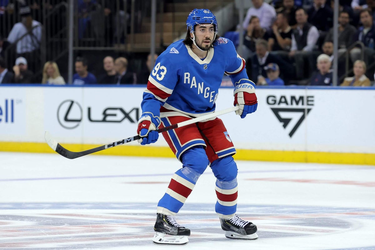
7. New York Rangers
Gentille: 7
Goldman: 6
McKenzie: 6
Undeniably ours. pic.twitter.com/MAZ9tVwrNW
— New York Rangers (@NYRangers) September 18, 2025
Julian: I don’t think they’re awful, but I don’t think they’re amazing. I like the placement of ‘Rangers’ on the front of their jersey. But I’d much rather see it on a darker blue base, kind of like the blue they wear on their current home jerseys. I also think the shoulders are too plain for me. Finally, this being the jersey for your centennial is underwhelming. I expected something bold, majestic and royal from one of the league’s most iconic teams. But I will concede these jerseys look a bit better on television than I thought they would.
Sean: Temu Captain America costume. Pass.
Shayna: I actually really like the lighter blue. It feels fresh and classic. This jersey only slotted low for me because others ranked higher. But two things bug me. First, it’s basically the same as the 2018 Winter Classic, just in a different shade of blue. It was a nice jersey then, but a regurgitated version doesn’t feel special enough for the centennial. Second, something about the neckline actually bothers me more this time around; it’s giving nun.
8. Edmonton Oilers
Gentille: 6
Goldman: 4
McKenzie: 6
Built to work. Built to win. 💪
Presenting the new #Oilers alternate jersey, now available for pre-order at https://t.co/HvU1K1KYly! pic.twitter.com/L5Ta1gO0Aq
— Edmonton Oilers (@EdmontonOilers) September 20, 2025
Shayna: Okay, I think this look has taken more heat than it deserves. I love the color scheme; the cream really pops with the blue and orange to give it the perfect vintage vibe. And the logo isn’t bad either. It’s not as cool as the blue oil drop from the 2000s, but I think this scripted logo is better than the Jets from a few years ago. There’s just one major gaffe: the font everywhere else. If you’re going to commit to the heritage styling, with the logo/cream, the name on the back and numbers need to match that energy – especially on jerseys where the scripted lettering is the focal point. It just feels like an incomplete, undeveloped idea.
Julian: Damn. I actually liked the font on the front and back. I also don’t mind the cream-colored base of the jersey. (Cream/off-white seems to be in, nowadays.) I don’t think they’re amazing, but I definitely think they’re better than some people give them credit for.
Sean: Even though cream-colored hockey jerseys scream “2011,” the front crest had me intrigued enough. Then I saw the back. Something about the styles clash between the logo and numerals/font leaves me unsettled and upset.
9. Pittsburgh Penguins
Gentille: 4
Goldman: 5
McKenzie: 5
The longest-tenured trio in North American sports take the ice in Pittsburgh for season 20. pic.twitter.com/ZchAct25nA
— Pittsburgh Penguins (@penguins) October 9, 2025
Sean: Pittsburgh gets a point or two for the patch alone. Other than that, what’s to like? We’ve seen the Penguins try gold uni sets in the past — they wore one for a Stadium Series game, then tweaked it for use as an alternate from 2018-2021. It was underwhelming then, and it’s underwhelming now.
Shayna: I really like the idea of a gold third jersey for two reasons: 1) an alternate is the chance to lean into a secondary color of a team’s scheme, and 2) it’s a bright pop of color that translates well on the ice. The gold buckets are fun, and I like the simplicity of the black striping on the arm. But the fact that the waist/ankle stripes don’t match the theme is throwing me off. And there was a chance to do something more with the logo, like going back to the Robo Penguin or trying something a bit more new and inventive. A big standard Penguin on this look is giving half-cooked Stadium Series.
Julian: I don’t mind these gold jerseys with black stripes. The gold helmets might be a bit too much for me. But the jersey on its own looks pretty sweet with the Penguins logo and front lace at the collar. The Penguins probably could’ve gone more adventurous. But I don’t think these jerseys are a flop in any sense of the imagination. They’re mostly fun.
10. Ottawa Senators
Gentille: 3
Goldman: 3
McKenzie: 5
Ignite the red 🔴
Our new red alternate jerseys are going to go so hard at @CdnTireCtr this year!#GoSensGo pic.twitter.com/DP0bYP2ADD— Ottawa Senators (@Senators) September 3, 2025
Julian: It’s OK. I’m not crazy about the black shoulders and elbows, probably because of how they clash with the loud red base and glitter-gold trim. Maybe if the red was more subtle? Personally, I would’ve loved it if the Senators trotted out these pre-expansion/never-worn jerseys as their alternates. It would’ve been an awesome homage considering the team is celebrating the 30th anniversary of its arena in January. I don’t dislike it as much as my colleagues, but it’s not my favorite alternate Sens jersey (the ‘O’ made famous by Rihanna). It’s not the worst, either.
Sean: We ran into this issue with the original batch of PWHL jerseys because the Ottawa Charge adopted a similar shade of red. Didn’t like it then, don’t like it now, and it’s basically the only idea the look projects.
Shayna: It’s just boring. A jersey with this cool of a logo and gold accents shouldn’t be boring. It honestly feels like this was an early draft that was never completed — what is that gold strip on the shoulder, and why does it feel so incomplete?